SaaS Landing Page Best Practices: What Actually Converts in 2026
TLDR
- Most SaaS landing page headlines are too vague. Your headline fails the specificity test if three of your competitors could use the exact same sentence.
- Treat your landing page not as a brochure but as a sequenced sales conversation. Each section should answer the next logical objection a visitor has as they scroll.
- Social proof is not a design element; it's a trust argument. Use "proof stacking"—layering logos, specific testimonials, and usage metrics—at the point of maximum visitor skepticism.
- The architecture of a product-led growth (PLG) page and a sales-led enterprise page must be different. PLG pages optimize for zero friction to signup; sales-led pages build a case before the demo request.
- Over-designing a page with excessive animations and heavy assets creates cognitive load and poor page speed, measurably costing conversions. The bottleneck is often editorial discipline, not technical compression.
Most B2B SaaS landing pages look professional. They have clean design, a sharp hero image, a feature grid, and a carousel of smiling customer logos. Yet, average conversion rates remain stubbornly stuck around 2-3%. The marketing system is running, but the output is flat.
The problem isn't a lack of design tools or inspiration galleries. The problem is that most pages default to vague benefit language that could describe any product in the category. They are expensive, well-designed brochures that fail to connect with a specific buyer.
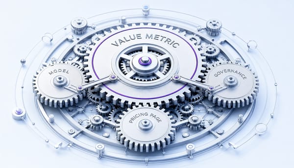
The practices that separate high-converting SaaS landing pages from the rest are not about layout templates. They are about messaging specificity, page-level narrative architecture, and the operational ability to test and ship improvements continuously. This isn't a checklist of elements to include. It's a set of frameworks for making better decisions about the content, structure, and performance of the one page that carries the most weight for your growth.
Your Hero Section Is Doing Too Many Jobs — Fix the Message First
Imagine the scenario: a marketing team spends weeks in Figma redesigning their landing page. They debate hero imagery, fine-tune animations in Webflow, and launch with confidence. The result? Conversion rate barely moves. The diagnosis is almost always the same: the headline describes a category ('The All-in-One Platform for Modern Teams') rather than a specific outcome for a specific buyer.
The hero section's job is not to impress; it is to answer three questions in under five seconds:
- What does this do?
- Who is it for?
- Why should I care right now?
Visitors form a judgment about a website within 50 milliseconds. This initial impression is governed by information scent—the visitor, arriving from an ad or search result, needs immediate confirmation they are in the right place. If the headline is generic, the scent is lost, and the back button is clicked. The failure is not in the design; it's in the message. The contrast is stark: 'The modern platform for customer success' is a category label. 'Reduce churn 30% by identifying at-risk accounts before they leave' is a value proposition. The first could be used by any competitor; the second could not.
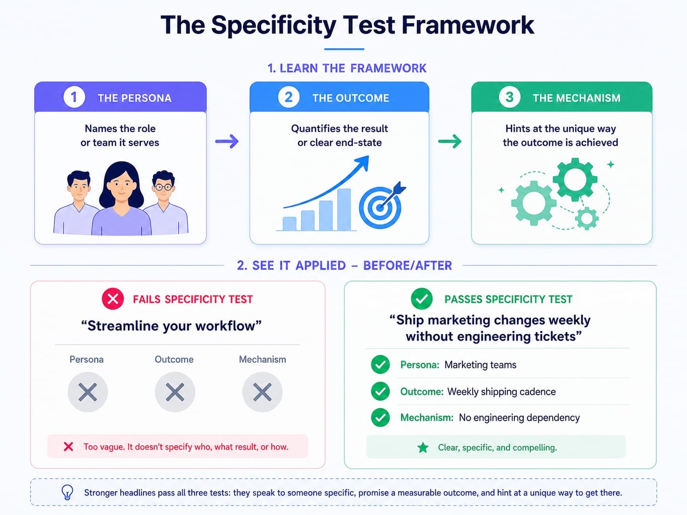
How to Write a Value Proposition That Passes the Specificity Test
Here is a practical framework: the specificity test. Take your headline and ask, "Could three of my direct competitors use this exact sentence on their landing page?" If the answer is yes, your headline fails. It's a category descriptor, not a differentiator.
A specific SaaS value proposition has three components:
- The Persona: It names the role or team it serves.
- The Outcome: It quantifies the result or describes a clear end-state.
- The Mechanism: It hints at the unique way the outcome is achieved.
Consider this rewrite. Vague: 'Streamline your workflow.' Specific: 'Ship marketing changes weekly without engineering tickets.' The first is forgettable fluff. The second identifies a specific pain (engineering dependency), a specific persona (marketing), and a specific outcome (weekly cadence). Tools like Framer and Webflow have made iterating on layouts trivial. The real bottleneck holding back conversion rates is almost always the copy, not the container it sits in.
Above-the-Fold Hierarchy: What Earns the First Screen
Most SaaS pages waste the most valuable real estate on the internet. The space above the fold is often cluttered with oversized navigation menus, decorative illustrations, or autoplay videos that push the actual value proposition below the visible area. This reduces fold density—the ratio of decision-relevant information to decorative content in the first viewport.
Every pixel above the fold has a job, and decoration is not one of them. A high-performing hierarchy is ruthlessly efficient:
- Headline: The specific, outcome-driven value proposition.
- Supporting Statement: A single sentence that clarifies the mechanism or adds context.
- Primary CTA: The single, desired next action.
- Trust Signal: A customer logo bar or a single, powerful metric (e.g., "Trusted by 5,000+ marketing teams").
For products where the value is visual or experiential, an interactive product demo from a tool like Arcade or Navattic can replace a static hero image. But this is a performance trade-off. If the embed isn't instant, it will increase scroll decay and hurt more than it helps.
Treat Your Landing Page as a Sales Conversation, Not a Brochure
The most common structural failure on SaaS landing pages is organizing them like a brochure: hero, features, testimonials, pricing, footer. This sequence follows convention, not buyer psychology. It treats the page as a static collection of modules rather than a persuasive argument.
A better mental model is the scroll narrative. Treat the page as a sequenced sales conversation where each section anticipates and answers the visitor's next question.
The typical buyer's internal monologue unfolds like this:
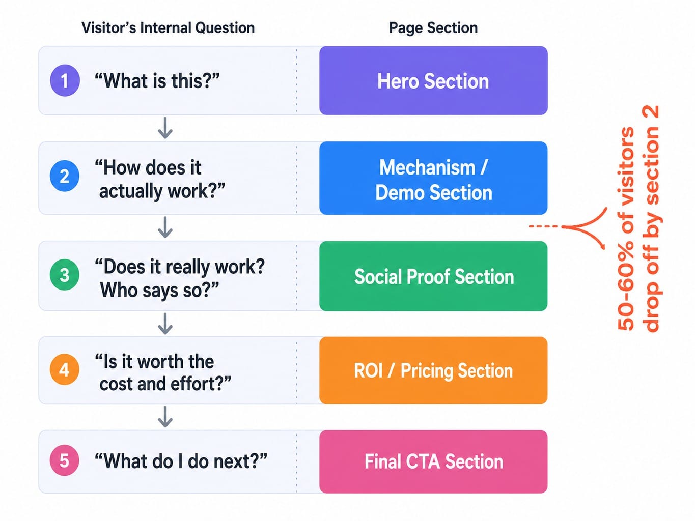
This isn't just theory. We've seen teams analyze session recordings in Hotjar or Microsoft Clarity and discover visitors consistently drop off at the feature grid. The features weren't wrong, but they appeared before the visitor understood the problem—the narrative was broken. By moving a problem-framing section before the features, they aligned the page with the visitor's journey and improved scroll depth. Data shows that 50-60% of visitors never scroll past the second section. This makes your section sequence a critical conversion lever, not a simple design choice.
Read more: Hotjar vs Crazy Egg (2026): What Each Tool Does Well—And What Neither Does
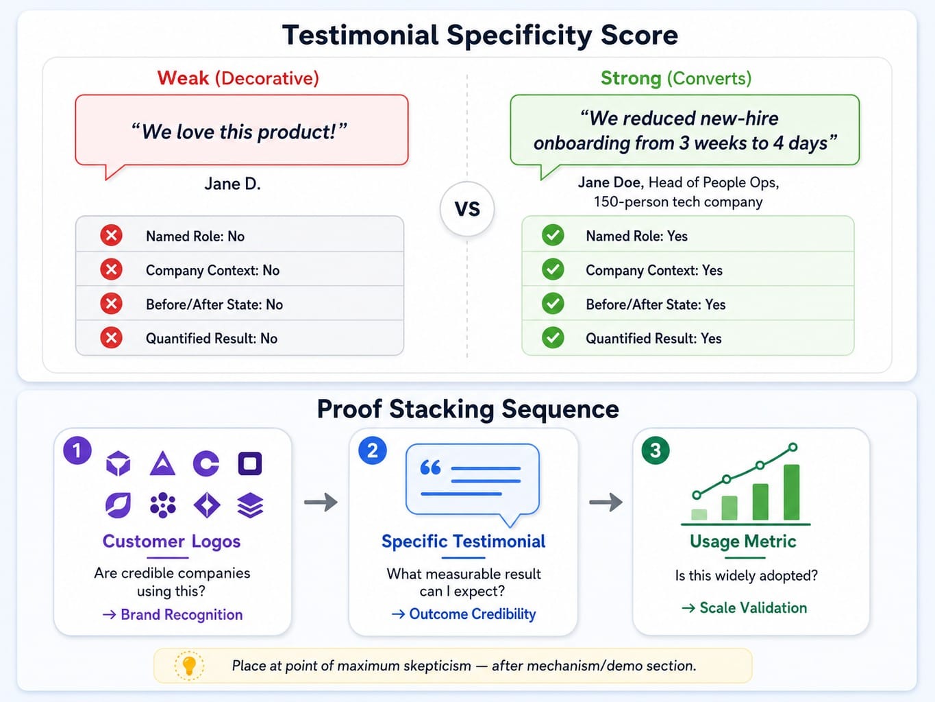
Social Proof That Converts vs. Social Proof That Decorates
Nearly every SaaS landing page has a testimonial section. And most are useless. They are filled with generic, low-impact quotes like "Great tool, saved us a lot of time!" This isn't social proof; it's decoration. It feels like a section the designer was told to include, so they filled it with placeholder content that never got updated.
The most effective testimonials have a high specificity score. They convert because they give the visitor a concrete mental model of the outcome. Contrast the impact:
- Weak: "We love this product!" - Jane D.
- Strong: "We reduced our new-hire onboarding time from 3 weeks to 4 days after switching to this platform." - Jane Doe, Head of People Ops, 150-person tech company.
The second version works because it names a role, a company context, a before-and-after state, and a quantified result. It builds a believable case.
To maximize impact, use proof stacking: layering different forms of social proof to answer different trust questions in sequence.
- Customer Logos: Answer "Are other credible companies using this?" (Brand recognition)
- Specific Testimonial: Answers "What specific, measurable result can I expect?" (Outcome credibility)
- Usage Metric: Answers "Is this a widely adopted solution?" (Scale validation)
Placement is just as crucial. Social proof should appear at the moment of maximum skepticism in the scroll narrative—typically right after you've explained how your product works.
PLG Self-Serve vs. Sales-Led Enterprise: Two Different Page Architectures
One of the costliest mistakes in SaaS is applying generic landing page advice that doesn't match your go-to-market motion. A product-led growth (PLG) page and a sales-led enterprise page have fundamentally different jobs. Applying PLG patterns to an enterprise page—or vice versa—cripples its effectiveness. "Best practices" are model-dependent, not universal.
Contrast the patterns. A PLG page from a company like Vercel or Posthog leads with an interactive demo and a single "Start free" CTA with zero friction. It's a direct path to the product. An enterprise page for a complex sale leads with an ROI calculator, a detailed case study, and a "Book a Demo" CTA that deliberately uses form fields to qualify the lead. The advice to "always reduce form fields" is correct for PLG and often dead wrong for an enterprise sales motion.
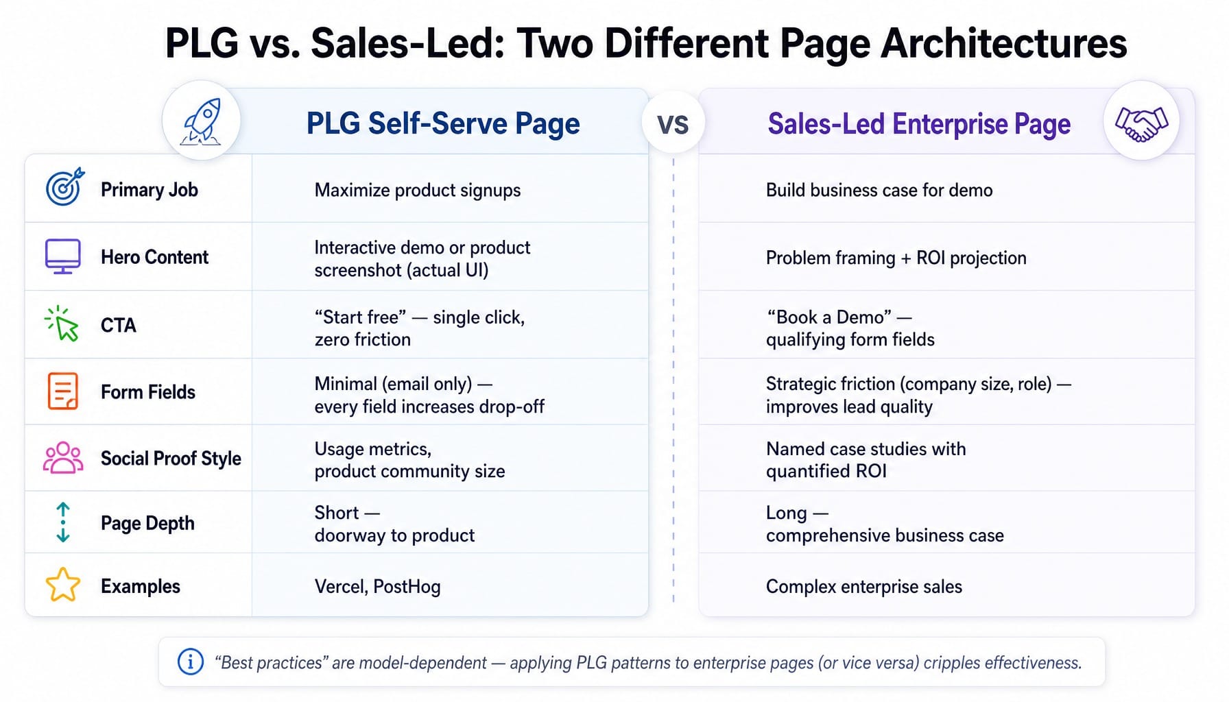
PLG Pages: Remove Every Barrier Between Visit and Product
The job of a PLG landing page is to maximize product signups by minimizing time-to-value. Every element should be ruthlessly optimized to get the visitor into the product experience, ideally within a single click. The page is a doorway, not a pitch deck.
The architecture should be simple: a specific headline, an interactive demo or a clear product screenshot showing the actual UI (not an abstract illustration), a single CTA like "Start free," and minimal navigation to distract. This is where the progressive disclosure pattern excels: show just enough to create curiosity and let the product itself do the convincing. Form field reduction is non-negotiable; every additional field measurably increases drop-off.
Read more: Instapage vs ClickFunnels (2026): The Real Difference After Using Both for Paid Campaigns
Sales-Led Pages: Build the Case Before Asking for the Meeting
A sales-led landing page has to do more work. The ask—a 30-minute demo call—is a much higher commitment than a free signup. The page must build a comprehensive business case before the CTA.
The narrative needs more depth: problem framing, mechanism explanation, social proof from recognizable logos, and a specific case study with quantified results. This is where elements like anchor pricing frames or ROI projections are effective, as the buyer needs ammunition to justify the meeting internally. Here, a few qualifying form fields (company size, role) are not the enemy. They create strategic friction that improves the quality of conversions, closing the MQL-to-signup attribution gap that plagues teams focused only on top-of-funnel volume.
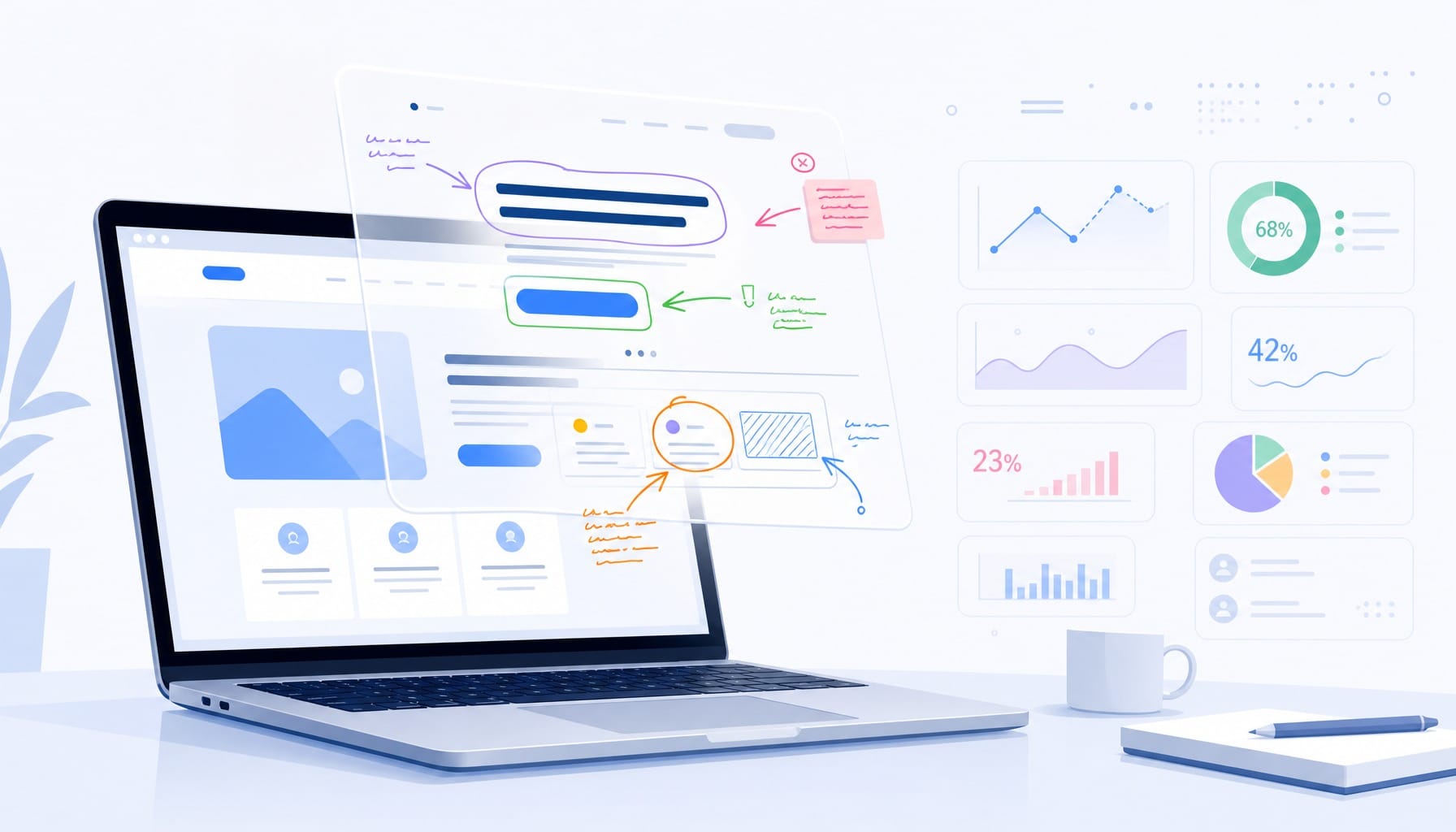
The Hidden Conversion Cost of Over-Designed Pages
A SaaS team invests in a full rebuild. The new page, built in Framer, is stunning: scroll-triggered animations, Lottie files, a 4MB hero video. In the design review, everyone loves it. Then they check Core Web Vitals. Largest Contentful Paint (LCP) is 4.2 seconds. The CTA button shifts during load. Mobile users on 4G see a blank screen for three seconds. The conversion rate drops.
This scenario is constant. There is a measurable conversion cost to visual complexity that most teams never quantify because they evaluate pages in design tools on fast office networks, not under real-world user conditions. As page load time goes from 1 to 5 seconds, the probability of a bounce increases by 90%. For paid campaigns, every bounce is a direct financial loss.
Run a cognitive load audit on your page. Every animation, every moving element, every decorative illustration adds cognitive processing time that competes with the visitor's ability to understand your value proposition. Use Lighthouse to diagnose performance and tools like Microsoft Clarity to find the dead zone heatmaps where engagement dies. Often, the elements in that zone are serving design aesthetics, not the user's goal.
When the Bottleneck Is Not Knowing What to Fix — It Is Shipping the Fix
You now have a clear audit path: test your hero message for specificity, map your page's scroll narrative, restructure your social proof, and check if your architecture matches your GTM model. But this creates the real bottleneck for most marketing teams. It's not a strategy problem; it's a shipping problem. The latency between identifying what needs to change and actually deploying that change—through planning, approvals, and execution—eats weeks.
This is the execution gap Spike AI closes. It's not another analytics tool that gives you a dashboard of problems. It's the execution layer that turns your backlog into weekly releases.
Every week, Spike AI identifies the single highest-impact move across your website—whether it's a headline variant, a re-sequenced content block, or a technical fix—and deploys it. The marketer moves from being a bogged-down operator to a strategic approver. Knowing the best practices is necessary, but it's not sufficient. The teams that break away from the 2% conversion rate are the ones with the operational cadence to ship meaningful changes continuously, not just heroically once a quarter.
See how Spike AI ships your highest-impact website changes weekly
Conclusion
SaaS landing page best practices are not a checklist of elements. Following a template guarantees mediocrity. High-performing pages are the output of a system, not a design project. They are built on messaging specificity, a psychologically-aware narrative sequence, and an architecture that matches the commercial model.
The single most important shift is to stop evaluating your landing page as a static design artifact and start treating it as an execution system. It needs continuous input, measurement, and improvement to compound results. The teams that will win in 2026 won't be the ones with the most polished pages. They will be the ones that ship the most meaningful changes per quarter.
Frequently Asked Questions
How many CTAs should a SaaS landing page have?
Multiple CTAs are acceptable as long as they all drive the same action (e.g., "Start free trial"). The mistake is having competing CTAs for a demo, a newsletter, and a webinar, which splits attention and reduces conversions on all of them. A good rule is one primary action, repeated at 2-3 natural decision points in the scroll narrative.
Should a SaaS landing page include pricing information?
For PLG products, yes; transparent pricing reduces friction. For sales-led enterprise products, showing a starting price can anchor expectations without revealing a complex pricing structure. Hiding pricing entirely when competitors show theirs is often a mistake, as visitors will leave to compare rather than book a call to find out.
What is the difference between a SaaS homepage and a campaign landing page?
A homepage serves multiple audiences and is a navigation hub. A campaign landing page serves one audience from one source with one goal. Campaign pages should have no primary navigation and focus every element on a single conversion action. Sending paid traffic to a homepage instead of a dedicated landing page almost always wastes budget.
Should SaaS landing pages use video or interactive demos?
Interactive demos (via tools like Arcade or Navattic) often outperform videos because they let visitors experience the product. However, both add significant page weight. Only use them if they load in under 2 seconds and can replace—not just supplement—static feature descriptions. A slow demo costs more conversions than it creates.
How do you A/B test a SaaS landing page without enough traffic?
If you have fewer than 5,000 visitors per month, run sequential tests: deploy version A for two weeks, then version B for two weeks, and compare conversion rates directionally. Focus on high-impact variables like the headline or page structure, not micro-changes like button color, so the effect is large enough to detect with a small sample.
How do AI tools change SaaS landing page optimization in 2026?
AI is shifting optimization from periodic redesigns to continuous iteration. Instead of quarterly audits, AI-driven platforms can identify underperforming sections, generate copy variants, and deploy changes weekly. The biggest change isn't AI-generated content blocks; it's AI-driven prioritization that tells teams which change will have the highest conversion impact right now, solving the execution bottleneck.