Landing Page Examples That Convert: 15 B2B SaaS Pages Analyzed by What Actually Works
Skip the design gallery. These 15 B2B SaaS landing page examples are analyzed by the specific conversion mechanics that make them work for PLG, sales-led, and enterprise teams.
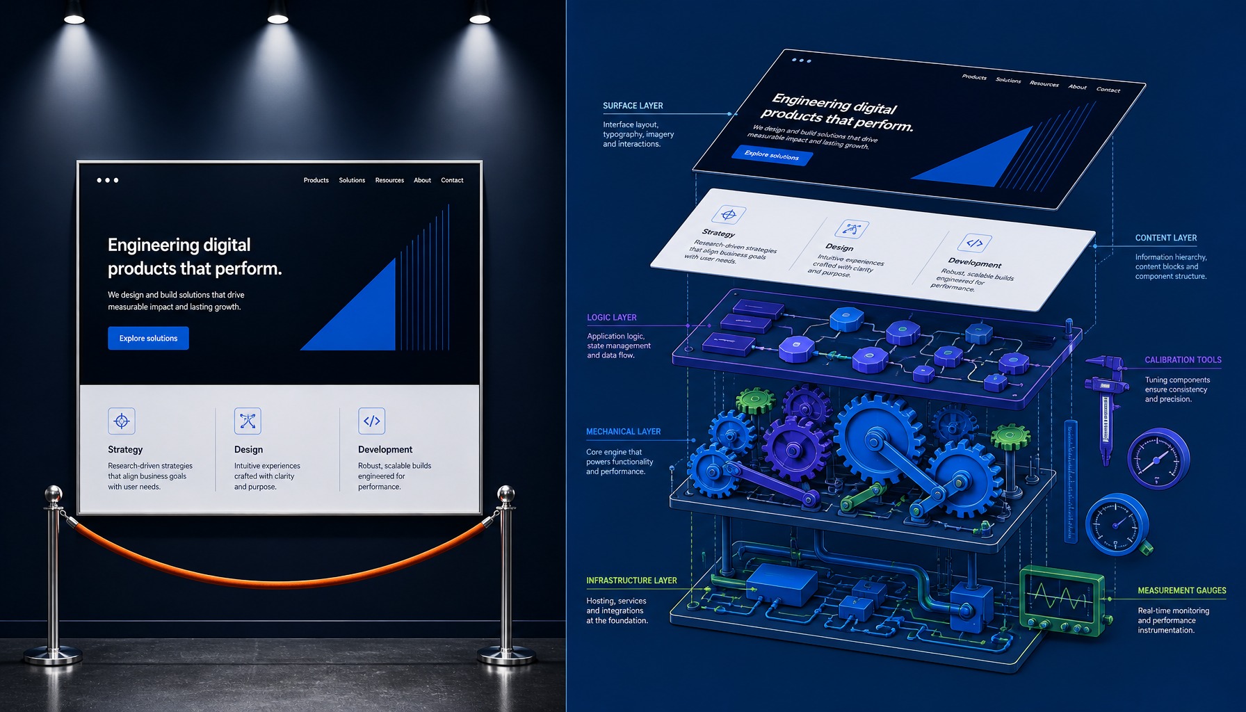
Key Takeaways
- High-converting landing pages are built on five core patterns: Headline-to-CTA alignment, social proof placement, form field calibration, attention ratio, and message match.
- Your go-to-market motion dictates page structure: PLG pages optimize for friction reduction, while sales-led pages must build value to justify a higher-friction ask like a demo.
- Never use the same landing page for all traffic. A page built for a high-intent paid search visitor will fail for a retargeting audience that needs objection handling.
- Common mistakes like including a navigation bar, using vague CTA copy ("Submit"), or describing product features instead of outcomes consistently suppress conversion rates.
- The difference between a 2% and an 8% conversion rate isn't a major redesign; it's the continuous, weekly optimization of these core conversion patterns.
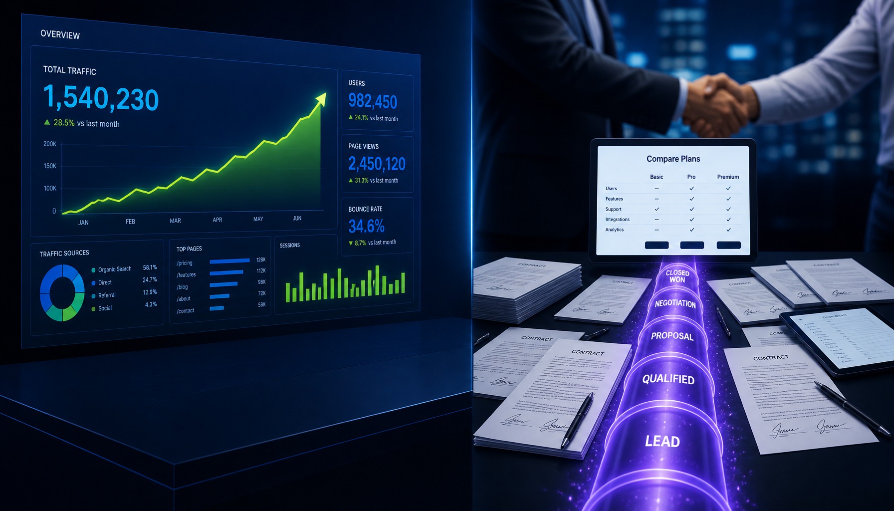
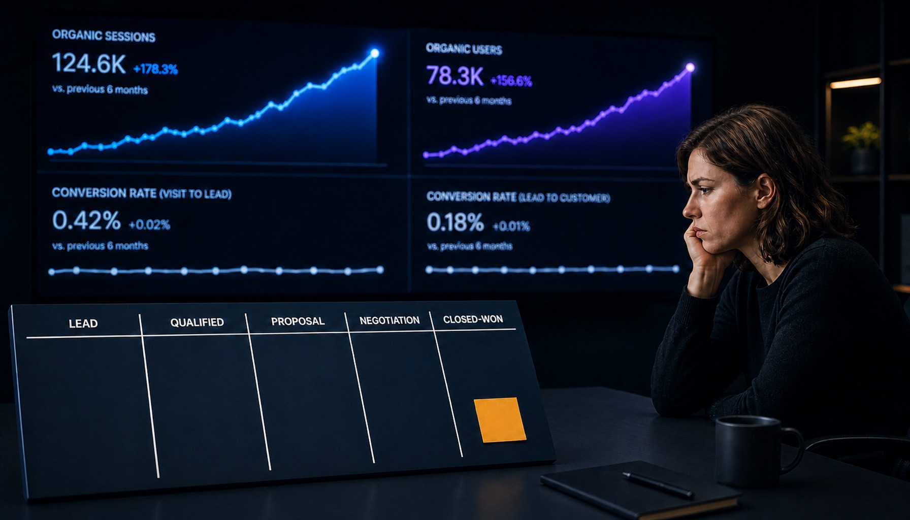
Design inspiration won't tell you why one B2B SaaS landing page converts at 8% while a visually identical competitor sits at 1.5%. The difference is the conversion mechanics: how the headline, social proof, form length and traffic-source match work together at the point of decision.
This is not another design gallery. Here are 15 B2B SaaS landing page examples, organized by go-to-market motion and broken down by the specific conversion patterns that make them work.
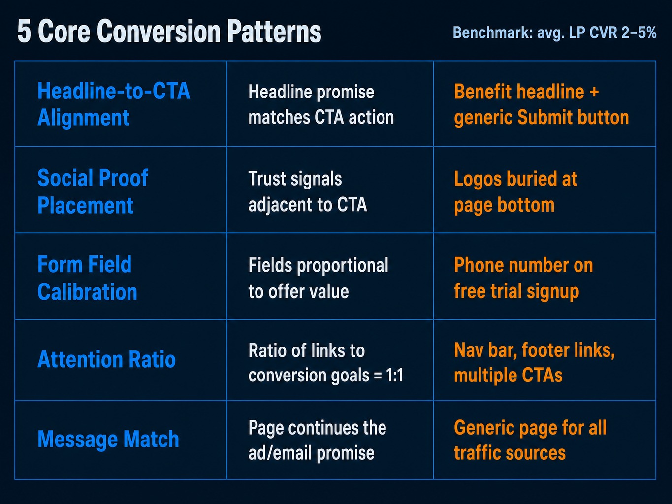
The 5 Conversion Patterns Behind Every High-Performing SaaS Landing Page
Before we look at any examples, we need a shared vocabulary for what actually drives landing page CVR. While the average landing page conversion rate sits around 2-5%, pages that score well on these mechanics consistently outperform that benchmark.
- Headline-to-CTA Alignment: The headline makes a promise, and the CTA provides the path to claim it. Good alignment gives the visitor a direct, logical path from promise to action. The common failure is a benefit-driven headline paired with a generic CTA like "Submit," creating a cognitive disconnect.
- Social Proof Placement: This isn't just having logos; it's where you put them. High-performing pages place trust signals logos, testimonials, usage stats directly adjacent to the primary CTA, reducing friction at the moment of decision. Low-performing pages often bury them at the bottom.
- Form Field Calibration: The number of form fields must be proportional to the perceived value of the offer. A free trial signup (low value exchange) demands fewer fields than an enterprise demo request (high value exchange). The most common mistake is asking for a phone number on a self-serve signup.
- Attention Ratio: This is the ratio of clickable elements on the page to the number of conversion goals. An ideal landing page has an attention ratio of 1:1 one goal (the CTA) and one corresponding button. Pages with navigation bars, footer links, and multiple competing offers have a high attention ratio and leak conversions.
- Message Match: The landing page must feel like a direct continuation of the ad, email, or link that brought the visitor. This means the headline, value proposition, and even imagery should align with the source. A mismatch is the fastest way to a high bounce rate.
Every example that follows illustrates at least one of these patterns.
PLG Landing Page Examples: Free Trial and Self-Serve Signup Pages
The job of a product-led growth (PLG) landing page is fundamentally different from its sales-led counterpart. You are asking the visitor to start using the product right now. The page must therefore eliminate friction while communicating just enough value to earn the click.
1. Calendly
- Page: Free Trial Signup
- Key Conversion Pattern: Single-field form with an inline CTA. Calendly asks only for an email address and immediately follows with a "Sign up" button.
- Takeaway: For PLG, the easiest way to start is the best way to start.
2. Airtable
- Page: Signup Page
- Key Conversion Pattern: Product-as-hero imagery. Instead of a generic stock photo, Airtable's hero section is a clean, animated GIF of the product in action. This answers the visitor's core question "What does this thing actually do?" visually and instantly.
- Takeaway: Show, don't just tell: a well-chosen product shot does more than a paragraph of benefit copy.
3. Loom
- Page: Free Account Signup
- Key Conversion Pattern: Objection-handling micro-copy. Directly below the CTA button, Loom uses the simple phrase: "Free forever. No credit card required."
- Takeaway: Identify the primary friction point for your offer and address it with explicit copy right next to the CTA.
4. Notion
- Page: Signup Page
- Key Conversion Pattern: Low attention ratio. The page is stripped of all navigation, footer links, and secondary CTAs. There are only two paths: sign up with your email or sign up with Google.
- Takeaway: A true landing page is a dead end with one way out: through your CTA.
Sales-Led Landing Page Examples: Demo Request and Contact Pages
The core tension of a sales-led landing page is that you're asking for a visitor's time, not just their email. A demo call is a 30-minute commitment. The page must therefore do more work to build trust and justify the ask. Here, social proof and form calibration become the dominant conversion levers.
1. Gong
- Page: Get a Demo
- Key Conversion Pattern: High-impact social proof placement. Above the fold, Gong pairs a row of instantly recognizable customer logos (LinkedIn, Zillow, Slack) with a specific ranking claim: "See why we're rated #1."
- Takeaway: Don't just show logos; pair them with a specific, verifiable claim so they carry context.
2. Drift
- Page: Demo Request
- Key Conversion Pattern: Sequenced form field calibration. Drift uses a multi-step form disguised as a chatbot conversation. It asks for one piece of information at a time (first name, then email), which reduces the perceived cognitive load compared to a long static form.
- Takeaway: Break down long forms into a conversational sequence to lower perceived friction.
3. Salesloft
- Page: Request a Demo
- Key Conversion Pattern: Value-building video adjacent to the form. Salesloft places a short, dynamic product tour video directly next to the demo request form.
- Takeaway: Before you ask for their time, show them why the conversation will be worth it.
Enterprise and Hybrid Landing Page Examples: Long-Form Pages for Complex Buyers
Enterprise buyers operate on longer consideration cycles with more stakeholders. The landing page can't convert on a single screen; it must build a layered, logical argument that speaks to different personas and survives internal sharing.
1. Salesforce
- Page: Sales Cloud "Watch Demo" Page
- Key Conversion Pattern: Repeated CTAs at key scroll depths. The primary "Watch Demo" CTA appears above the fold, again mid-page after the feature overview, and a third time at the bottom. The copy varies slightly, matching the context of the section it follows.
- Takeaway: On long pages, assume the visitor won't scroll back up, so place CTAs where decisions are made.
2. Databricks
- Page: Platform Trial Page
- Key Conversion Pattern: Persona-based information architecture. Databricks uses a tabbed section ("For Data Scientists," "For Data Engineers," "For ML Engineers") that allows different buyer personas to self-select the information path most relevant to them, all on a single page.
- Takeaway: If you sell to multiple personas, let them choose their own adventure instead of forcing them through a single narrative.
3. Workday
- Page: "Take a Tour" Product Page
- Key Conversion Pattern: Case study as a mid-page conversion anchor. Halfway down the page, Workday inserts a case study block with a customer logo, a direct quote, and a quantified ROI metric.
- Takeaway: Use customer success metrics as a "second chance" to convert visitors who aren't convinced by your initial value proposition.
Matching Page Length to Deal Complexity
Page length should be driven by the complexity of the buying decision, not a desire to "cover everything." A PLG free-trial page that scrolls for eight screens is adding friction. An enterprise demo page that fits on one screen is leaving objections unaddressed.
As a rule of thumb, deals above $25K ARR with more than one decision-maker need distinct content blocks (value prop, social proof, use cases, ROI evidence, CTA). Below that threshold, shorter pages with a single clear ask tend to outperform. Length without a layered argument is just padding.
How Traffic Source Should Change Your Landing Page Structure
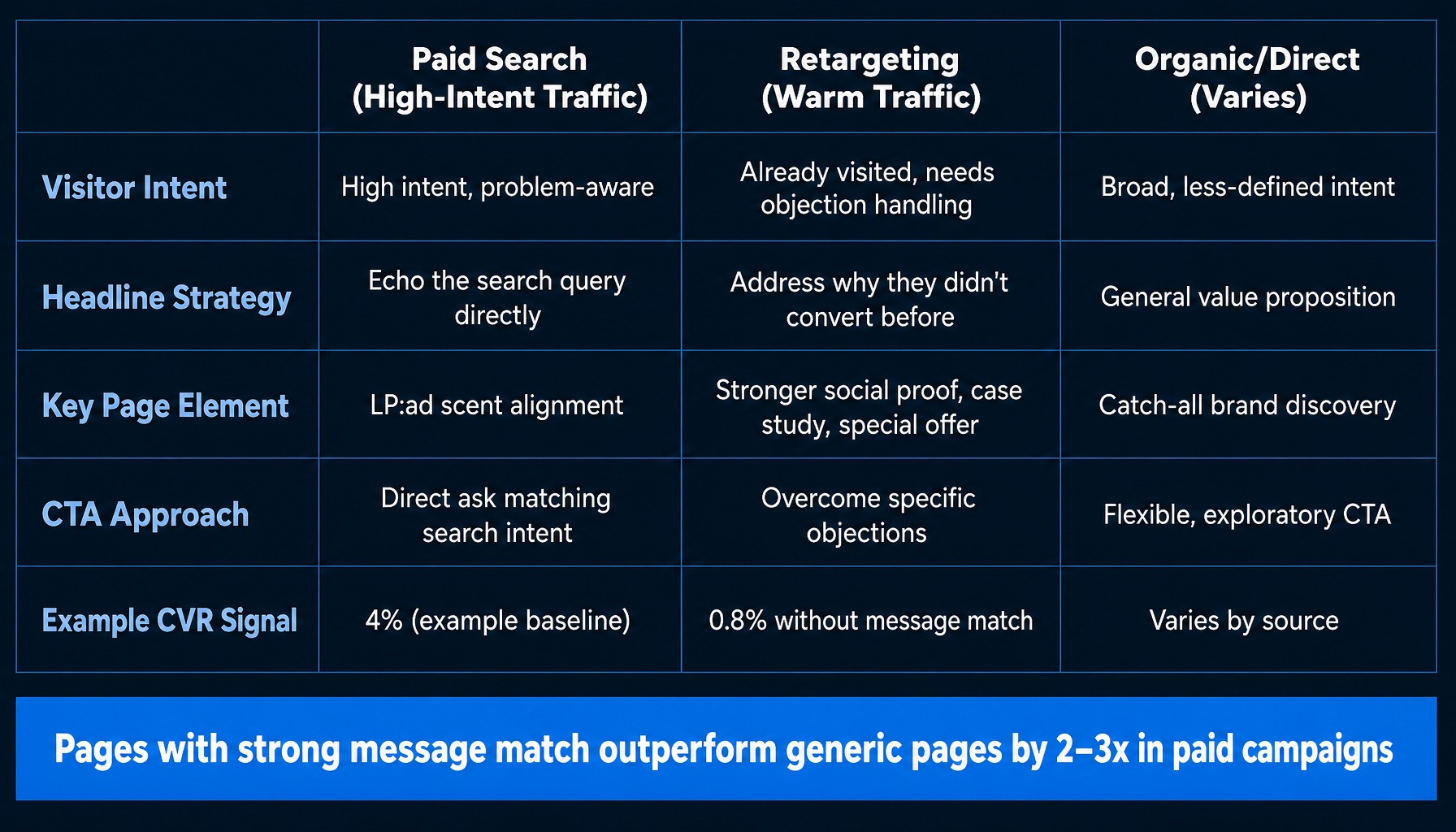
Here's a common scenario. A marketing team runs one landing page for all their paid campaigns. Their Google Ads traffic, arriving from high-intent searches, converts at 4%. But their LinkedIn retargeting traffic converts at just 0.8% on the exact same page.
The problem isn't the page design; it's a failure of message match. The page is built for one audience but shown to another.
- Paid Search Visitors (High-Intent Traffic): Arriving from a query like "best crm for startups," they need a headline that directly echoes that need. The page must quickly prove it's the right solution for their specific problem. LP:ad scent alignment is the priority.
- Retargeting Visitors (Warm Traffic): This person already visited your site. They don't need the basic value proposition again. They need their objections answered. A retargeting page should feature stronger social proof, a case study, or a special offer to overcome whatever stopped them from converting the first time.
- Organic/Direct Visitors (Varies): This traffic has broader, less-defined intent. These pages can afford a more general value proposition, as they often serve as a catch-all for brand discovery.
Most teams don't build separate pages because it feels like too much work. But the CVR difference is significant; pages with strong message match consistently outperform generic pages by 2-3x in paid campaigns.
Read more: SaaS Landing Page Best Practices: What Actually Converts in 2026
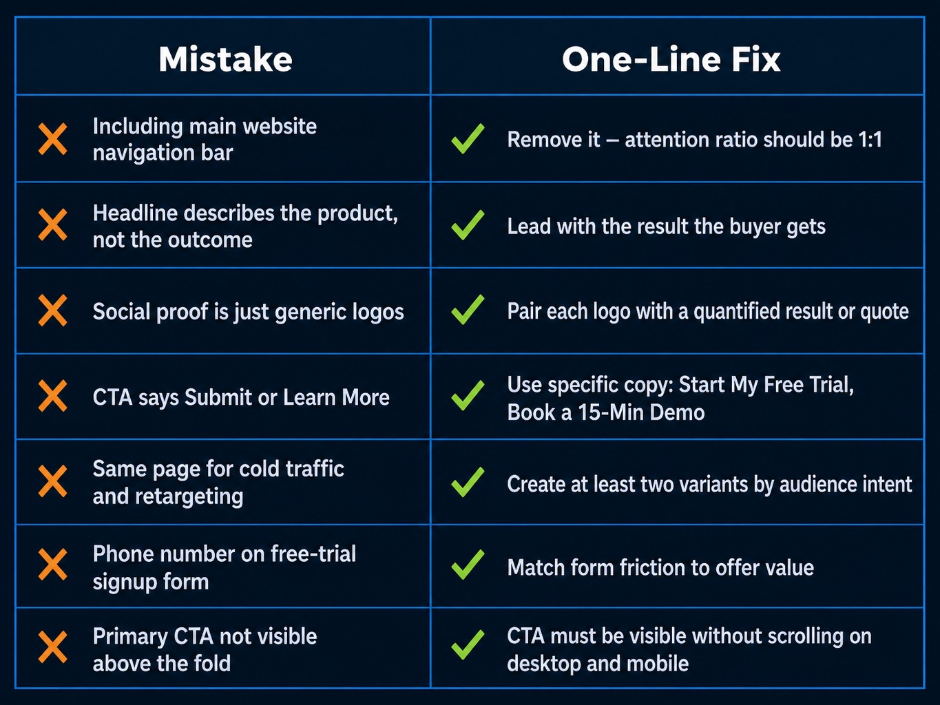
The Most Common B2B SaaS Landing Page Mistakes (and One-Line Fixes)
These are the patterns that consistently suppress CVR on B2B SaaS landing pages. Audit your own pages against this list.
- Mistake: Including the main website navigation bar.
- Fix: Remove it. The attention ratio on a landing page should be 1:1, guiding the user to a single action.
- Mistake: The headline describes the product instead of the outcome.
- Fix: Lead with the result the buyer gets, not a label for what your product does.
- Mistake: Social proof is just a row of generic logos.
- Fix: Pair each logo with a specific, quantified result or a specific, attributed quote to give it context and credibility.
- Mistake: The CTA button says "Submit" or "Learn More."
- Fix: Use action-oriented, specific copy that describes what the user will get, like "Start My Free Trial" or "Book a 15-Min Demo."
- Mistake: Using the same page for cold traffic and retargeting.
- Fix: Create at least two variants: one with benefit-driven copy for new visitors, and one with objection-handling copy for retargeting.
- Mistake: Asking for a phone number on a free-trial signup form.
- Fix: Match the form's friction to the offer's value; a phone number is a high-friction ask for a low-commitment offer.
- Mistake: The primary CTA is not visible above the fold.
- Fix: Your main call-to-action must be visible without scrolling on both desktop and mobile devices.
Applying data-driven CRO strategies to these common mistakes is a practical starting point for measurable lift.
How to Keep Landing Pages Optimized Every Week
Knowing the patterns that separate a 2% page from an 8% page is only half the work. The other half is shipping changes consistently.
Getting to high performance requires a continuous rhythm of headline tests, social proof rotations, form field experiments, and message-match adjustments. For most lean SaaS teams, that's a backlog of tasks that never gets done.
Closing that gap takes a weekly cycle: identifying which element on which page is suppressing conversions, prioritizing the highest-impact fix, and shipping it, then repeating the cycle the following week.
Spike AI is built to run that weekly cycle for lean teams, and its reported conversion rate success metric is 80%. That figure is Spike AI's own result, not a guaranteed outcome for your landing pages.
Conclusion
The difference between a landing page that looks good and one that converts is not design it is the deliberate application of conversion patterns matched to your SaaS motion and traffic source. The examples in this article are not a gallery to admire; they are a library of patterns to test. Ship one improvement each week and let the data guide the next one.
Frequently Asked Questions
Should a SaaS landing page show pricing or gate it behind a form?
It depends on your sales motion. For PLG products under $100/month, transparent pricing reduces friction. For enterprise products with custom pricing (>$25K ARR), gating it behind a demo is standard because the price requires context. For everything in between, the weakest option is showing no pricing signal at all; even a "starting at" anchor helps qualify visitors.
How do AI-generated landing pages compare to manually designed ones in conversion performance?
AI tools accelerate iteration, but their performance depends on the quality of the strategic inputs. AI-generated pages can outperform manual design on testing velocity, allowing more variants to be tested per month. However, a tool cannot fix a weak value proposition or a fundamental message-match problem.
How should a landing page differ for top-of-funnel vs bottom-of-funnel traffic?
Top-of-funnel visitors need education, so the page should lead with the problem and use lighter CTAs like downloading a guide. Bottom-of-funnel visitors are evaluating solutions, so the page should lead with differentiation and use stronger CTAs like booking a demo. The CTA friction should match the visitor's intent and awareness level.
What role does page speed play in landing page conversion rates?
Page speed is critical. Pages loading in under 2 seconds convert at a much higher rate than those loading in 5+ seconds. For paid campaigns, slow pages also increase your cost-per-click, as platforms like Google Ads factor landing page experience into their Quality Score. Prioritize image compression and minimize render-blocking scripts.
How do you A/B test a landing page when traffic volume is low?
With low traffic, run sequential tests (variant A for two weeks, then variant B) instead of simultaneous A/B tests, and compare CVR while being mindful of time-based variables. Alternatively, focus on testing high-impact changes to the headline and CTA, where a larger effect size is more likely to be detectable in a smaller sample.
What is the ideal above-the-fold layout for a SaaS landing page?
The above-the-fold area must contain four key elements: a benefit-driven headline, a subheadline clarifying the audience or use case, a visible CTA button with action-specific copy, and at least one trust signal (like a customer logo bar or key stat). Any hero image or video should support these elements, not push the CTA below the fold.