
The B2B SaaS Product Metrics That Matter — And the Ones Wasting Your Dashboard Space (2026)

TLDR
- Stop tracking vanity metrics like raw DAU. Instead, validate your activation event—the specific user action that correlates with 90-day retention—and measure your activation rate against it.
- Replace aggregate churn rates with cohort retention curves. This reveals when and why users leave, showing you the true health of your product, not just a blended average.
- Your product metrics are likely corrupted by "instrumentation debt"—inconsistent event naming, tracking gaps, and double-counting. Audit your core event definitions before you trust your dashboards.
- The metrics that matter change with your go-to-market motion. PLG companies should obsess over activation funnels and PQL velocity; sales-led companies need customer health scores and seat expansion rates.
- A true north star metric must be a leading indicator of revenue and influenceable by your team within a sprint cycle. If it doesn't correlate with revenue in a simple scatter plot, it's the wrong metric.
Your B2B SaaS growth team reviews the weekly dashboard. Daily active users (DAU) are up 4% week-over-week. Session duration looks healthy. A new feature shows a "trending positive" adoption curve. Everything is green. Yet, trial-to-paid conversion hasn't moved in two quarters, and the sales pipeline is flat. The dashboard signals health, but the business is stalling.
This isn't a hypothetical scenario. It's the operational reality for most B2B SaaS companies. The problem isn't that teams are under-instrumented; it's that they are mis-instrumented. They track metrics that feel productive but fail to connect product behavior to revenue outcomes.
The issue isn't which analytics tool you use. It's which B2B SaaS product metrics you select, how you define them, and whether your underlying event tracking is clean enough to trust the numbers in the first place.
This is not another list of 15 metrics to add to your dashboard. This is a practitioner's framework for selecting the few that actually drive product decisions, understanding how your go-to-market motion changes the prescription, diagnosing the hidden problem of instrumentation debt, and choosing a north star metric you can actually trust.
Why Most B2B SaaS Teams Measure the Wrong Product Metrics
The default behavior for most B2B SaaS teams is to instrument everything their analytics tool makes available. They connect Amplitude or Mixpanel, see options for DAU, MAU, session duration, and feature clicks, and build dashboards around whatever looks interesting. The result is a dashboard that reports on activity but cannot diagnose problems or prescribe action. It tells you what happened, but not why it happened or what to do next.
Consider a 30-person SaaS company tracking 14 different product metrics. When logo churn spikes from 3% to 6% in a single month, the team scrambles. They look at their 14 metrics, but no single one provides a clear signal. Was it a drop in DAU? A dip in feature adoption? Nobody can identify the leading indicator because none of the 14 were selected to predict churn—they were selected because the tool made them easy to track.
This highlights the critical distinction between leading and lagging indicators.
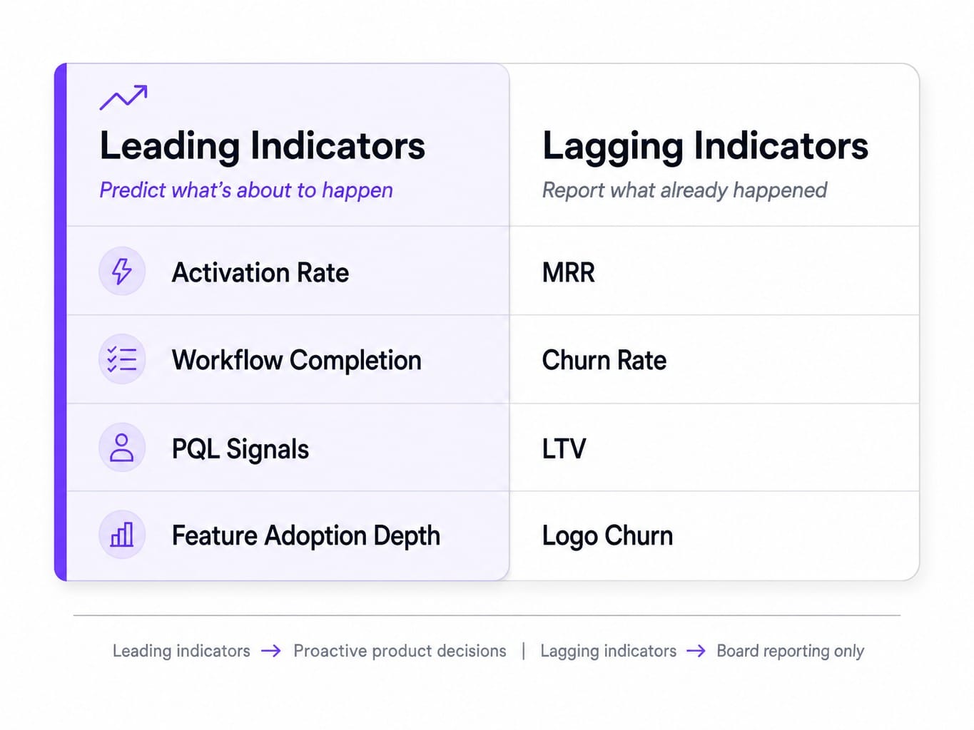
- Lagging Indicators tell you what already happened (e.g., MRR, churn rate, LTV). They are outcomes.
- Leading Indicators tell you what is about to happen (e.g., activation rate, workflow completion, PQL signals). They are predictors.
Most teams over-index on lagging indicators, which are useful for reporting to the board but useless for making proactive product decisions. The rest of this article focuses exclusively on the leading indicators that connect product behavior to future revenue.
The Product Metrics That Actually Drive Decisions in B2B SaaS
Instead of a shallow list of a dozen metrics, we're going to focus on the four that most reliably connect product usage to revenue outcomes in B2B SaaS. For each one, the definition is where most teams go wrong. Get the definition right, and the metric becomes a powerful lever for growth. Get it wrong, and it's just another number on a dashboard.
Activation Rate: Finding Your Real Aha Moment
Activation rate is the single most important leading indicator for B2B SaaS, but most teams define it incorrectly. They pick an arbitrary, top-of-funnel action like "completed onboarding" or "created first project" and call it a day. A true activation event is the specific user action that has the highest correlation with long-term retention. It's the "aha moment" where a user experiences the core value of your product, validated by data, not assumption.
The right way to find this is to analyze the behaviors of users who retain for 90 days versus those who churn, and identify the actions the retained group took disproportionately in their first week.
- Wrong Way: A project management SaaS defines activation as "created first project."
- Right Way: After analysis, they discover the real aha moment is "invited a second team member to a project within 48 hours." Users who do this are 4x more likely to become paying customers.
Formula: (Number of users who completed the activation event) / (Number of users who signed up) 100
While Userpilot's 2025 benchmark report found a 37.5% average activation rate across B2B companies, that number is meaningless if your activation event is wrong. Use L7 and L28 engagement windows (activity within the first 7 or 28 days) to validate which actions truly predict retention.
Cohort Retention Curves: What Aggregate Churn Hides
An aggregate churn rate is a lagging, blended number that hides critical information. A 5% monthly churn rate could mean steady attrition across all cohorts, or it could mean catastrophic early churn from new users that is being masked by strong retention from your oldest, most loyal customers. You can't tell the difference from a single number.
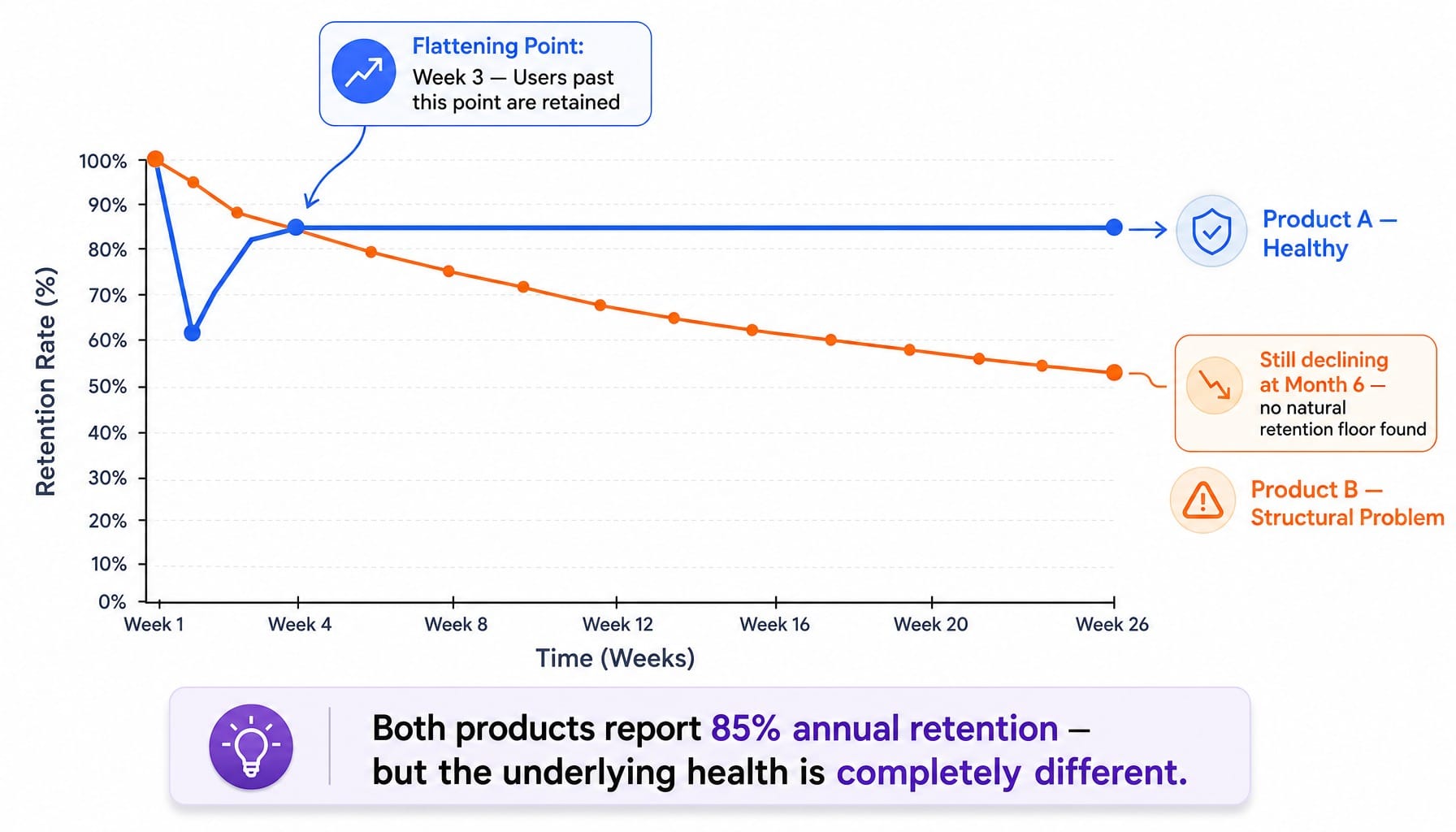
This is why you must use cohort retention analysis. By grouping users by their signup week or month and plotting their retention over time, you can see the unvarnished truth. The key is to look for the "flattening point"—the moment where the curve stabilizes. This indicates your product's natural retention floor and the point at which users are truly "retained."
Imagine two SaaS products both reporting 85% annual retention. Product A's cohort curve flattens in Week 3, meaning users who make it past the first few weeks are highly likely to stick around. Product B's curve is still declining at Month 6, signaling a deep structural problem with long-term value. Tools like Amplitude, Mixpanel, and PostHog are built for this analysis. Also, be sure to distinguish logo churn (lost customers) from revenue churn (lost MRR). You can lose 10% of your logos but grow revenue if the churned accounts were small and the retained accounts expanded.
Read more: Heap vs Amplitude in 2026: A Practitioner's Guide to Choosing the Right Analytics Platform
Product-Qualified Leads: Bridging Product Usage and Revenue
Product-Qualified Leads (PQLs) are the metric that connects product analytics directly to the sales pipeline. Too many B2B SaaS companies either don't define them or define them weakly as "anyone who signed up for a trial." A real PQL scoring model combines behavioral signals from within the product with firmographic fit.
PQLs are not MQLs. MQLs are based on marketing engagement (downloaded a whitepaper). PQLs are based on product engagement that signals buying intent.
For example, a security compliance SaaS might define a PQL using a scoring model based on three key signals:
- User completed one full-security scan (core workflow).
- User logged in 3+ days in their first week (L7 engagement).
- User's company matches the ICP (e.g., 100-1000 employees, in a regulated industry).
When this PQL definition is pushed to the sales team's CRM, they find these leads convert to paid at 3x the rate of MQLs. This isn't a PLG-only concept. Any SaaS with a trial or freemium motion can use a PQL model to focus sales effort on the accounts most likely to convert. Tools like Pendo and Heap can track the behaviors, while reverse-ETL platforms like Census or Hightouch can sync the resulting scores to your CRM.
Net Revenue Retention: The Metric That Proves Product-Market Fit
Net Revenue Retention (NDR) is the single strongest signal of product-market fit and sustainable growth in B2B SaaS. If your NDR is above 100%, it means your existing customers are generating more revenue through upgrades and expansion than you are losing from downgrades and churn. Your business is growing even without acquiring new customers.
Formula: (Starting MRR + Expansion MRR - Contraction MRR - Churn MRR) / Starting MRR
Top-performing public B2B SaaS companies consistently post NDR figures between 110% and 130%. It's crucial to distinguish NDR from Gross Revenue Retention (GRR), which excludes expansion revenue and measures pure retention health. While GRR tells you if you have a leaky bucket, NDR tells you if your bucket is overflowing. Tools like ChartMogul and ProfitWell by Paddle are designed to track this automatically.
How Your GTM Motion Changes Which Metrics Matter
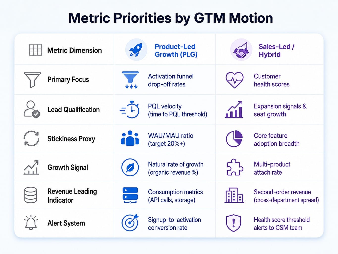
The metrics that matter for a product-led SaaS with a self-serve freemium model are fundamentally different from those that matter for a sales-led SaaS closing six-figure annual contracts. Most guides present a universal list, but the reality is that your go-to-market (GTM) motion dictates your metric priorities.
Product-Led: Activation Funnels, PQL Velocity, and Natural Rate of Growth
In a product-led growth (PLG) motion, the product is the sales engine. The metrics that matter most are those that measure the efficiency of this self-serve progression. You should obsess over activation funnel drop-off rates—identifying exactly where users abandon the onboarding flow before reaching their aha moment. A single percentage point improvement in signup-to-activation can directly increase revenue without any additional customer acquisition cost (CAC).
Other key PLG metrics include PQL velocity (how quickly new signups reach the PQL threshold), the WAU/MAU ratio as a proxy for product stickiness (Mixpanel data suggests 20%+ is strong for B2B SaaS), and the natural rate of growth (the percentage of revenue from organic and product-driven channels). If you employ a usage-based pricing model, consumption metrics like API calls or storage used become direct, revenue-leading indicators.
Read more: Data-Driven CRO Strategies: Identifying Marketing Opportunities for True Conversion Optimization
Sales-Led and Hybrid: Expansion Signals, Customer Health Scores, and Second-Order Revenue
In a sales-led or hybrid model, product metrics serve a different purpose: they are early warning systems for churn and expansion signals for the account management and sales teams. The most critical metric is a customer health score. This is a composite score, often built in a platform like Gainsight, combining signals like login frequency, breadth of core feature adoption, support ticket volume, and NPS. When a score drops below a predefined threshold, it automatically alerts the CSM team, allowing them to intervene months before a renewal conversation turns sour.
Other key metrics include seat expansion rate (are teams growing their usage organically?) and multi-product attach rate for companies with multiple offerings. A more advanced concept is tracking second-order revenue, which measures how product usage in one department drives expansion into adjacent departments, attributing revenue back to the product's viral or collaborative features.
The Instrumentation Debt Problem: Why Your Product Metrics Might Be Lying
Every product metric is only as reliable as the event tracking that powers it. Over time, most B2B SaaS companies accumulate significant instrumentation debt: a messy, undocumented, and untrustworthy foundation of analytics events. You have inconsistent event naming conventions, duplicate events firing from different parts of the app, and critical user actions that were never instrumented at all.
The result is a dashboard that displays numbers with false precision. Your activation rate looks like 34%, but you don't realize the underlying event fires when a user simply loads the dashboard, not when they complete a meaningful action.
Here's a real-world scenario: a SaaS team debates whether to invest in onboarding improvements because their activation rate is "already at a healthy 40%." An audit reveals the activation_event fires when a user reaches step 3 of a 5-step setup wizard, not when they complete a core workflow. The real activation rate is closer to 18%. The team was about to make a major strategic decision based on corrupted data.
The three most common forms of instrumentation debt are:
- Event Taxonomy Drift: Event names and properties change over time without documentation, making historical analysis impossible.
- Tracking Gaps: Critical user actions are never instrumented because product and engineering never aligned on their importance.
- Double-Counting: The same event fires on both the client-side and server-side, artificially inflating metrics.
Before you trust any product metric, audit its foundation. Verify the event definition, confirm it fires correctly in a staging environment, and ensure it matches the business definition your team uses in conversation. Tools like PostHog and Amplitude have features for event validation, and using a transformation layer like dbt can help clean event data before it ever reaches your dashboards.
How to Choose a North Star Metric Without Fooling Yourself
Every B2B SaaS company is told to find its north star metric (NSM). The problem is that most teams pick one that flatters the dashboard rather than one that accurately predicts future business outcomes. A true north star metric must satisfy three criteria simultaneously:
- It reflects the core value your product delivers to users.
- It is a leading indicator of revenue.
- The team can directly influence it through product and marketing decisions.
Here is a four-step process for choosing one rigorously:
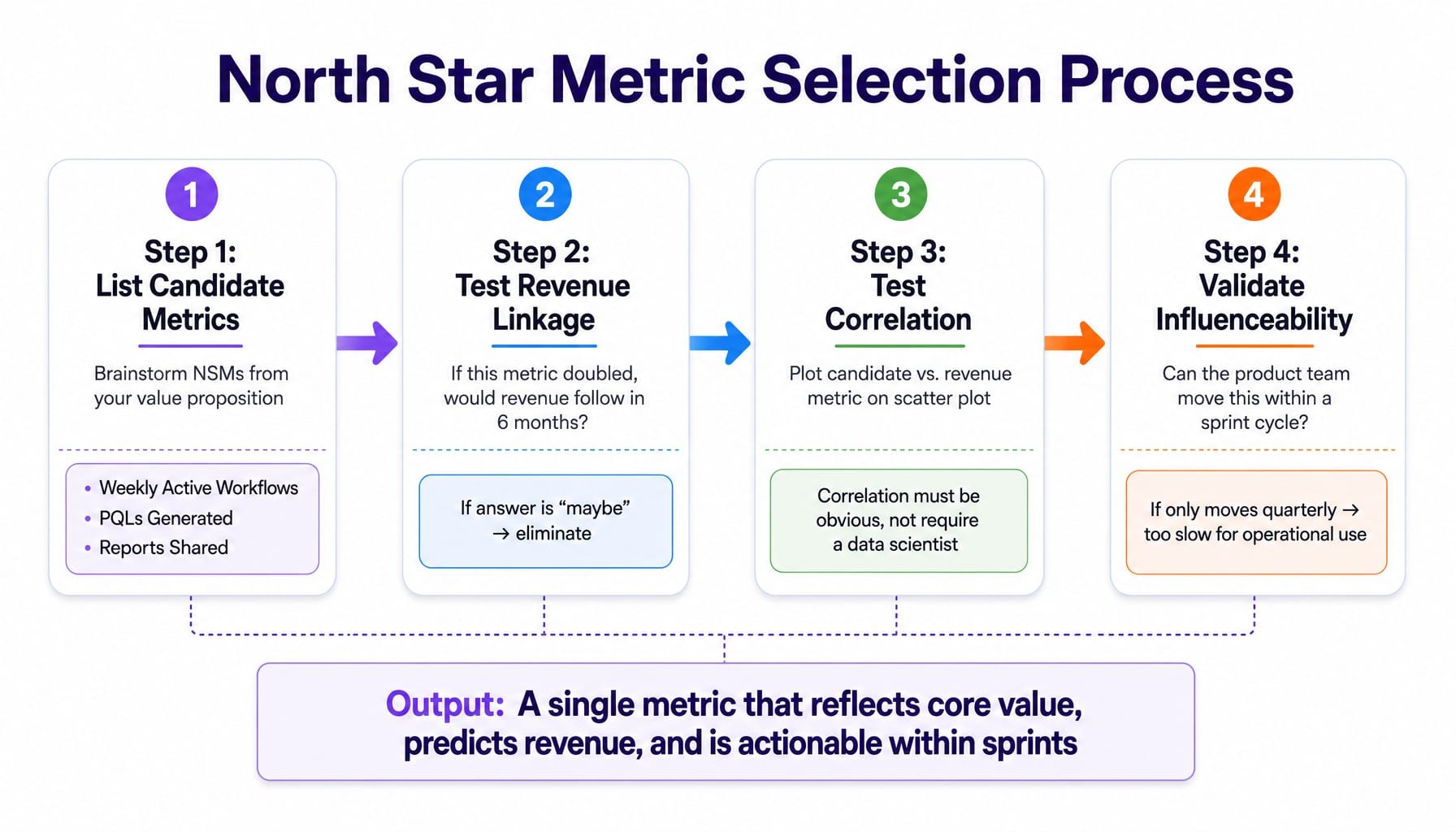
Step 1: List Candidate Metrics. Brainstorm potential NSMs based on your product's value proposition. Candidates might include "Weekly Active Workflows," "PQLs Generated," or "Number of Reports Shared."
Step 2: Test for Revenue Linkage. For each candidate, ask a simple question: "If this metric doubled, would our revenue reliably follow within 6 months?" If the answer is "maybe" or "it's complicated," it's not a north star.
Step 3: Test for Correlation. Don't guess. Pull the last 6-12 months of historical data for your candidate metric and your key revenue metric (e.g., expansion MRR). Plot them on a scatter plot. If you can't see a clear correlation, it's too weak to be your north star. The relationship should be obvious, not require a data scientist to find.
Step 4: Validate Influenceability. Can your product team ship changes that move this number within a sprint cycle? If the metric only moves on a quarterly or annual timescale, it's too slow for operational use.
For example, a collaboration SaaS initially considers "Daily Active Users" as their NSM. But after running this process, they discover that "Number of teams with 3+ members completing a shared workflow in their first 7 days" is a much stronger predictor of long-term retention and expansion revenue. They can also use frameworks like RICE to prioritize features that directly impact this more specific, more valuable metric.
When the Metrics Are Right but the Execution Bandwidth Isn't
Getting your B2B SaaS product metrics right requires rigorous event tracking, careful metric selection, and continuous validation. But even when a team achieves this—when they know their real activation rate is 18%, when they've identified a true north star, when they can see exactly where the funnel breaks—they still face the execution gap. The insight is clear, but shipping the fix requires design, development, QA, and deployment cycles that can stretch for weeks or months.
The backlog of metric-informed improvements grows faster than the team can possibly ship. This is the final, and most frustrating, bottleneck.
This is where Spike AI closes the loop. It's an execution layer designed to bridge the gap between metric insight and shipped improvement. When your analytics show a 40% drop-off in your activation funnel, Spike AI doesn't just give you another dashboard. It identifies the highest-impact fix—whether it's a UX tweak, a copy change, or a technical optimization—and deploys it. Weekly. This compounding cadence means metric improvements don't sit in a Jira backlog; they compound, delivering measurable gains every sprint.
See how Spike AI turns metric insights into weekly shipped improvements
Your Metrics Are a System, Not a Dashboard
The critical shift is to see your product metrics not as a dashboard problem, but as a decision system. That system only works when the right metrics are selected, the instrumentation is trustworthy, and your team has the execution bandwidth to act on what the data reveals.
Most teams are over-instrumented and under-acting. They track 15 metrics when four would be more useful, trust event data they've never audited, and choose north star metrics that flatter rather than predict. They are busy measuring the business instead of moving it.
The B2B SaaS companies that win in 2026 won't be the ones with the most comprehensive dashboards. They will be the ones who have a tight, closed-loop system for turning metric insights into shipped improvements—every week, not every quarter.
Frequently Asked Questions
What is the difference between logo churn and revenue churn in B2B SaaS?
Logo churn measures the percentage of customer accounts lost in a period, while revenue churn (or MRR churn) measures the percentage of recurring revenue lost. They can diverge significantly; you might have 10% logo churn but only 2% revenue churn if you're only losing small accounts. Track both, but revenue churn is the more critical signal for financial health.
What is the SaaS quick ratio and why does it matter?
The SaaS quick ratio measures growth efficiency by comparing new and expansion revenue to lost revenue: (New MRR + Expansion MRR) / (Contraction MRR + Churn MRR). A ratio above 4 indicates healthy, sustainable growth. A ratio below 2 suggests that churn is consuming most of your growth engine, signaling an underlying retention problem that needs to be fixed.
What is a good DAU/MAU ratio for a B2B SaaS product?
For B2B SaaS, a DAU/MAU ratio above 20% is generally considered strong, though the industry average hovers around 13%. This benchmark varies significantly by product type; daily-use tools like team chat should aim for 30%+, while weekly-use reporting tools might naturally sit at 10-15%. The trend of your ratio over time is more important than hitting an absolute number.
How do you build a customer health score using product usage data?
A customer health score is a composite metric combining 3-5 weighted signals. Key inputs include login frequency (recency), core feature adoption (breadth), user growth within the account (depth), and support ticket volume/sentiment. Weight each signal based on its historical correlation with renewal. Tools like Gainsight can automate this scoring and trigger alerts when a customer's health score drops.
How should B2B SaaS companies measure time to value?
Time to value (TTV) is the time from a user's first login to the moment they complete your validated activation event. It should be measured in hours or days, not sessions. A meaningful TTV metric is completely dependent on having a correct, data-backed definition of activation. Userpilot's 2025 data found an average TTV of 1 day and 12 hours, but this varies dramatically by product complexity.
How do usage-based pricing models change which product metrics matter?
Usage-based pricing makes consumption metrics direct, revenue-leading indicators. Instead of tracking seats, you must track API calls, data storage, or queries executed. Key metrics become consumption velocity (is usage growing week-over-week?), consumption concentration (is usage spread across the team or isolated to one power user?), and proximity to plan limits, which signals an imminent upsell opportunity.