
2026 SaaS Churn Rate Benchmarks: Data by Segment & Why Most Comparisons Mislead
TLDR
- There is no single "good" SaaS churn rate; benchmarks range from <5% annually for enterprise to over 30% for SMB-focused products. Your ACV and contract type define your real peer set.
- Most published benchmarks suffer from survivorship bias and aggregate dissimilar companies, making direct comparison to your metrics statistically unreliable and potentially dangerous.
- A low logo churn rate can hide a high revenue churn rate caused by customer downgrades (contraction MRR). You must track both and diagnose the gap.
- Net Revenue Retention (NRR) can mask underlying value erosion. Always track Gross Revenue Retention (GRR) to see the raw retention of your existing revenue before expansion.
- Involuntary churn from failed payments often accounts for 20-40% of total churn and is the cheapest, highest-ROI churn category to fix through optimized dunning and payment recovery.
SaaS churn rate benchmarks are the most frequently Googled and most frequently misused metric in B2B SaaS.
Consider this scenario: a VP of Growth at a $12M ARR company sees they have 4% annual logo churn. They Google 'SaaS churn rate benchmark,' find a table suggesting the average is 5-7%, and conclude they're doing fine. But their ACV is $8K on monthly contracts serving SMBs. Their actual peer set—companies with the same structure—churns closer to 2-3% annually. They aren't doing fine; they're underperforming by 50% and don't know it.
This is the central problem. The single benchmark number you find online is almost certainly not your peer set, and comparing your performance against it creates a dangerous false confidence.
This article provides the real 2026 data, segmented properly. But more importantly, it explains the specific ways published benchmarks mislead, reveals the hidden contraction layer inside your NRR that masks real churn, and shows you how to build a composite benchmark that actually fits your business.
What SaaS Churn Rate Actually Measures (And the Boundary Most Definitions Miss)
SaaS churn rate measures the percentage of customers or recurring revenue lost over a defined period—typically monthly or annually—and serves as the primary indicator of whether a SaaS business retains enough value to compound growth. But this definition misses a critical boundary: churn rate, as commonly calculated, does not capture contraction MRR. Customers who downgrade but don't cancel create a revenue drain that standard logo churn figures completely ignore.
This means a company can report a healthy 3% logo churn while quietly losing 8% of its revenue base to seat compression and plan downgrades.
Imagine a B2B SaaS company with 500 customers. In one month, they lose 15 logos, a 3% customer churn rate. That same month, 40 other customers downgrade from an enterprise to a mid-market plan. This creates a 6% revenue impact that never appears in the headline churn number.
The formulas are simple, but the story you tell depends on which one you choose:
- Customer Churn Rate = (Customers Lost ÷ Customers at Start) × 100
- Revenue Churn Rate = (MRR Lost ÷ MRR at Start) × 100
According to Recurly's 2025 data, the median overall SaaS churn is 3.27% annually. But this is a gross figure that often excludes contraction, making the ecosystem appear healthier than it is. Churn rate isn't one number; it's a family of metrics. The version you track determines whether you see the real picture.
2026 SaaS Churn Rate Benchmarks by Segment, Stage, and Contract Type
B2B SaaS churn rate benchmarks for 2026 range from below 5% annually for enterprise companies with annual contracts to 30-50% for SMB-focused products on monthly billing—a 10x spread that makes any single "average" meaningless.
The only way to find a relevant benchmark is to segment by ACV, contract structure, and business model.
Sources: Recurly 2025, Paddle Q2 2025, KeyBanc 2024 SaaS Survey, OpenView Partners Benchmarks.
Enterprise churn below 5% annually is achievable because multi-year contracts, deep integrations, and high switching costs create structural retention that SMB products cannot replicate. This is why the widely-cited "5% annual churn is good" stat is so misleading; it originates from enterprise-weighted datasets and is an unrealistic, even damaging, target for most SMB-focused companies where 10-15% annual churn may be genuinely healthy.
A $50K ACV enterprise SaaS with 4% annual churn is healthy. A $3K ACV SMB SaaS with 4% annual churn is a top-decile, exceptional performer. The number is the same; the meaning is entirely different.
Why Comparing Your Churn to Published Benchmarks Is Statistically Misleading
The SaaS churn benchmarks you find in industry reports suffer from three systematic biases that make direct comparison to your own metrics unreliable.
First is survivorship bias. Benchmark reports from sources like Bessemer, KeyBanc, and OpenView primarily survey companies that are still alive and growing. The companies with catastrophic churn rates (30%+) that died or were acqui-hired are excluded from the dataset. This systematically inflates the apparent "average" performance. It's like measuring the average health of current gym members and concluding that the general population is incredibly fit.
Second is the ACV normalization failure. Most reports aggregate $5K ACV SMB companies with $200K ACV enterprise companies into a single "B2B SaaS" bucket. A 5% annual churn rate means something entirely different when you're losing five $200K contracts versus fifty $5K contracts. The operational response, the root cause, and the fix are completely different, yet the benchmark treats them as equal.
Third is contract structure distortion. Companies on annual contracts show artificially low monthly churn because customers literally cannot churn in months 2-11. This creates the "month-13 cliff" phenomenon, where all churn concentrates at renewal. A company with 100% annual contracts might show 0% churn for 11 months, then 8% churn in month 12. Their "monthly average" of 0.67% looks excellent but masks a serious renewal problem.
Stop comparing your churn to a single published number. The only useful path is to build a composite benchmark normalized for your ACV band, contract mix, and company stage.
Logo Churn vs. Revenue Churn: Why the Disconnect Is Where the Real Insight Lives
Logo churn measures the percentage of customer accounts lost; revenue churn measures the percentage of MRR or ARR lost—and the gap between them reveals whether you're losing the right or wrong customers. Neither metric alone tells the full story. The combination, however, is a powerful diagnostic tool.
- Scenario 1: High Logo Churn (8%), Low Revenue Churn (2%)
You are successfully losing small, low-value accounts while retaining and expanding large ones. This is often a healthy sign of successful upmarket migration. However, it's also a clear signal that your product-market fit for the SMB segment is weak, and your acquisition costs for those customers are likely being wasted.
- Scenario 2: Low Logo Churn (2%), High Revenue Churn (6%)
This is the most dangerous pattern. Customers are staying, but they are downgrading plans or reducing seats. This indicates value erosion. Your product isn't bad enough to make them leave, but it isn't good enough for them to maintain their spend. This is the "contraction drag" that Net Revenue Retention calculations can easily obscure.
- Scenario 3: High Logo Churn (8%), High Revenue Churn (8%)
Your product has a core problem. Customers of all sizes are leaving at a similar rate, indicating a fundamental issue with product-market fit, value delivery, or competitive positioning. This isn't a retention problem to be solved by customer success; it's a strategic problem for the entire company.
Always track both metrics. The gap—or lack thereof—tells you whether your problem is in acquisition targeting, product value delivery, or your core pricing structure.
The Hidden Contraction Layer: How Downgrades Masquerade as Retention Inside NRR
A company can report 105% net revenue retention while quietly losing ground—because NRR conflates expansion revenue with contraction revenue into a single net figure that hides the churn waterfall.
Consider this worked example. Company X starts the quarter with $1M MRR.
- They lose $30,000 to customer cancellations (3% gross logo churn).
- They lose another $50,000 to downgrades and seat reductions (5% contraction MRR).
- But they gain $80,000 from upsells and seat expansion from other accounts.
Their Net Revenue Retention is 100% ($1M - $30k - $50k + $80k = $1M). On a slide, this looks stable. But the reality is that 8% of their revenue base eroded ($30k + $50k) and was replaced by expansion from a shrinking pool of happy, growing accounts. If that expansion slows—as it always does in economic downturns—the contraction drag becomes visible overnight, and the company's growth stalls.
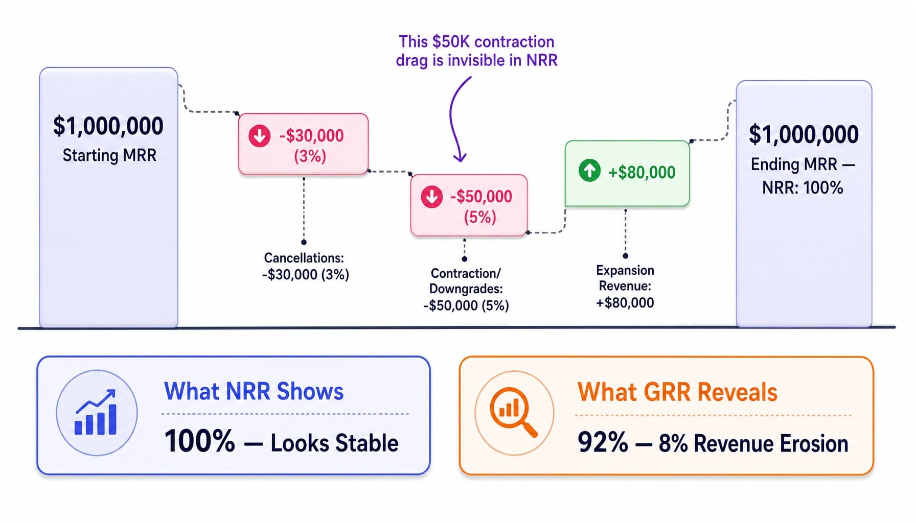
This is why Gross Revenue Retention (GRR) is the metric sophisticated operators and investors now track alongside NRR. GRR strips out expansion revenue and shows the raw retention of existing revenue. SaaS Capital's research shows a GRR below 85% is a red flag, regardless of NRR.
The practical diagnostic is to run a churn waterfall that separates cancellation MRR, contraction MRR, expansion MRR, and reactivation MRR into four distinct lines. If contraction MRR exceeds 3% of starting MRR in any quarter, you have a pricing or value-delivery problem that expansion is temporarily masking. Tools like ChartMogul, Baremetrics, or ProfitWell by Paddle can build this waterfall automatically.
Involuntary Churn: The Highest-ROI Churn Reduction Lever Most Teams Ignore
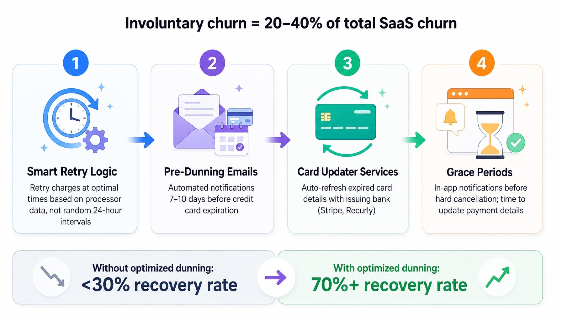
Involuntary churn—cancellations caused by failed payments rather than customer decisions—accounts for 20-40% of total SaaS churn and is the single most fixable churn category, yet most teams allocate zero dedicated resources to reducing it.
This isn't a rounding error. According to Gong's research, it's a significant chunk of your churn problem. If your total monthly churn is 3% and 1% of that is involuntary (a common scenario, per Recurly's data), fixing payment failures alone could reduce your total churn by 33% without changing your product, pricing, or customer success motion.
The four highest-impact tactics for dunning and payment recovery are:
- Smart Retry Logic: Attempting charges at optimal times based on payment processor data, not just randomly every 24 hours.
- Pre-dunning Emails: Sending automated notifications 7-10 days before a credit card is set to expire.
- Card Updater Services: Using services from payment providers like Stripe and Recurly that automatically refresh expired card details with the issuing bank.
- Grace Periods: Implementing a grace period with in-app notifications before a hard cancellation, giving customers a chance to update their details without service interruption.
Best-in-class save rates on failed payments exceed 70%. Companies without an optimized dunning process often recover less than 30%. Before you invest six figures in a new customer success program, audit your involuntary churn rate. It's almost certainly higher than you think and cheaper to fix than any other churn category.
When Churn Starts at the Website: How Continuous Optimization Compounds Retention
The article has built a cumulative tension: churn is not one number but a system of interconnected metrics, and reducing it requires continuous action across multiple surfaces—product, pricing, payment recovery, and critically, the website. A significant portion of churn originates before a customer even activates. Poor landing page messaging attracts wrong-fit customers. Unclear value propositions set incorrect expectations. Friction in signup flows filters out high-intent users while letting low-intent ones through. These are not downstream retention problems; they are upstream conversion problems that manifest as churn months later.
Fixing this requires a continuous optimization cadence that most lean marketing teams can't sustain. The backlog of "should fix" website issues grows, but the execution bandwidth doesn't. This is the gap Spike AI closes. By continuously identifying and shipping fixes across your website, SEO, and conversion funnel on a weekly cadence, Spike AI reduces churn at its source. It ensures the website-level signals feeding your churn rate are constantly improving, without requiring your team to manage yet another backlog.
See how Spike AI identifies and ships your highest-impact website fixes weekly
Conclusion
The published SaaS churn rate benchmark is a starting point, not an answer. It only becomes useful when you normalize it for your ACV, contract structure, and company stage, and when you decompose your own churn into its component parts: logo versus revenue, voluntary versus involuntary, cancellation versus contraction.
The single most important shift is to stop asking, "Is my churn rate good?" and start asking, "Which type of churn is my biggest lever, and am I executing against it every week?"
The companies that compound retention gains in 2026 won't be the ones with the best benchmarks. They'll be the ones with the fastest cycle time between identifying a churn signal and shipping a fix.
Read more: Pipeline Marketing in 2026: Strategy, Metrics, and Why Most Teams Regress to Lead Gen
Frequently Asked Questions
What churn rate do SaaS investors typically expect before a Series B round?
Most Series B investors look for annual net revenue churn below 10% and NRR above 100% for B2B SaaS. However, the threshold varies by ACV; SMB-focused SaaS can have higher logo churn (up to 15% annually) if NRR shows strong expansion. Trajectory—declining churn quarter-over-quarter—matters more than hitting a static number.
How do usage-based and seat-based SaaS pricing models produce different churn patterns?
Usage-based models show higher month-to-month revenue volatility but lower hard cancellations, as customers can scale down without fully churning. This creates higher contraction MRR but lower logo churn. Seat-based models produce more binary outcomes (stay or leave), making their churn metrics cleaner but their retention levers more limited.
At what ARR scale does SaaS churn rate typically stabilize?
Churn rates generally stabilize between $10M and $20M ARR, when the customer base is large enough to smooth out individual account volatility. Below $5M ARR, a single enterprise customer churning can swing the rate by several percentage points, making month-to-month benchmarking unreliable and often misleading.
How should product-led growth SaaS companies think about churn benchmarks differently?
PLG companies inherently have higher top-of-funnel churn, as free users churn at 5-10x the rate of paid customers. The meaningful metric is activated-user churn—churn among users who reached a defined activation milestone. Comparing your total churn to non-PLG benchmarks is an apples-to-oranges comparison that will always look unfavorable.
What is negative churn and what does it take to achieve it?
Negative churn occurs when expansion revenue from existing customers (upsells, cross-sells, seat growth) exceeds revenue lost from cancellations and downgrades, producing an NRR above 100%. It requires a pricing model with natural expansion vectors—usage tiers, per-seat scaling, or modular add-ons—and a product that delivers increasing value over time.
How do vertical SaaS churn rates compare to horizontal SaaS at similar ACV?
Vertical SaaS (e.g., for healthcare, legal, construction) typically churns 20-40% less than horizontal SaaS at equivalent ACV. Their products embed into industry-specific workflows and regulatory structures, creating high switching costs. This structural advantage allows for higher pricing with lower churn, but growth is capped by the vertical's market size.