
B2B SaaS Product Metrics: The 5 That Actually Predict Revenue (and When They Mislead)

TL;DR
- Focus on five key B2B SaaS product metrics that predict revenue: Net Revenue Retention (NDR), Activation Rate, Product-Qualified Leads (PQLs), Expansion Revenue Rate, and Time to Value (TTV).
- Most metric dashboards create noise. The real problem isn't what you measure, but the weeks-long delay between identifying a metric decline and shipping a fix.
- The metrics that matter change based on your go-to-market motion. A PLG motion prioritizes PQL-to-close conversion, while a sales-assisted motion focuses on post-sale onboarding completion.
- Traditional engagement metrics like DAU/MAU are becoming unreliable. AI agents consuming SaaS products and the rise of usage-based pricing require a shift to metrics like depth-of-use scoring.
- Building a metrics layer without a data team is possible. Start with a product analytics tool (like PostHog) connected to a reverse ETL tool (like Census) to push signals into your CRM.
A growth team reviews their weekly dashboard. Daily Active Users (DAU) are up 12%. NPS is a respectable 42. A key feature adoption metric looks healthy. Yet, for the second consecutive quarter, net revenue retention (NDR) has quietly dropped below 100%. Nobody noticed because the metrics they watch daily are disconnected from the ones that actually predict revenue.
This isn't a strategy failure; it's a system failure. The problem isn't a lack of data. It's that most B2B SaaS product metrics are treated as a dashboard exercise, creating noise instead of action.
Almost every guide will hand you a list of 10, 15, even 20 metrics to track. This article does something different. We will identify the five that reliably predict your revenue trajectory. We'll explain how they shift depending on your go-to-market motion and why traditional benchmarks are breaking. Most importantly, we'll address the operational reality that knowing a metric has dropped is useless if you can't ship a fix before the affected cohort churns.
Why Most B2B SaaS Metric Dashboards Create Noise Instead of Action
Most B2B SaaS teams suffer from metric proliferation, not metric ignorance. The average product team tracks 15-25 KPIs across Amplitude, Mixpanel, or Pendo dashboards. Yet despite this heavy investment in analytics, average B2B SaaS website conversion rates remain stuck around 2%. The gap is not in data; it's in execution.
Consider a common scenario: a product team notices the activation rate for new signups dropped from 34% to 28% over two months. The signal is clear. It's flagged in a Monday standup. It's added to a JIRA backlog. It's discussed in a planning meeting two weeks later. A fix is scoped, but it has to wait for engineering capacity. A change finally ships six weeks after the initial signal was detected.
By then, the cohort is gone. The opportunity is lost.
This is the execution gap. Metrics are only as valuable as your team's ability to act on them, and most lean teams are structurally unable to close the loop between signal and response in a meaningful timeframe.
This is why you must ruthlessly prioritize. If your team only has the bandwidth to meaningfully act on 3-5 metric signals per quarter, those signals must be leading indicators—metrics that predict future outcomes and give you time to intervene. Lagging indicators, like quarterly revenue, tell you what already happened. By then, it's too late.
Read more: Marketing Task Prioritization for Lean Teams: A Framework That Actually Works | Spike
Five B2B SaaS Product Metrics That Actually Predict Revenue Trajectory
We've selected these five metrics because they meet three strict criteria: they are leading indicators of future revenue, they connect product behavior directly to financial outcomes, and they are actionable by a lean team without a dedicated data science function. Each one is a lever, not just a number on a screen.
Net Revenue Retention: The Single Metric Investors Care About Most
Net Revenue Retention (NDR) measures how much your monthly recurring revenue (MRR) has grown or shrunk from your existing customer base over a period. It's the ultimate signal of product-market fit and customer health.
- Formula: (Starting MRR + Expansion MRR − Contraction MRR − Churn MRR) / Starting MRR
- Example: A company starts the month with $500K in MRR. They gain $60K in expansion from upgrades, lose $15K from downgrades (contraction), and lose $20K from customers who cancel (churn). Their NDR is ($500K + $60K - $15K - $20K) / $500K = 105%.
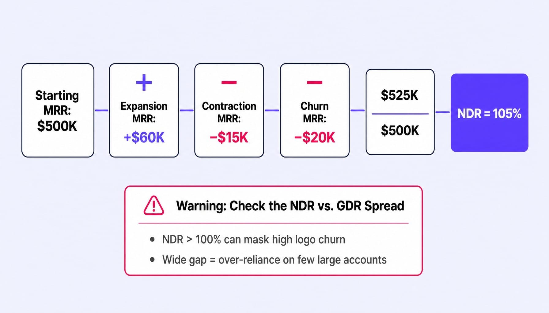
- When It Misleads: NDR above 100% can mask dangerous logo churn. If you're losing 8% of your customer logos but your remaining accounts are expanding enough to cover the loss, the top-line metric looks healthy while your customer base is eroding. Always analyze the NDR vs. GDR (Gross Dollar Retention) spread. A wide gap signals an over-reliance on a few large accounts. Tools like ChartMogul or ProfitWell Metrics by Paddle are essential for this.
Activation Rate: Finding Your Real Activation Event, Not the One You Assumed
Most teams define activation incorrectly. They pick a milestone that feels important, like "completed onboarding" or "created first project." True activation is the specific early user action that statistically correlates with long-term retention. Finding it requires aha moment mapping.
- Formula: (Users in a cohort who completed the activation event) / (Total new users in that cohort)
- Example: A project management SaaS assumed activation was "created first project." Using cohort analysis in PostHog, they discovered that users who "invited a second team member within 48 hours" were 4x more likely to be retained at 90 days. Their real activation event was collaborative setup, not initial use.
- When It Misleads: Activation rate is meaningless without a validated activation event. If you are measuring the wrong milestone, you will invest resources optimizing a user flow that has no impact on retention or revenue. Use tools like Amplitude or PostHog to run correlation analysis between early actions and 30-day retention to find your real activation trigger.
Product-Qualified Leads: Bridging the Gap Between Product Usage and Sales Pipeline
Product-Qualified Leads (PQLs) are users who have reached a product usage threshold that historically correlates with a high likelihood of converting to a paid plan or expanding their account. They are fundamentally different from Marketing-Qualified Leads (MQLs), which are based on marketing engagement signals like ebook downloads.
- Formula: The key metric isn't the PQL count, but the PQL-to-close conversion rate.
- Example: A freemium analytics tool defines a PQL as an account with 3+ active users that has run 50+ queries in the last 7 days (L7). Their PQL-to-close rate is 18%, compared to just 4% for MQLs. This signal allows their sales team to focus on accounts that are already deriving value.
- When It Misleads: PQL definitions decay. The usage threshold that predicted conversion six months ago may not predict it today as your product evolves and your user base shifts. PQL models must be re-evaluated quarterly to ensure they remain predictive.
Read more: B2B Lead Scoring: How to Build a Model That Doesn't Break in 90 Days | Spike AI
Expansion Revenue Rate: Measuring Second-Order Revenue From Product Usage
Expansion revenue is the new MRR generated from your existing customer base through plan upgrades, seat additions, or usage-based overages. The expansion revenue rate measures how much of your growth is coming from deepening relationships with current customers versus acquiring new ones.
- Formula: Expansion MRR / Total New MRR
- Example: A company adds $100K in new MRR in a month. Of that, $40K comes from existing customers upgrading their plans. Their expansion revenue rate is 40%. This signals strong product-market fit and a well-designed pricing structure that grows with the customer.
- When It Misleads: A high expansion revenue rate can mask a weak new-logo acquisition engine. If your growth is almost entirely from existing customers, your top-of-funnel may be broken. It's a signal of product depth, not a replacement for a healthy acquisition pipeline.
Time to Value: The Metric That Predicts Everything Else
Time to Value (TTV) is the elapsed time between a user's first interaction (like a signup) and the moment they achieve your defined activation event. It is the earliest and most powerful leading indicator in the entire customer lifecycle. A shorter TTV directly predicts higher activation rates, better retention, and ultimately, stronger NDR.
- Formula: (Time of activation event) - (Time of signup)
- Example: A team using Pendo noticed their TTV was 3 days. By pre-populating new accounts with sample data and guided tours, they reduced TTV to under 4 hours. Their activation rate for new cohorts jumped from 22% to 37% within a month.
- When It Misleads: TTV benchmarks are meaningless across different product categories. A self-serve PLG tool might aim for a TTV under 5 minutes, while a complex enterprise platform with a required integration might target a TTV of under 48 hours. Only compare TTV against your own historical cohorts.
How Metrics Diverge Between PLG and Sales-Assisted Hybrid Motions
Most guides on B2B SaaS product metrics make a critical error: they assume a single go-to-market motion. The reality for most scaling SaaS companies is a hybrid model—a self-serve, product-led growth (PLG) motion for smaller accounts and a sales-assisted or sales-led motion for enterprise.
Applying a single metric framework across both motions will generate misleading signals. The same metric can mean something completely different in each context.
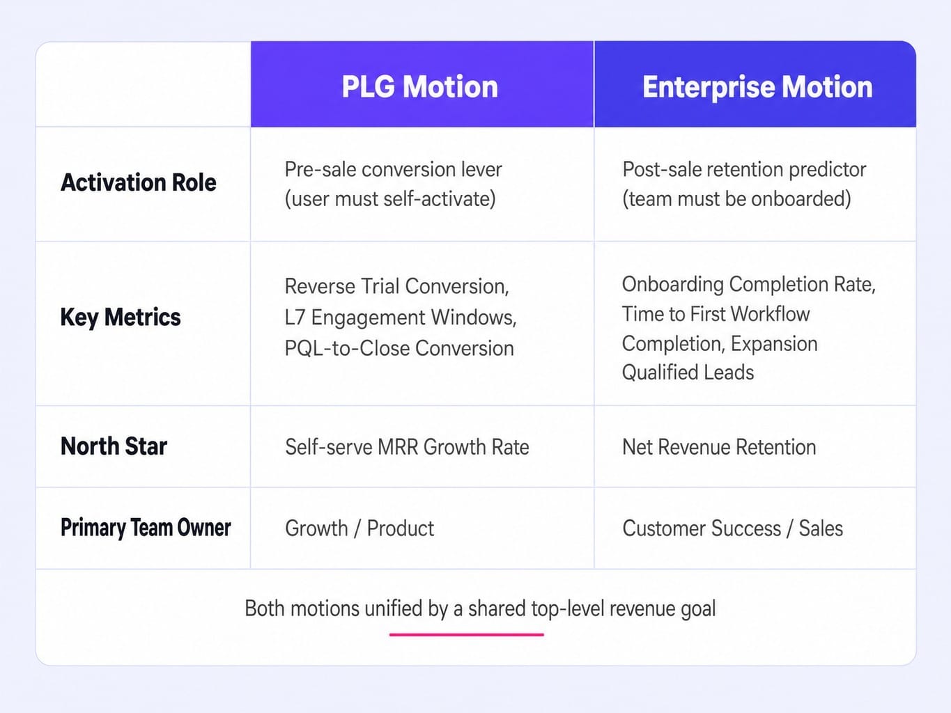
Take activation rate. In a PLG motion, activation is the primary conversion lever. If users don't activate themselves, they never see the value and never convert to paid. It's a pre-sale metric. In a sales-assisted motion, the deal is already closed. Here, activation is a post-sale metric that predicts retention and expansion potential.
Consider a collaboration tool with a hybrid model:
- Their PLG Motion tracks:
Reverse Trial Conversion: Users who convert to paid after a trial ends, signaling the product is sticky enough to create a pain of loss.
L7 Engagement Windows: Tracking weekly active users to monitor habit formation.
PQL-to-Close Conversion: The rate at which high-usage free accounts convert to paid plans without sales intervention.
North Star: Self-serve MRR growth rate.
- Their Enterprise Motion tracks:
Onboarding Completion Rate: Ensuring large teams are properly set up by customer success.
Time to First Workflow Completion: The time it takes for a new account to complete a key multi-step task, signaling adoption depth.
Expansion Qualified Leads: Existing accounts hitting usage thresholds that signal readiness for an upsell conversation.
North Star: Net Revenue Retention.
The lesson is clear: your measurement system must reflect your go-to-market architecture. Maintain parallel metric hierarchies for each motion, unified by a shared, top-level revenue goal. Use a framework like RICE to prioritize which motion's metric gaps offer the highest leverage for improvement.
Why Traditional Engagement Metrics Break in AI-Native and Usage-Based Products
The B2B SaaS product metrics that worked in 2024 are already showing cracks. Two major shifts are invalidating traditional engagement benchmarks: the rise of AI agents as users and the move toward consumption-based pricing.
If an AI agent runs 200 queries per day in your analytics product but no human logs in, is that account "engaged"? Metrics like DAU/MAU, session duration, and even seat-based licenses all assume a human user. As AI agents increasingly consume B2B SaaS—running automated workflows, pulling data via API, and executing tasks—these metrics become unreliable proxies for account health and value delivery. The more your product is used for system-to-system automation, the less DAU/MAU matters. The future is depth-of-use scoring, which measures the complexity and variety of actions performed, regardless of whether the actor is human or machine.
This ties directly to the shift in pricing models. When revenue scales with consumption (e.g., API calls, data processed, workflows executed) rather than seats, metrics like ARPU and seat expansion rate become obsolete.
For example, a data infrastructure SaaS on a consumption plan might have an account with only two human users that generates $50,000/month in usage fees. Their DAU/MAU is terrible, but their account health is excellent. For these models, the metrics that matter are:
- Consumption Growth Rate per Account: Is usage increasing month-over-month?
- Usage Concentration Risk: What percentage of consumption comes from your top 10% of accounts?
- Outcome Delivery Rate: How often are consumption activities leading to a successful business outcome for the customer?
Your metric framework must evolve with your product architecture and pricing strategy. The benchmarks of today are the vanity metrics of tomorrow.
Building a Product Metrics Layer Without a Dedicated Data Team
Knowing which metrics to track is useless if you can't instrument, collect, and act on them. For most B2B SaaS teams under $30M ARR, there is no dedicated data team. The growth marketer or product manager is the one writing SQL queries and building dashboards. And let's be honest, for most lean teams, "warehouse-native" sounds like a problem for next year's budget.
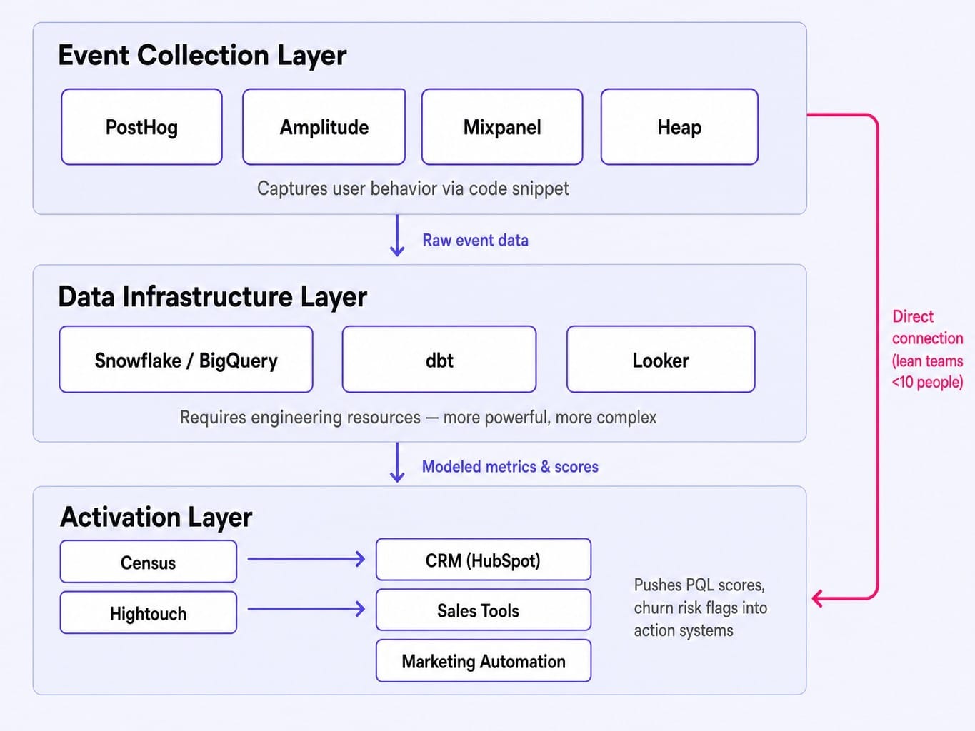
Fortunately, the modern stack makes this solvable. It has three layers, and your choice depends on your team's technical bandwidth.
- Event Collection Layer: This is where user behavior is captured. Product analytics tools like PostHog, Amplitude, Mixpanel, or Heap allow you to instrument your product with a snippet of code and start collecting data without needing a data warehouse.
- Data Infrastructure Layer: This is the more powerful but more complex approach. It involves sending event data to a cloud data warehouse like Snowflake or BigQuery, then using a tool like dbt to transform and model the data. This provides ultimate flexibility but requires engineering resources.
- Activation Layer: This is the most overlooked and most critical piece. Data sitting in a dashboard is useless. Reverse ETL tools like Census or Hightouch push metric signals (like PQL scores or churn risk flags) out of your warehouse or product analytics tool and into the systems your teams actually use, like your CRM (HubSpot), sales engagement tools, or marketing automation platforms.
Practical Recommendation:
- For teams under 10 people: Start with a product analytics tool (PostHog is a strong, open-source choice) and connect it directly to your CRM with a reverse ETL tool. This closes the loop between insight and action without requiring a data engineer.
- For teams with a data engineer: Go warehouse-native with Snowflake + dbt and a BI tool like Looker for deep analysis. Use the reverse ETL layer to activate that data.
The stack only matters if it shortens the time between a metric signal and a shipped response.
How to Choose Your North Star Metric and Supporting Indicators
A North Star Metric isn't just the metric you care about most; it's the single metric that best predicts the long-term success of your business. If it moves in the right direction, you can be confident the business is getting healthier.
Most teams choose a North Star that is either too broad (like MRR, a lagging output you can't influence directly week-to-week) or too narrow (like adoption of a minor feature). Here is a simple, three-step framework to find yours:
- List Candidates: Write down your top 5 candidate metrics.
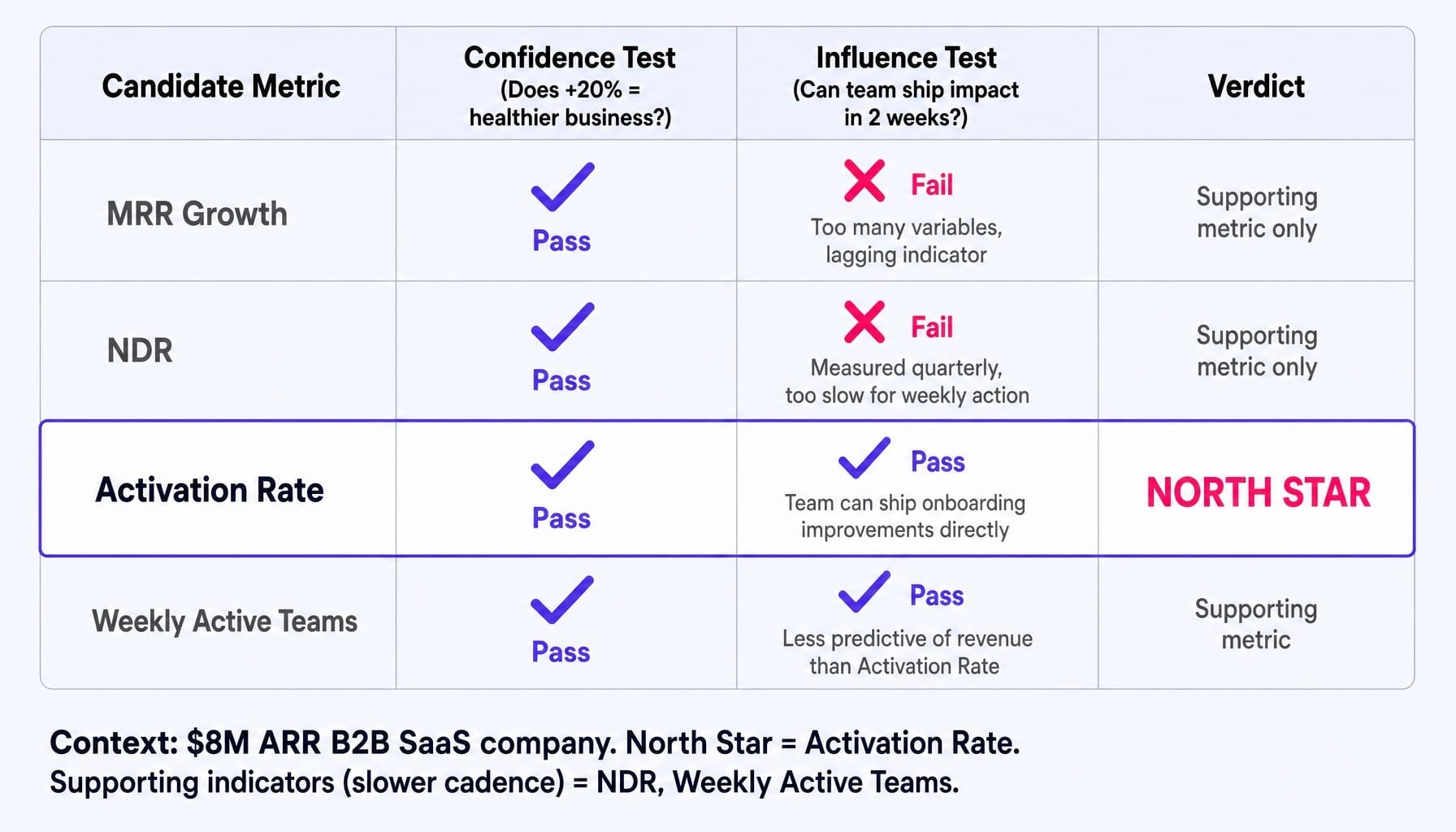
- The "Confidence" Test: For each candidate, ask: "If this metric improved by 20% while all others stayed flat, would I be confident the business is healthier?" If the answer is no, it's a supporting metric, not a North Star.
- The "Influence" Test: For the survivors, ask: "Can my team directly influence this metric through actions we can ship within two weeks?" If no, it's too far from your execution surface to be a useful guide for day-to-day work.
Worked Example:
An $8M ARR B2B SaaS company considers four candidates: MRR Growth, NDR, Activation Rate, and Weekly Active Teams.
- MRR Growth: Fails test #3. It's a lagging indicator influenced by too many variables to be directly impacted by the product team in a two-week sprint.
- NDR: Fails test #3. It's typically measured quarterly or annually, making it too slow for weekly prioritization.
- Activation Rate: Passes both tests. Improving it clearly makes the business healthier, and the team can ship onboarding improvements to influence it directly.
- Weekly Active Teams: Passes both tests, but is less predictive of revenue than Activation Rate.
They choose Activation Rate as their North Star, with NDR and Weekly Active Teams as key supporting indicators reported on a slower cadence. This process gives them a metric they can rally the team around and act on immediately.
When Metrics Reveal the Problem but Your Team Can't Ship the Fix
You now know which metrics to track. You have a framework for your North Star. But the core problem remains. The activation rate drops, the team flags it, the signal enters a backlog, and by the time a fix ships weeks later, the opportunity has vanished.
This is the execution gap that most marketing and growth systems ignore. Dashboards don't ship fixes. Backlogs don't improve conversion rates. The real value isn't in knowing a metric declined; it's in closing the loop between that signal and a shipped improvement.
This is where Spike AI operates. It sits downstream from your metrics stack and closes that gap. When your analytics show a drop in activation, a leaky onboarding flow, or a landing page with a high bounce rate, Spike AI doesn't just send an alert—it identifies the highest-impact intervention and executes it.
Instead of a problem lingering in a backlog for weeks, a fix is deployed. Every week. Spike AI turns your metric signals into a continuous shipping cadence, ensuring that insights from your data translate directly into compounding improvements across your website, SEO, and conversion funnel. The system is designed to shorten the distance between signal and response from weeks to days.
See how Spike AI turns metric signals into weekly shipped improvements
Your Metrics Are Only as Good as Your Execution Speed
The value of a product metric is not in its definition or its placement on a dashboard. Its true value is measured by the speed at which your team can convert a signal into a shipped change.
The five metrics that predict your revenue trajectory are net revenue retention, activation rate, product-qualified leads, expansion revenue rate, and time to value. But their predictive power is only realized when you have the operational infrastructure to act on them within days, not months.
The teams that win in 2026 won't be the ones with the most sophisticated dashboards. They will be the ones with the shortest distance between a metric signal and a shipped response. The question is no longer "what should we measure?" but "how fast can we act?"
Frequently Asked Questions
How do you calculate net revenue retention when customers have multiple products or contracts?
For multi-product companies, calculate NDR at the account level, not the product level. Sum all MRR changes (expansion, contraction, churn) across all products for each account. Calculating NDR per product can hide cross-product contraction patterns and provide a misleading view of overall account health.
How often should you re-validate your activation event definition?
Re-run the correlation analysis between early user actions and 30/60/90-day retention at least quarterly, or whenever you ship a significant onboarding change. Activation events decay as your user base evolves—what predicted retention for early adopters often fails to predict it for mainstream users.
What is the difference between logo churn and revenue churn, and which should you report to the board?
Logo churn measures the percentage of customer accounts lost; revenue churn measures the percentage of MRR lost. Report both, but lead with revenue churn. The spread between the two is the key insight: losing 10% of logos but only 3% of revenue means you're losing small accounts, which is a different problem than the reverse.
How do you build a product engagement score for a product with multiple distinct user personas?
Build separate engagement scoring models per persona. A power user admin and a casual viewer have different "healthy" engagement patterns. Define the key actions, frequency thresholds, and L7/L28 engagement windows for each persona independently, then aggregate them into an account-level health score based on each persona's influence.
What product metrics predict churn 60-90 days before it happens?
The strongest early churn predictors are declining login frequency (measured against the account's own historical baseline), reduced depth-of-use (fewer distinct features used per session), and a negative shift in support ticket sentiment. Track these as a composite churn risk score, as any single metric can produce false positives.