B2B SaaS Website Design in 2026: The Pages, Patterns, and Principles That Convert Committees

TL;DR
- Most B2B SaaS websites fail the 5-second comprehension test because they are designed for individuals, not the 6-10 person buying committees that actually make purchasing decisions.
- Your website isn't a single entity; it's a collection of pages serving different personas. Only seven pages consistently drive pipeline: Homepage, Product, Pricing, Case Studies, Comparisons, Demo, and Security.
- Treat your hero section as a continuous optimization surface, not a one-time design decision. Systematically test headline framing, CTA copy, social proof, and visuals.
- Page speed is a pipeline problem. Every second of load time increases bounce probability, silently killing conversions before your message is even seen. Target sub-2.5 second Largest Contentful Paint.
- Websites are not static projects; they are decaying assets. The gap between identifying a needed improvement and shipping it creates "conversion debt" that requires a system of continuous optimization to overcome.
As most B2B SaaS marketing leaders know, a website redesign happens every 18 to 24 months. It costs anywhere from $50,000 to $150,000, consumes months of team focus, and more often than not, results in no measurable change to the pipeline. The reason isn't bad design taste. It's a fundamental misunderstanding of what a B2B SaaS website is for.
Consumer SaaS sites optimize for individual signups. B2B SaaS sites must convince committees. These buying groups involve 6 to 10 decision makers, each visiting your site at different times, with different questions, and vastly different levels of technical sophistication.
A B2B SaaS website is a pipeline system, not a branding exercise. Designing it well means architecting for how committees buy, not how individuals browse. This guide covers the diagnostic frameworks, structural decisions, and continuous optimization required to build a site that generates pipeline, not just compliments.
Why Most B2B SaaS Websites Fail the 5-Second Comprehension Test
Picture a VP of Engineering landing on your homepage from a G2 comparison page. They have 12 tabs open. Within five seconds, they must answer three questions:
- What does this product do?
- Who is it for?
- Why should I care more than the last tab I opened?
Most B2B SaaS homepages fail this test because they lead with aspirational copy ("Transform your workflow") instead of concrete positioning ("API monitoring for engineering teams shipping 50+ deploys/week"). When a B2B SaaS website cannot be understood by a committee member within seconds of landing, the cost is not a lost pageview but a lost deal cycle. The evaluator moves to the next tab, and the sales team never even knows the opportunity existed. This is precisely the kind of silent pipeline leak that a continuous optimization model is built to detect and close.
Run the 5-second comprehension test on your own site. Load your homepage, show it to someone outside your company for five seconds, and ask them to describe what you sell and who you sell it to. If they can't, your above-the-fold content has a critical flaw, and you're suffering from built-in scroll depth decay. Research consistently shows that 50-80% of visitor attention concentrates in the first viewport, so if you lose them there, you've lost them for good.
This failure usually stems from one of three mistakes:
- Vague Positioning: Using category-level language that could describe hundreds of competitors ("Empower your teams with intelligent automation").
- Feature-First Copy: Listing features and assuming the visitor already understands the problem space and its importance.
- Aesthetic Over-Information: Prioritizing visual trends and animations over a clear information hierarchy that immediately communicates value.
Designing for the Buying Committee, Not the Individual User
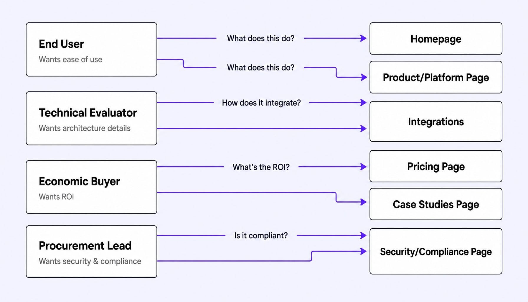
Consumer SaaS designs for one persona making one decision. B2B SaaS must design for a committee: the end user who wants ease of use, the technical evaluator who wants architecture details, the economic buyer who wants ROI, and the procurement lead who wants security and compliance. Each of these people visits your website at different stages, looking for different information.
This is why copying Notion's or Linear's homepage design so often fails for enterprise-focused B2B companies. Those products sell to individuals or small teams, not complex buying committees. The fundamental design challenge is serving all personas without creating a cluttered, unfocused experience. Multi-persona design is not about having more pages; it is about intent-based routing and progressive disclosure within a coherent information architecture.
Multi-Persona Navigation Without Menu Bloat
The common instinct to solve for multiple personas is to add more navigation items: Solutions > By Role, By Industry, By Use Case. This creates menu bloat that overwhelms visitors and dilutes click-through on what truly matters. It's a classic symptom of a navigation structure designed around internal product org charts rather than external buyer mental models.
A better approach is two-layered:
- Primary Navigation by Journey Stage: Organize the main navigation around the buyer journey (e.g., Product, Pricing, Resources, Company), not by persona. This keeps the top-level structure clean and universally relevant.
- Contextual Persona Routing: Use key pages to route visitors. A "Built For" section on the homepage can link to persona-specific landing pages. A use-case selector on the product page can filter features. This provides clear paths without cluttering the global navigation bar.
The goal is to use fewer top-level items with smarter in-page routing. It's an information architecture decision that precedes any visual design work.
Progressive Disclosure: Layering Depth Without Overwhelming
Progressive disclosure is the design pattern that resolves the tension between simplicity and depth. It sequences information according to buyer intent, revealing complexity only to those who seek it.
- The Homepage answers the end user's question: "What does this do and is it easy?"
- The Product Page answers the technical evaluator's question: "How does this work and does it integrate with our stack?"
- The Pricing Page answers the economic buyer's question: "What does this cost and what is the ROI?"
- The Security Page answers procurement's question: "Is this compliant and secure?"
Each layer provides more depth without forcing every visitor to wade through details they don't need. Interactive product tours, built with tools like Navattic or Storylane, are a powerful progressive disclosure mechanism. They let technical evaluators self-serve a deep-dive experience without cluttering the main marketing page with excessive screenshots and feature lists. This isn't about hiding information; it's about revealing it at the right moment in the buyer's journey.
The Seven Pages That Actually Drive Pipeline in B2B SaaS
I once audited a mid-market B2B SaaS site with 47 indexed pages and a blog with over 200 posts. When we looked at the multi-touch attribution data for closed-won deals, a stark pattern emerged. Only five pages appeared in any significant deal's journey more than twice: the homepage, the pricing page, a single use-case page for the IT buyer, the integrations page, and a comparison page against their top competitor. The other 42 pages contributed almost nothing to the pipeline.
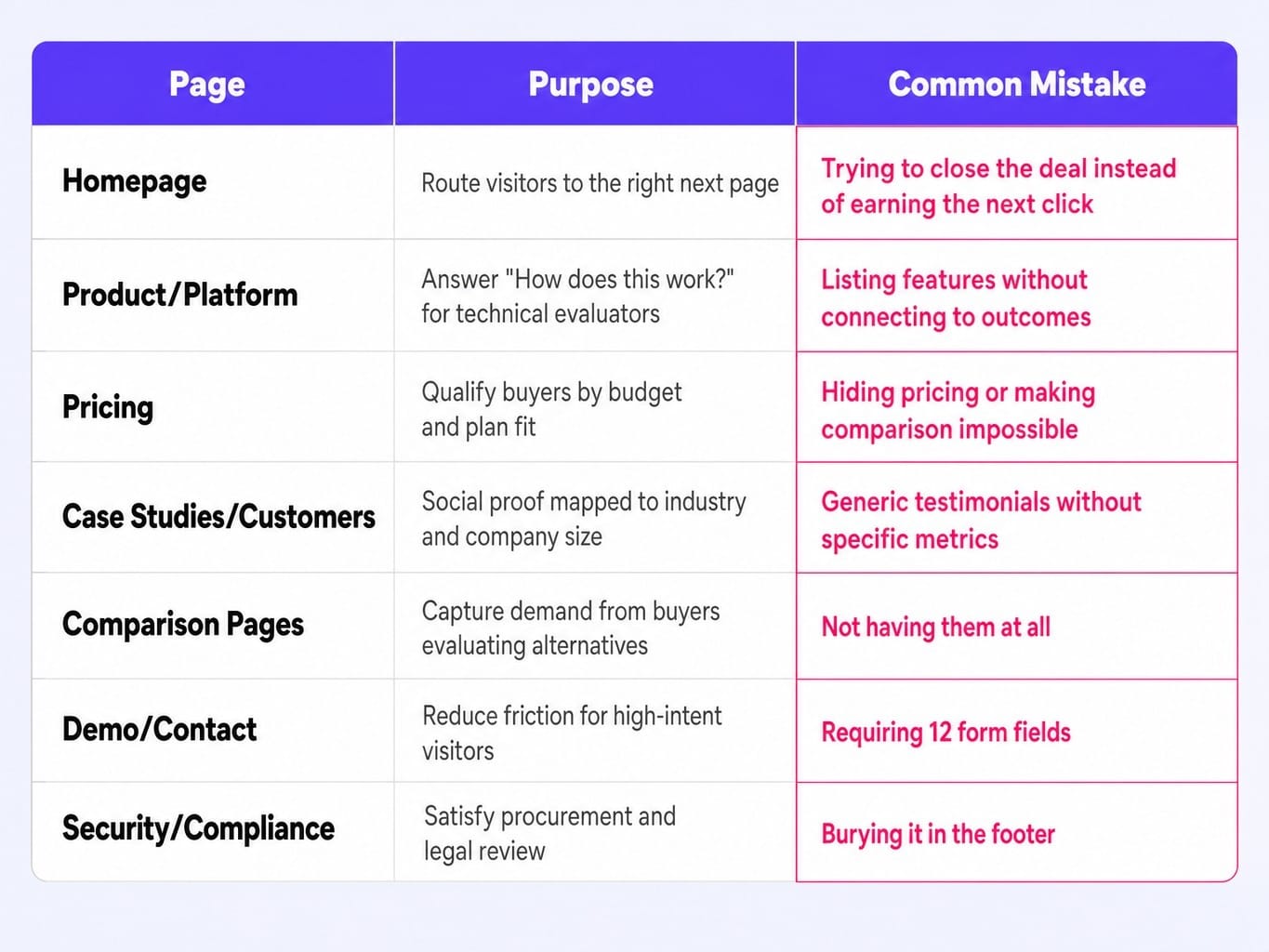
Most B2B SaaS sites have dozens of pages, but only a handful generate measurable pipeline influence. Focusing your design and optimization efforts on these seven pages prevents the common mistake of spreading resources evenly across a site where impact is highly concentrated.
- Homepage: Its purpose is to route the right visitors to the right next page. The mistake is trying to close the deal on the homepage instead of earning the next click.
- Product/Platform Page: Its purpose is to answer "How does this work?" for technical evaluators. The mistake is listing features without connecting them to outcomes and architecture.
- Pricing Page: Its purpose is to qualify buyers by budget and plan fit. The mistake is hiding pricing or making comparison impossible. It's worth remembering that pricing page conversion rates in B2B SaaS can be misleading; a well-designed page that reduces unqualified demo requests will show a lower conversion rate but improve downstream pipeline quality.
- Case Studies/Customers Page: Its purpose is to provide social proof architecture that maps to the visitor's industry and company size. The mistake is using generic testimonials without specific metrics. The 'social proof' that matters to a technical evaluator (a SOC 2 badge) is different from what an economic buyer needs (ROI data), so placement is a persona-routing decision.
- Comparison Pages: Their purpose is to capture demand from buyers actively evaluating alternatives. The mistake is not having them at all. Creating dedicated "vs." pages (e.g., "Acme vs. Competitor") captures high-intent search traffic that would otherwise go to third-party review sites.
- Demo/Contact Page: Its purpose is to reduce friction to zero for high-intent visitors. The mistake is requiring 12 form fields, creating a final hurdle for your most qualified leads.
- Security/Compliance Page: Its purpose is to satisfy procurement and legal review. The mistake is burying it in the footer where enterprise buyers, for whom this is a checklist item, cannot find it.
Hero Section Architecture: What to Test Above the Fold
The hero section of your website is not a creative exercise—it is a hypothesis. Every element above the fold is a variable, yet most B2B SaaS teams treat it as a one-time design decision.
Consider a B2B SaaS company that launches with a benefit-driven headline ("Reduce churn by 40%") and sees a 1.8% demo request rate. They then test a specificity-driven headline ("Predict which customers will churn 30 days before they cancel") and see the rate climb to 2.6%. The difference isn't copywriting talent; it's hypothesis testing applied to the most valuable real estate on the site. While CTA clicks are a starting point, remember that hero section testing that only measures click-through misses the real signal. Scroll depth and second-page navigation reveal whether the headline created enough comprehension to sustain engagement.
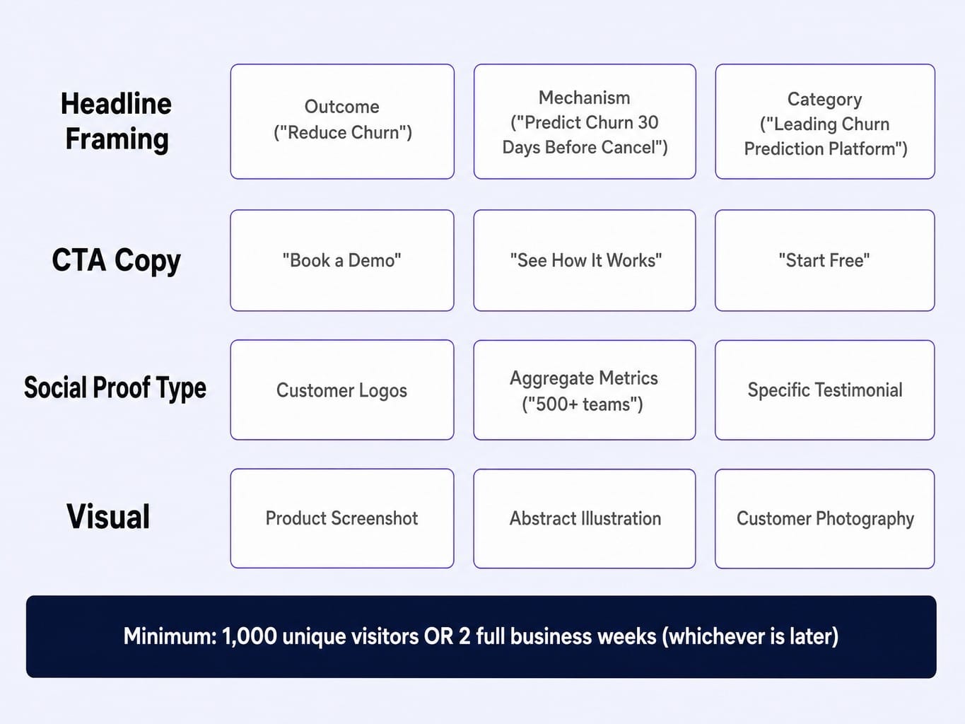
Prioritize testing these four elements:
- Headline Framing: Outcome ("Reduce Churn") vs. Mechanism ("Predict Churn") vs. Category ("The Leading Churn Prediction Platform").
- CTA Copy and Placement: "Book a Demo" vs. "See How It Works" vs. "Start Free."
- Social Proof Type: Customer logos vs. aggregate metrics ("Trusted by 500+ teams") vs. a specific testimonial.
- Visual: Product screenshot vs. abstract illustration vs. customer-centric photography.
As a rule of thumb, run each test for a minimum of 1,000 unique visitors or two full business weeks, whichever comes later, before drawing conclusions. The bottleneck is rarely the tool, like VWO or Optimizely; it's the cadence of testing.
Read more: Data-Driven CRO: Evolve Your Marketing Strategy for Revenue
The Performance-Conversion Loop: Why Page Speed Is a Pipeline Problem
Most marketing teams treat Core Web Vitals as a technical checkbox for engineering. This is a mistake. Page speed is a conversion problem. When a B2B buyer clicks from a LinkedIn ad or a G2 comparison and your page takes four seconds to load, they've already moved to the next tab.
The conversion cost of slow pages is invisible because it shows up in your analytics as "high bounce rate" or "low traffic," not "slow page." But the link is direct. As page load time goes from 1s to 3s, bounce probability increases by 32%, and from 1s to 5s it increases by 90%.
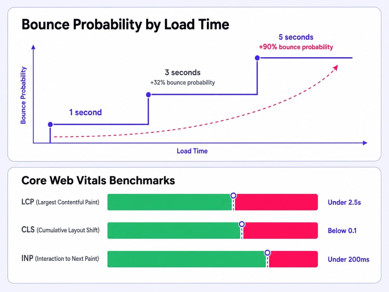
Aim for these practical benchmarks:
- Largest Contentful Paint (LCP): Under 2.5 seconds.
- Cumulative Layout Shift (CLS): Below 0.1.
- Interaction to Next Paint (INP): Under 200ms.
The most common performance killers on B2B SaaS sites are unoptimized hero videos, excessive third-party scripts (chat widgets, analytics tools), and heavy client-side rendering. Platforms like Webflow or headless CMS setups on Vercel/Next.js can mitigate this, but every team needs a page-weight budget. Page speed is a conversion rate multiplier that compounds across your entire site.
Why Static Websites Decay: The Case for Continuous Optimization
The typical B2B SaaS website is treated as a project: designed, launched, and then left largely untouched for 18-24 months. During that window, the market shifts, competitors update their positioning, and the site's conversion effectiveness quietly decays.
The marketing team notices pipeline softening but attributes it to market conditions or ad spend, not the website itself. Meanwhile, the backlog of needed fixes grows: the pricing page is out of date, the case studies are stale, the hero copy no longer reflects the product's true value. This backlog is your conversion debt—the accumulated gap between what the website says and what the product actually does.
The problem is not a lack of ideas. It's that the latency between identifying what needs to change and actually shipping it stretches into weeks or months. By the time one fix gets through design, copy, development, and QA, three new items have joined the backlog. Your website's conversion rate is not a snapshot; it's a decaying asset that requires a system for continuous maintenance. The bottleneck isn't strategy; it's the speed of shipping improvements.
Closing the Gap Between Website Insight and Website Improvement
The core tension is clear: B2B SaaS websites demand continuous optimization, but lean teams can't ship fast enough. The backlog grows, conversion debt compounds, and the site quietly underperforms.
Spike AI resolves this tension. It is the system that closes the latency gap between identifying what needs to change and actually shipping it. Every week, Spike AI identifies the highest-impact improvement across your website—whether it's copy, structure, or performance—and deploys it. There are no engineering tickets, no agency briefs, and no quarterly redesign cycles.
If a B2B SaaS website is a pipeline system, it needs to be operated like one: with continuous measurement, prioritization, and deployment. Spike AI provides the operational layer that makes this possible for teams that don't have the headcount to run a dedicated CRO program. It turns your website from a static project into a compounding growth asset.
See how Spike AI optimizes your website every week
Your Website Isn't a Project, It's a System
A high-performing B2B SaaS website is not a design project. It is a pipeline system architected for buying committees, structured around the seven pages that influence deals, and continuously optimized as your product and market evolve.
The companies that treat their website as a living system—testing hero sections, monitoring performance, and shipping improvements weekly—will compound conversion gains that static sites can never match. The next time your team discusses a website redesign, ask a different question: Is the problem the design, or is it the cadence of improvement? Most of the time, the site doesn't need to be rebuilt. It needs to be operated.
Read more: SaaS Marketing Metrics That Actually Inform Decisions (Not Just Dashboards)
Frequently Asked Questions
What CMS should a B2B SaaS marketing team use in 2026?
For teams wanting to ship without engineers, Webflow is a strong choice. If you're deep in the HubSpot ecosystem, their CMS offers tight integration. For teams with developer resources needing maximum flexibility and performance, a headless CMS like Sanity or Contentful paired with Next.js is ideal. Ultimately, the CMS choice matters less than your team's ability to ship changes quickly.
Should a B2B SaaS website use gated or ungated content?
Gate content only when the value is high enough to warrant a visitor's contact information, such as original research or ROI calculators. The trend is to ungate most educational content to build trust and SEO authority. Much of the B2B buying journey happens in the "dark funnel" you can't track, so gating top-of-funnel content often just reduces reach without improving pipeline quality.
How do you build enterprise trust signals into a B2B SaaS website?
Enterprise buyers look for specific signals: SOC 2 and ISO 27001 badges on a dedicated security page, named customer logos, case studies with specific metrics, a physical address, and uptime/SLA commitments. These signals must be visible and easy for a procurement persona to find—if they require more than two clicks, they effectively don't exist.
How do you design a B2B SaaS website that supports both self-serve and enterprise sales motions?
Use a dual-CTA pattern. Every key page should offer both a self-serve path ("Start Free") and a sales-assisted path ("Talk to Sales"). The self-serve CTA can be visually primary, with the sales CTA as a secondary but always-visible option. On your pricing page, use plan tiers to naturally segment users toward the appropriate path.
What interactive elements actually improve engagement on B2B SaaS websites?
Focus on elements that help a buyer make a decision. High-value examples include interactive product tours (Navattic, Storylane) that let evaluators experience the product, ROI calculators that quantify value, and configurators that help visitors self-select the right plan. Avoid decorative elements like parallax scrolling that add visual noise without moving a visitor closer to conversion.