
SaaS Marketing Metrics That Actually Inform Decisions (Not Just Dashboards)

TLDR
- Stop organizing metrics by funnel stage. Organize them by the decision they inform: pipeline economics (is the model sustainable?) and efficiency signals (is execution improving?).
- Audit your primary KPIs every time your ARR doubles. Metrics that were predictive at $2M ARR, like MQL volume, often become misleading vanity metrics at $15M ARR.
- Reconcile software and self-reported attribution. Use software attribution for operational campaign decisions and self-reported attribution for strategic demand creation insights. The divergence between them is often the most valuable signal.
- Track negative metrics like Pipeline Rejection Rate and Disqualification Velocity. They are leading indicators of pipeline quality problems that metrics like CAC won't surface for months.
- The goal isn't a better dashboard; it's a faster cadence from signal to action. The value of a metric is the speed and quality of the decision it enables.
You've just finished your quarterly marketing review. The slides look great: CAC is down 15%, MQLs are up 40%, and organic traffic grew 22%. You feel good. Then the CFO asks why pipeline coverage is declining and the CAC payback period has stretched to 18 months.
Suddenly, you're in two different meetings. Both sides are looking at accurate data, yet reaching opposite conclusions.
This is the central failure of most B2B SaaS marketing measurement. The problem isn't which metrics you track—most teams track the right ones. The problem is how those metrics are interpreted, connected, and acted upon. The gap between a dashboard and a decision is where measurement systems break down, creating misalignment and slowing execution to a crawl.
This isn't another glossary of SaaS marketing metrics. We're not here to define MQLs. Instead, this guide provides a framework for turning your data into a decision-making system. We'll cover which metrics inform which decisions, how KPIs lose predictive power as you scale, and how to reconcile the attribution models that make marketing's real impact visible.
Why Most SaaS Metric Dashboards Create Misalignment
The friction between marketing and finance isn't personal; it's structural. Marketing and finance teams look at the same metrics but apply different time horizons and attribution logic. Marketing reports on leading indicators—MQLs, traffic, engagement—while finance evaluates lagging outcomes like net revenue retention and CAC payback period. Neither is wrong, but most dashboards present these metrics side-by-side without a shared interpretive framework, guaranteeing conflict.
Consider a common scenario. A marketing team celebrates a 30% reduction in blended CAC. To them, this is a clear win. But finance sees that while organic CAC dropped, paid CAC actually increased by 20%. The blended number, while technically accurate, was masking a deteriorating paid channel. If your blended CAC is $150, but it's composed of a $280 paid CAC and a $40 organic CAC, you don't have an efficiency gain; you have a channel on life support being subsidized by another.
This happens because dashboards are often organized by funnel stage, not by the decision they inform. A better approach is a metrics hierarchy that cascades from the top down:
- Board-Level Metrics: These answer, "Is the business model working?" (e.g., LTV:CAC, CAC Payback Period, Net Dollar Retention).
- Leadership-Level Metrics: These answer, "Are we growing efficiently?" (e.g., Marketing-Sourced Pipeline, Pipeline Velocity, Blended vs. Paid CAC).
- Campaign-Level Metrics: These answer, "Is this specific activity working?" (e.g., Cost per Opportunity, Conversion Rate by Stage, Content Engagement).
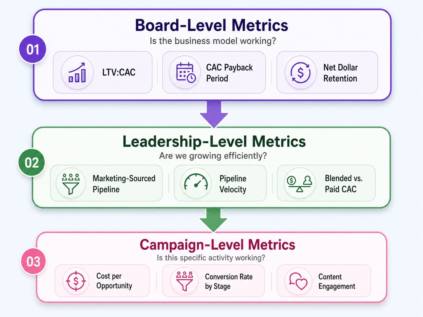
Platforms like Dreamdata or HockeyStack attempt to build this unified view, connecting activities to revenue. The core principle is this: organize your metrics by the question they answer, not the department that owns them. Your dashboard's structure, not just its data, is likely the source of internal friction.
Read more: Stop Syncing Strategy and Execution: Platforms That Unify Marketing Goals With Task Management
The SaaS Marketing Metrics That Actually Drive Revenue Decisions
Instead of a sprawling list of every possible KPI, it's more effective to group SaaS marketing metrics into two categories based on the decisions they drive.
- Pipeline Economics: These metrics tell you if your growth model is financially sustainable. They answer the question, "Can we afford to grow this way?"
- Efficiency Signals: These metrics tell you if your execution is improving or degrading. They answer, "Are we getting better at turning effort into results?"
This framing maps directly to the questions marketing leaders face in planning meetings. It separates the "what" (our model works) from the "how" (our execution is sharp).
Pipeline Economics: CAC, LTV:CAC, CAC Payback, and Pipeline Velocity
These four metrics form a connected system for evaluating the health of your go-to-market engine. Viewing them in isolation is how you end up with a "good" LTV:CAC ratio but a cash-flow crisis.
- Customer Acquisition Cost (CAC): The total cost to acquire a new customer. You must separate Blended CAC (Total Sales & Marketing Cost / New Customers) from Paid CAC (Paid Channel Spend / Customers from Paid Channels). Reporting only the blend is a common way to hide inefficient spending.
- LTV:CAC Ratio: This contextualizes your acquisition cost. A common benchmark is 3:1, but this is highly dependent on your model. A PLG company with low ACV might need a 5:1 ratio to be healthy, while an enterprise SaaS business with high net revenue retention might sustain at 2.5:1.
- CAC Payback Period: This adds the critical dimension of time. A strong 4:1 LTV:CAC ratio is far less attractive if it takes 24 months to recoup your acquisition cost. For most venture-backed SaaS, a payback period under 12 months is the goal.
Formula: CAC / (ARPU × Gross Margin %)
- Pipeline Velocity: This measures the speed at which you generate revenue. It shows how changes in deal size, win rate, or sales cycle length impact your top line.
Formula: (Qualified Opportunities × Average Deal Value × Win Rate) / Sales Cycle Length
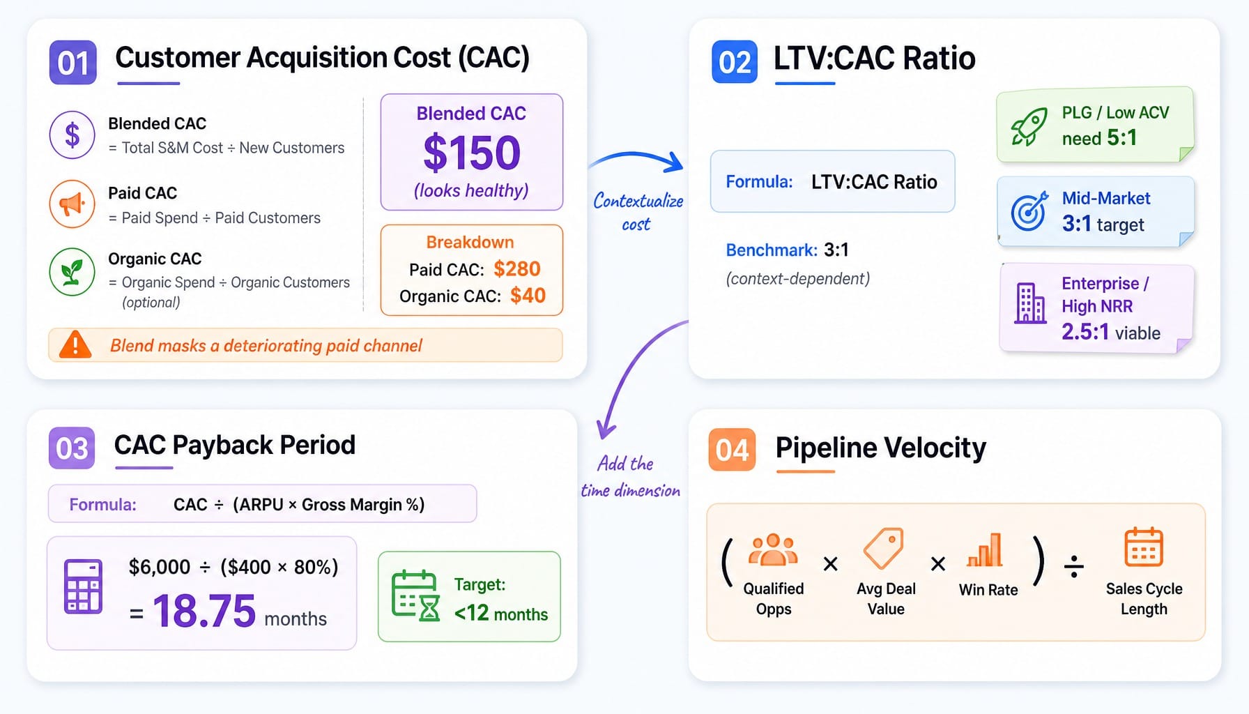
Tools like ChartMogul or ProfitWell by Paddle surface these metrics, but the interpretation is on you. A team with a 4:1 LTV:CAC might feel safe, but if their payback period is 19 months, they are one bad quarter away from a cash crunch. These metrics must be read together.
Efficiency Signals: Marketing-Sourced Pipeline, SAL-to-SQL Conversion, and Cost per Opportunity
Pipeline economics tell you if the model works. Efficiency signals tell you if your execution is improving.
- Marketing-Sourced vs. Influenced Pipeline: This distinction is critical for credibility. Sourced pipeline means marketing generated the opportunity (e.g., first touch on a demo request). Influenced pipeline means marketing touched the deal at some point. Conflating the two inflates marketing's contribution and creates distrust with sales. The rule: use sourced pipeline for accountability and influenced pipeline for strategic planning.
- SAL-to-SQL Conversion Rate: The handoff from a Sales Accepted Lead (SAL) to a Sales Qualified Lead (SQL) is where marketing theory meets sales reality. A low conversion rate here doesn't mean you need more leads; it means you have an ICP alignment or lead quality problem. It's the single best metric for diagnosing friction between sales and marketing.
- Cost per Opportunity: Ditch Cost per Lead (CPL) as a primary metric. CPL incentivizes volume over quality. Cost per Opportunity (Total Marketing Spend / Qualified Opportunities) is far more useful because it accounts for lead quality. It tells you what it costs to generate pipe gen, not just a name in your CRM. Platforms like 6sense or Factors.ai are built to connect spend to qualified pipeline, making this a more accessible metric than ever.
Read more: B2B Conversion Rate Optimization: The Cross-Channel Pipeline and Revenue Playbook
Metric Decay: Why the Same KPIs Lose Predictive Power as You Scale
Metrics that are highly predictive at one ARR stage often become misleading at the next. This isn't because the metrics are flawed; it's because the underlying business dynamics have changed.
Take the MQL. At $2M ARR, with a small sales team where every lead gets immediate attention, MQL volume is a useful leading indicator of future revenue. The relationship is direct and predictable.
At $15M ARR, with multiple product lines, a larger sales team, and a mix of inbound and outbound motions, MQL volume becomes a vanity metric dressed in operational clothing. The conversion rate from MQL to revenue now varies wildly by channel, segment, and product intent. A 20% increase in MQLs might correspond with a 5% decrease in revenue if the new volume is coming from a low-converting segment. The metric hasn't changed, but its predictive power has decayed.
This happens as a company scales: channel saturation curves flatten, the ideal customer profile broadens, and the ratio of new-logo to expansion revenue shifts. Metrics calibrated for one stage encode assumptions that no longer hold.
Here's a practical heuristic: every time your ARR doubles, audit your primary marketing KPIs. Ask a simple question: "Does this metric still reliably predict the outcome I care about, or does it just correlate with activity?" Teams using product analytics tools like Amplitude or Mixpanel can spot this decay early by segmenting conversion rates by acquisition cohort. Is your dashboard reflecting the business you are today, or the business you were 18 months ago?
Self-Reported Attribution vs. Software Attribution: How to Reconcile Both
Software attribution (from tools like Salesforce or Dreamdata) and self-reported attribution ("How did you hear about us?" fields) frequently disagree. Most teams either pick one and ignore the other or, worse, report whichever number looks better that quarter. This is a mistake. The divergence is the insight.
- Software attribution is great at tracking digital touchpoints but is blind to the dark funnel: podcast mentions, word-of-mouth, Slack community recommendations, or a LinkedIn post someone saw but didn't click.
- Self-reported attribution captures intent signals that software misses but is subject to recency bias. People often credit the last touchpoint ("Google search") when the real influence was a conference talk they saw three months prior.
Perfect attribution is impossible, but useful attribution is achievable. Use this two-layer reconciliation framework:
- Operational Layer (Software Attribution): Use your multi-touch attribution software for short-term, campaign-level optimization. It's the best tool for deciding where to allocate budget this quarter.
- Strategic Layer (Self-Reported Attribution): Use self-reported data to understand demand creation vs. demand capture. This informs your long-term strategy.
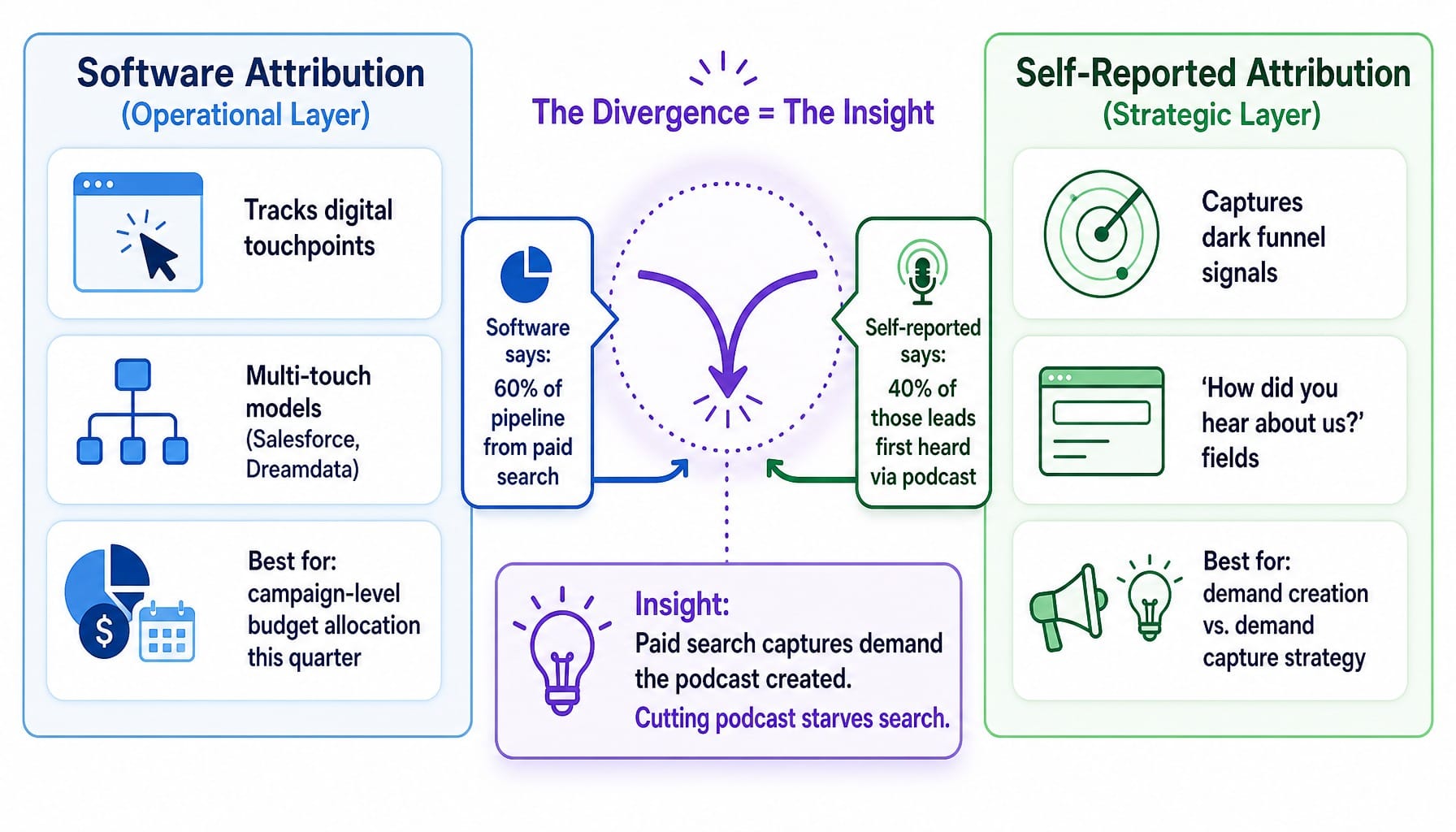
For example, your software might attribute 60% of pipeline to paid search. But self-reported data reveals that 40% of those leads first heard about you from a podcast sponsorship. The insight: paid search is capturing demand the podcast created. Cutting the podcast to double down on search would, over time, starve your top-performing channel. The two models tell a complementary story. You can enrich this further with tools like Clay or Clearbit Reveal to add firmographic context to self-reported answers, improving their reliability.
The Negative Metrics Most SaaS Teams Ignore
Most marketing dashboards are built to show progress. Metrics go up, charts trend green. But the signals that reveal your most critical systemic problems are often negative—they measure rejection, failure, and friction.
Here are two to start tracking immediately:
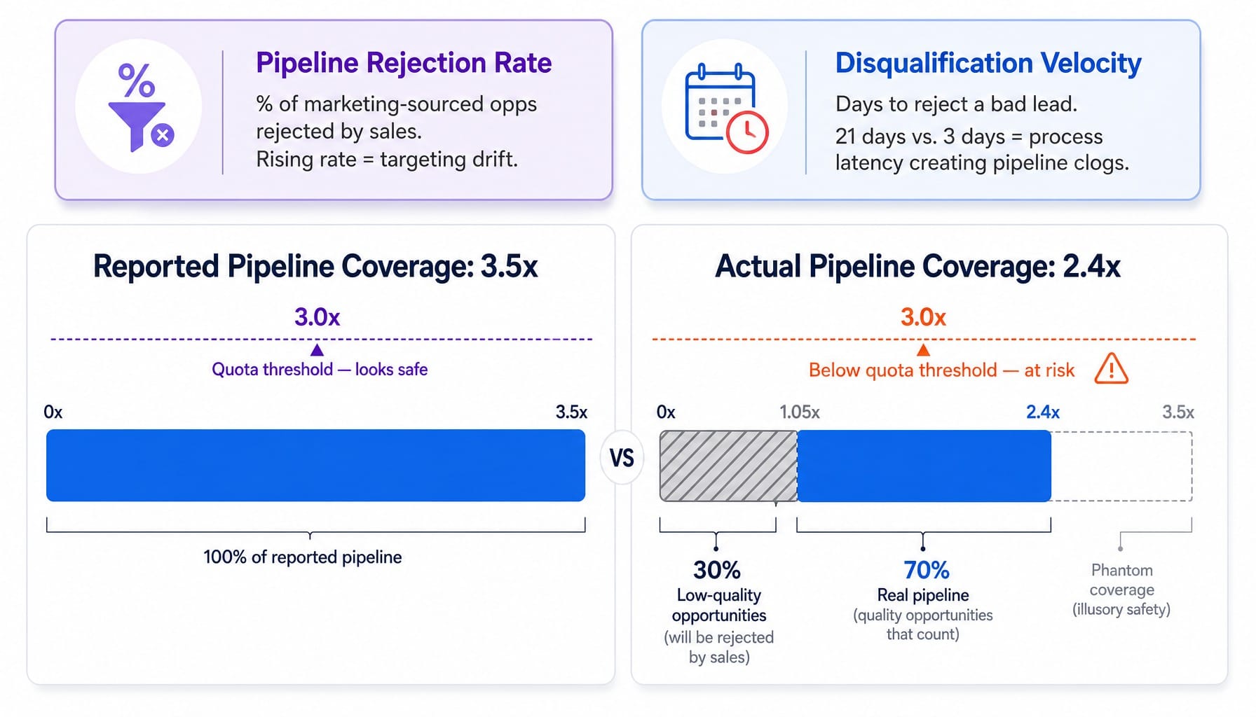
- Pipeline Rejection Rate: The percentage of marketing-sourced opportunities that sales rejects or disqualifies before they reach a meaningful stage. A rising rejection rate, even alongside rising MQL volume, is a leading indicator that marketing's targeting has drifted from sales' reality. It signals wasted spend months before your CAC figures will reflect it.
- Disqualification Velocity: How quickly rejected leads are disqualified. If it takes sales 21 days to reject a lead that should have been filtered out in 3, the problem isn't just lead quality; it's process latency. This "pipeline clog" inflates your coverage ratios and gives you a false sense of security.
Imagine a team with an apparently healthy 3.5x pipeline coverage. However, a closer look reveals that 30% of that pipeline consists of low-quality opportunities that sales will inevitably reject. The real coverage is closer to 2.4x—below the threshold for hitting quota. This team didn't have a pipeline generation problem; they had a pipeline quality and process problem that only negative metrics could reveal.
When Metric Interpretation Becomes an Execution Bottleneck
Tracking these SaaS marketing metrics isn't the hard part. The real work is interpreting them across channels, detecting metric decay, reconciling attribution models, and monitoring negative signals at a cadence fast enough to act.
Most lean marketing teams understand this intellectually but lack the bandwidth to sustain the required analytical cadence. They review dashboards monthly or quarterly, but the signals that matter—a rising pipeline rejection rate, a CAC payback period stretching past plan, a channel saturation curve flattening—demand weekly, if not continuous, monitoring. This is an execution system failure. Human bandwidth is the bottleneck. Teams that need to prioritize marketing tasks with limited resources often find that sustained metric interpretation is the first thing to slip.
This is the exact gap Spike AI closes. It's not another metrics dashboard. It's a cross-channel intelligence and execution layer that continuously identifies which metric is signaling the highest-impact intervention, then prioritizes and helps ship the fix. The patterns this article describes—blended CAC masking paid channel deterioration, metric decay between ARR stages, pipeline quality problems hidden behind coverage ratios—are precisely what an autonomous system can detect and act on continuously. Where other tools diagnose problems and hand you homework, Spike AI deploys solutions.
From Dashboard to Decision Engine
SaaS marketing metrics are not a reporting exercise; they are an execution system. The value of a metric isn't its precision on a dashboard but the speed and quality of the decision it enables.
Most teams track the right data but fail in the interpretation. They organize metrics by funnel stage instead of by decision type, fail to spot when KPIs lose predictive power, ignore the negative signals that reveal systemic flaws, and can't sustain the analytical rhythm needed to act on what the data shows.
The teams that win in 2026 and beyond won't be the ones with the most elaborate dashboards. They will be the ones that close the gap between signal and action the fastest.
Frequently Asked Questions
How do you calculate CAC payback period for a B2B SaaS company?
CAC payback period is calculated as: CAC / (Monthly ARPU × Gross Margin %). For example, if your CAC is $6,000, monthly ARPU is $400, and gross margin is 80%, your payback is $6,000 / ($400 × 0.80) = 18.75 months. Most investors consider under 12 months healthy for venture-backed SaaS.
What is a good LTV:CAC ratio for B2B SaaS, and when is the 3:1 benchmark misleading?
The 3:1 LTV:CAC benchmark assumes mid-market ACV and moderate churn. For PLG companies with lower ACV and higher volume, a 5:1 ratio is often necessary to cover higher support costs. Conversely, enterprise SaaS with long sales cycles and high net revenue retention (120%+) can be healthy at 2.5:1.
Should B2B SaaS companies still track MQLs, or switch entirely to PQLs?
It depends on your go-to-market motion. Sales-led companies still benefit from MQLs but must pair them with SAL-to-SQL conversion rate to measure quality. PLG companies should track PQLs (Product Qualified Leads) as their primary signal. Hybrid companies need both—MQLs for sales-sourced pipeline and PQLs for product-sourced—reported separately, never blended.
How do you measure content marketing ROI for B2B SaaS without last-touch attribution?
Track two layers: assisted conversions (content that appeared in the journey of closed deals, via tools like Dreamdata) and self-reported attribution (asking customers which content influenced them). Neither is perfect alone. Measure content ROI over 6-12 month windows; 30-day last-touch models systematically undervalue content's compounding effect.
What marketing KPIs should a B2B SaaS CMO track weekly vs. quarterly?
Weekly, track operational signals that degrade quickly: pipeline sourced, SAL-to-SQL conversion rate, website conversion rate, and cost per opportunity by channel. Quarterly, track strategic metrics that require larger sample sizes: LTV:CAC ratio, CAC payback period, net revenue retention, and marketing-sourced pipeline as a percentage of total revenue.
How do you benchmark SaaS marketing metrics against industry standards?
Public benchmarks from sources like OpenView or KeyBanc are useful for directional context but dangerous as absolute targets. They aggregate across different ACVs and growth stages. The most useful benchmark is your own trailing 90-day trend. If your CAC payback is improving and your pipeline rejection rate is declining, you are getting better—regardless of the industry median.