SaaS Pricing Page Examples: 8 Teardowns That Reveal What Actually Converts

TL;DR
- Your pricing page isn't a design problem; it's a decision architecture problem. Success depends on how you structure choices, not on your color palette.
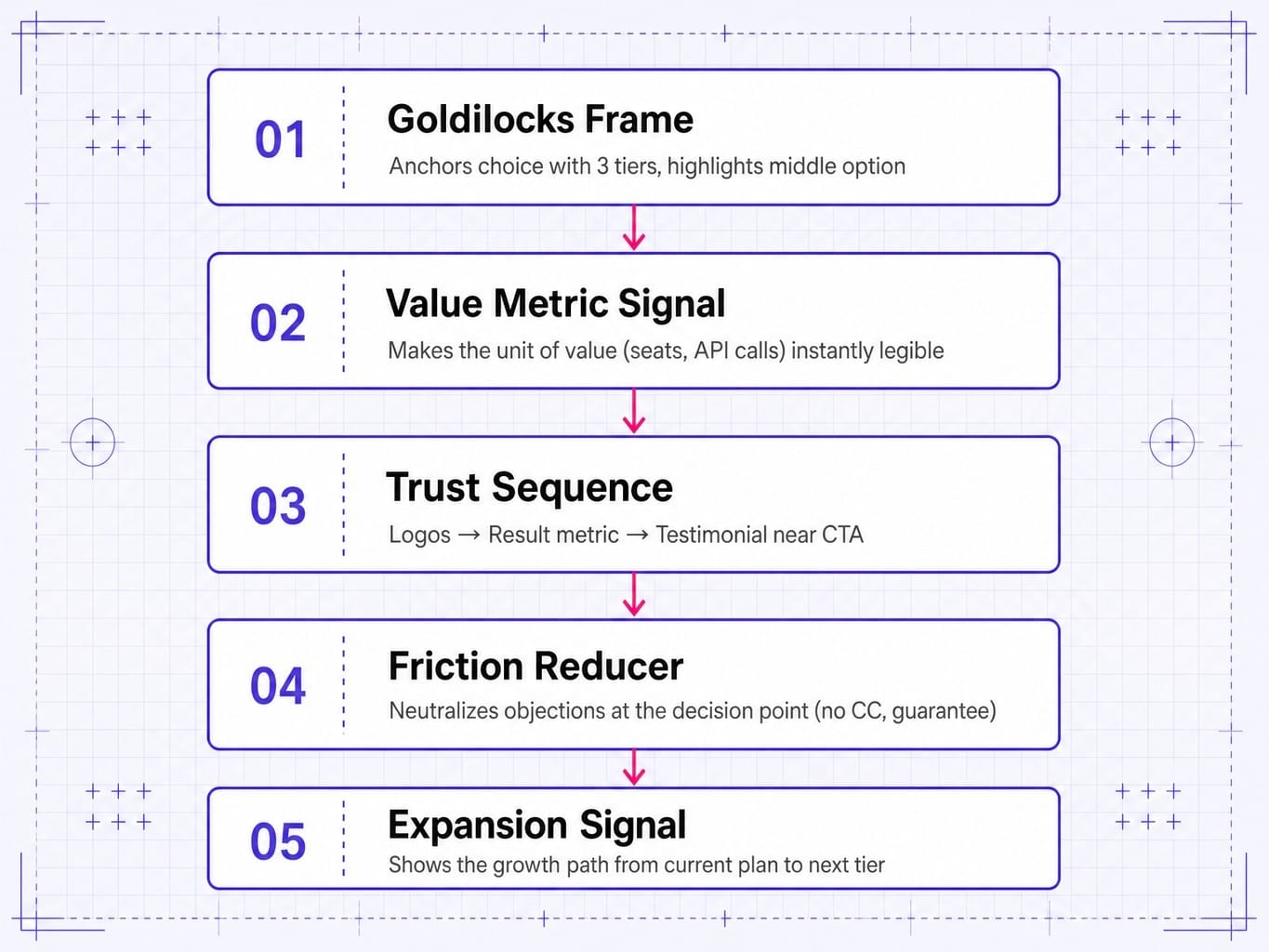
- High-converting pages consistently use five structural patterns: the Goldilocks Frame, Value Metric Signal, Trust Sequence, Friction Reducer, and Expansion Signal.
- The job of a PLG pricing page is checkout (reduce friction), while the job of a sales-led page is qualification (increase confidence in a conversation). Designing for the wrong motion kills conversions.
- For AI-native products, pricing pages fail when they display abstract units (tokens, credits) without a translation layer that connects them to tangible workflow outcomes.
- Don't treat your pricing page as a static artifact. The highest-leverage pages are optimized continuously, not redesigned quarterly.
Most SaaS pricing pages don't fail because they're ugly. They fail because they make the buyer's decision harder, not easier.
Marketing teams spend weeks on redesigns—tweaking colors, refining typography, adding a slick annual vs monthly toggle—only to see zero lift in trial starts or plan selection. The problem was never the visual design. It was the decision architecture.
When a buyer lands on your pricing page, they are trying to solve an equation in their head: "Which of these options gives me the most value for the least cost and risk, based on my specific problem?" A great pricing page helps them solve that equation in seconds. A bad one forces them to open a spreadsheet.
This article breaks down 8 real SaaS pricing page examples—not as design inspiration, but as case studies in decision engineering. You'll learn the structural patterns that separate pages that convert from pages that just look good.
5 Structural Patterns Behind Pricing Pages That Actually Convert
After analyzing dozens of high-performing SaaS pricing pages, five structural patterns consistently appear. They have nothing to do with aesthetics and everything to do with engineering a clear decision path for the buyer.
When a pricing page forces a buyer into a comparison task the page itself doesn't resolve, the most common outcome isn't a bounce but a delayed decision that clogs the pipeline with stale opportunities. For teams already constrained by manual follow-up workflows, that delay compounds into weeks of lost velocity. Tools like Spike AI exist to compress that delay by continuously testing and resolving these decision-architecture failures without waiting for a quarterly CRO sprint.
The average SaaS website conversion rate hovers around 2-3%, and the pricing page conversion rate (PCR)—the percentage of visitors who start a trial or initiate checkout—is the single highest-leverage metric most teams never measure. These five patterns are how you move it.
- The Goldilocks Frame: This is the classic good-better-best framework. Three tiers are presented, with the middle tier visually highlighted or labeled "Most Popular." The outer tiers exist primarily as anchors; the low tier feels too basic, and the high tier feels too expensive, making the middle option feel "just right." This uses price anchoring to guide choice without being forceful.
- The Value Metric Signal: The page makes the unit of value—seats, contacts, projects, API calls—immediately legible. Buyers can instantly map the pricing to their own scale and self-qualify. This aligns the price with the customer's willingness-to-pay and answers the question, "What am I actually buying?"
- The Trust Sequence: Social proof isn't just present; it's sequenced. High-performing pages often place well-known customer logos above the fold for instant credibility. Then, a specific result metric ("Teams using X see a 30% increase in Y") appears near the tiers. Finally, a relatable customer testimonial is placed near the primary CTA to reduce last-second hesitation.
- The Friction Reducer: At the point of maximum decision friction—right before the buyer has to click "Sign Up" or "Buy Now"—a specific objection is neutralized. This can be "No credit card required" text, a money-back guarantee badge, or a concise FAQ section addressing common concerns about implementation or data security.
- The Expansion Signal: The pricing structure subtly shows the buyer how they will grow. It makes the path from their initial plan to the next tier obvious. This reduces commitment anxiety because the initial purchase doesn't feel like a permanent, dead-end decision. It signals that the product will scale with them.
The following teardowns show these patterns in action.
8 SaaS Pricing Page Teardowns: What Works and What to Steal
These eight SaaS pricing page examples were selected for specific, intelligent structural decisions that solve real buyer problems. We're looking at the engineering, not the paint job.
Seat-Based Pricing: Figma and Slack
Seat-based pricing is the default for collaborative SaaS, but the best examples use sophisticated price fencing to maximize both adoption and ARPU.
Figma
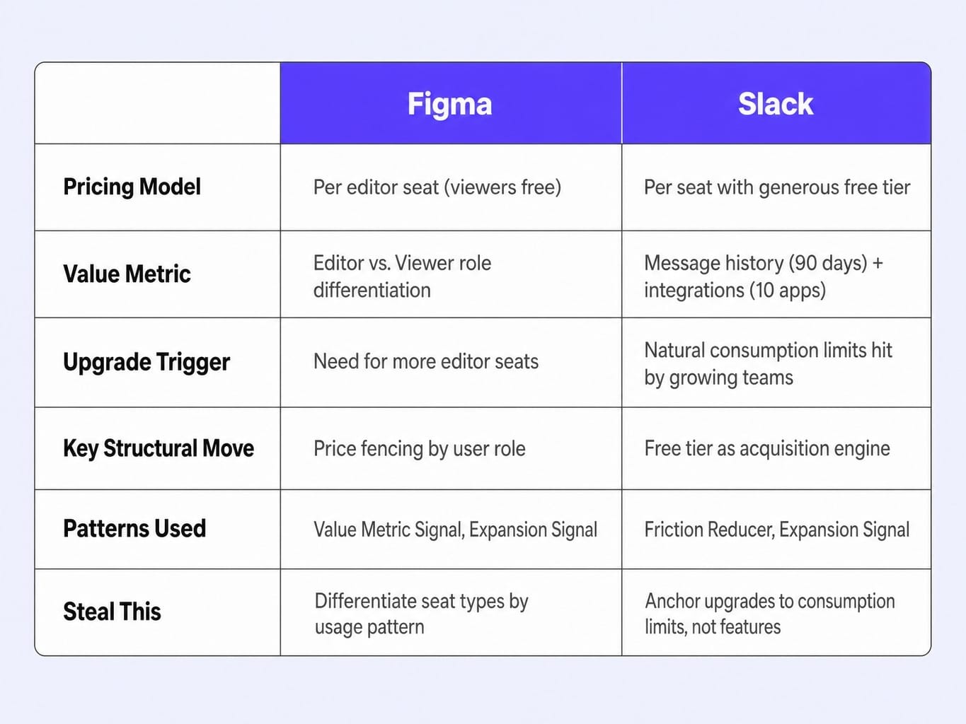
Figma's pricing page is a masterclass in differentiating a value metric. Instead of just charging per "seat," they split it into "editor" seats and free "viewer" seats. This is a brilliant price fencing strategy. It allows an entire organization to adopt Figma for collaboration while only monetizing the core users who create designs. The comparison table is also smart; it groups features by workflow (Design, Prototyping, Dev Handoff), which lets buyers self-qualify based on their role, not a random feature list. The enterprise CTA isn't a generic "Contact Us"; it specifically calls out "advanced security, controls, and flexible support," naming the exact pillars enterprise buyers care about.
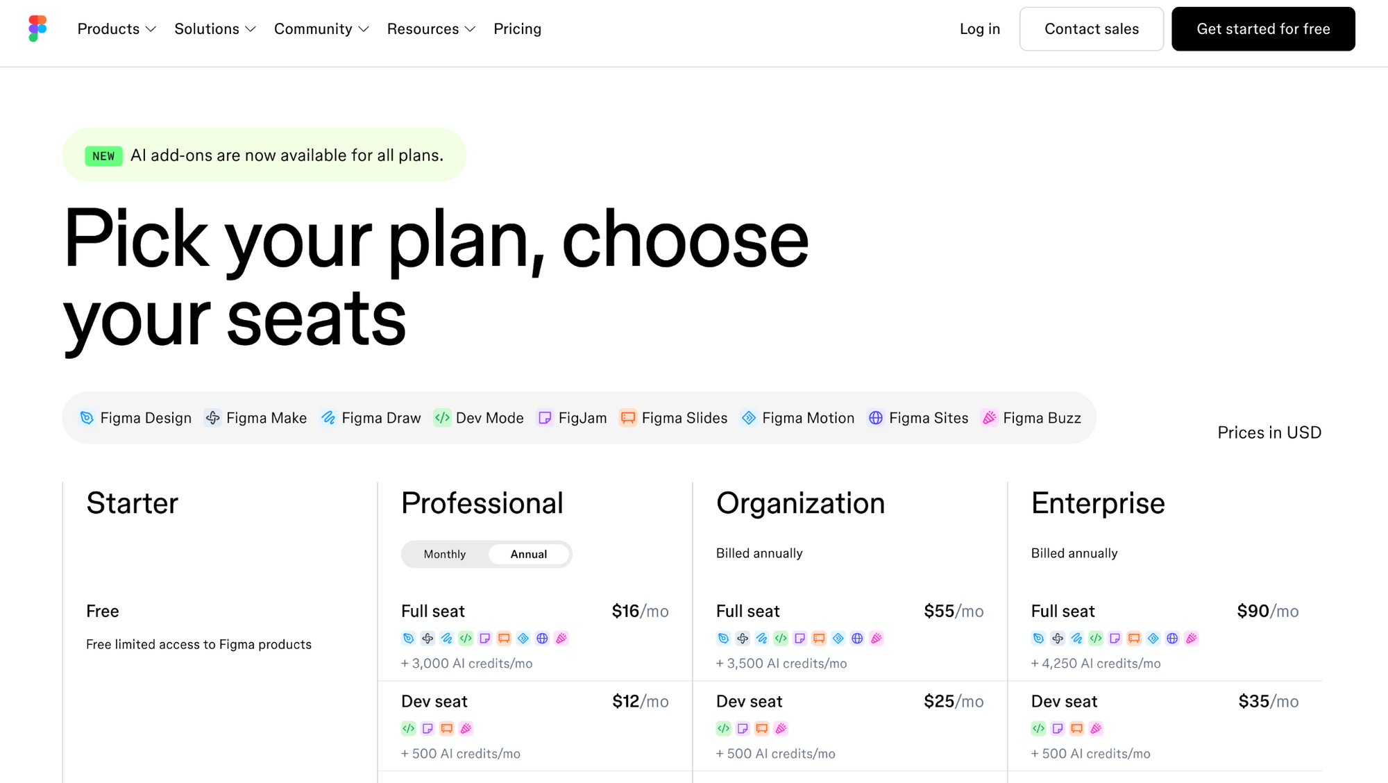
- Patterns Demonstrated: Value Metric Signal, Expansion Signal.
- Steal this: Differentiate your seat types. If you have users with vastly different usage patterns, create different roles (e.g., admin, editor, viewer) with different price points to lower the barrier to team-wide adoption.
Slack
Slack's pricing page doesn't sell features; it sells a growth path. The free tier is deliberately generous, acting as a powerful acquisition engine. The key structural decision is how they define the upgrade trigger: message history (90 days) and integrations (10 apps). These aren't arbitrary feature gates; they are natural constraints a growing team will eventually hit. This creates predictable, organic expansion pressure, which is the engine of negative churn. The page makes the free tier feel like a complete product, not a crippled demo, which dramatically reduces trial anxiety.
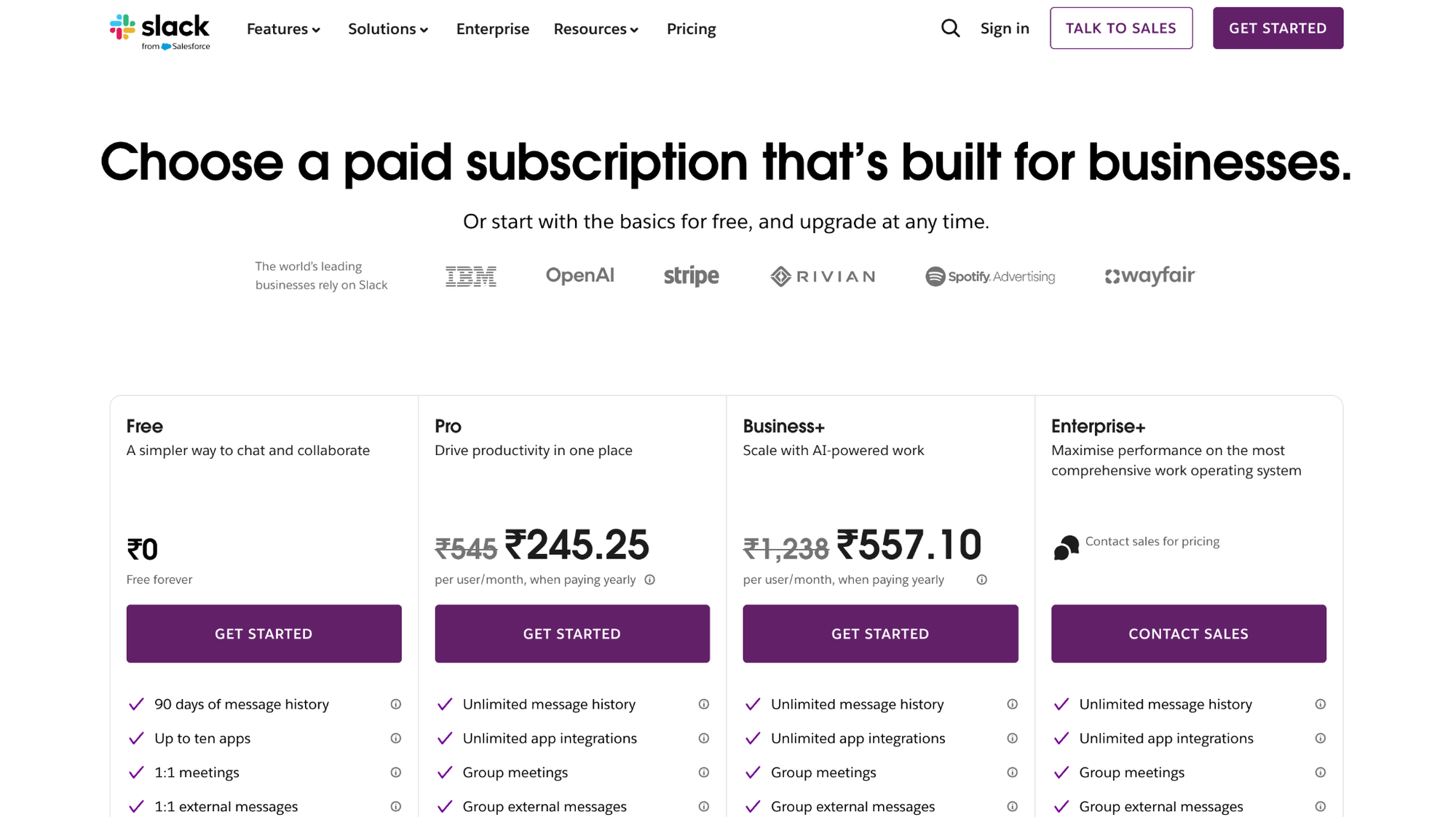
- Patterns Demonstrated: Friction Reducer, Expansion Signal.
- Steal this: Anchor your upgrade path to a consumption limit, not a feature. Find the one metric (messages, projects, contacts) that correlates with a team's growth and make that the primary lever for moving from free to paid.
Read more: SaaS Pricing Strategy Guide 2026: Value Metrics, Hybrid Pricing & AI
Usage-Based and Hybrid Models: Stripe and Vercel
Displaying usage-based pricing is a design challenge. The best pages prioritize transparency and use calculators to translate abstract rates into concrete costs.
Stripe
Stripe's challenge is immense complexity—multiple products, each with its own usage-based model. They solve this with radical transparency and smart information architecture. The per-transaction fee is the hero element, not hidden in footnotes. A tabbed interface lets buyers explore different products like Payments, Billing, and Connect within a single page, preventing the user from getting lost. Crucially, they include a volume discount table that clearly shows how the rate decreases with scale. This turns a potential negative (cost) into a positive signal for enterprise buyers: "As you grow with us, we get cheaper."
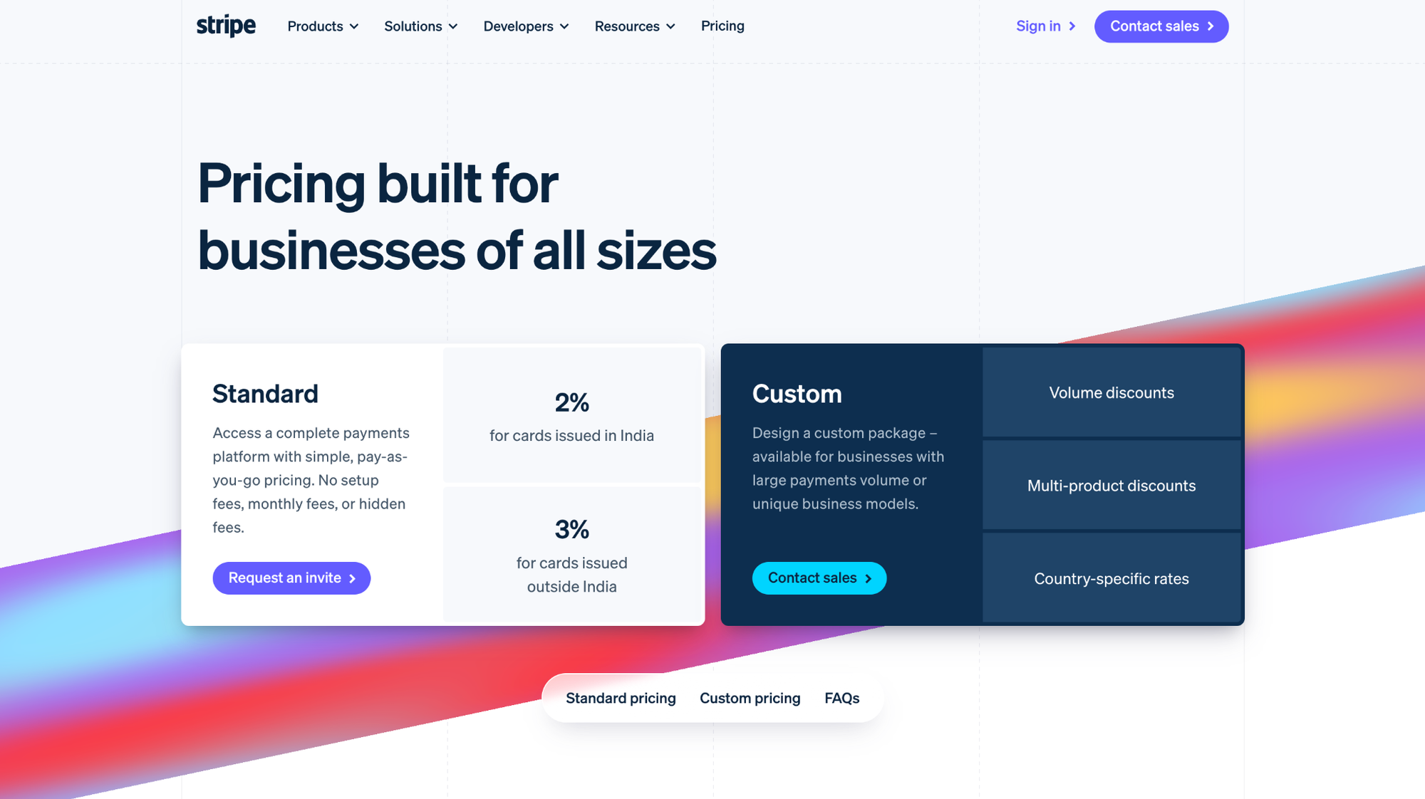
- Patterns Demonstrated: Value Metric Signal, Trust Sequence.
- Steal this: Use a calculator or interactive slider. If your pricing is consumption-based, don't make the user do math. Give them a tool to input their expected volume and see the exact cost.
Vercel
Vercel employs a hybrid model: per-seat for collaboration and per-usage for resources like bandwidth and serverless functions. This can be confusing, but their pricing page makes it feel like a safety net, not a trap. They use the Pro tier as a clear anchor (the Goldilocks Frame) and include a generous baseline of usage. The overage pricing is presented transparently, but the message is clear: most teams on the Pro plan won't hit it. This frames the usage component as insurance for future growth, not a primary cost, which is a psychologically astute way to sell a hybrid model.
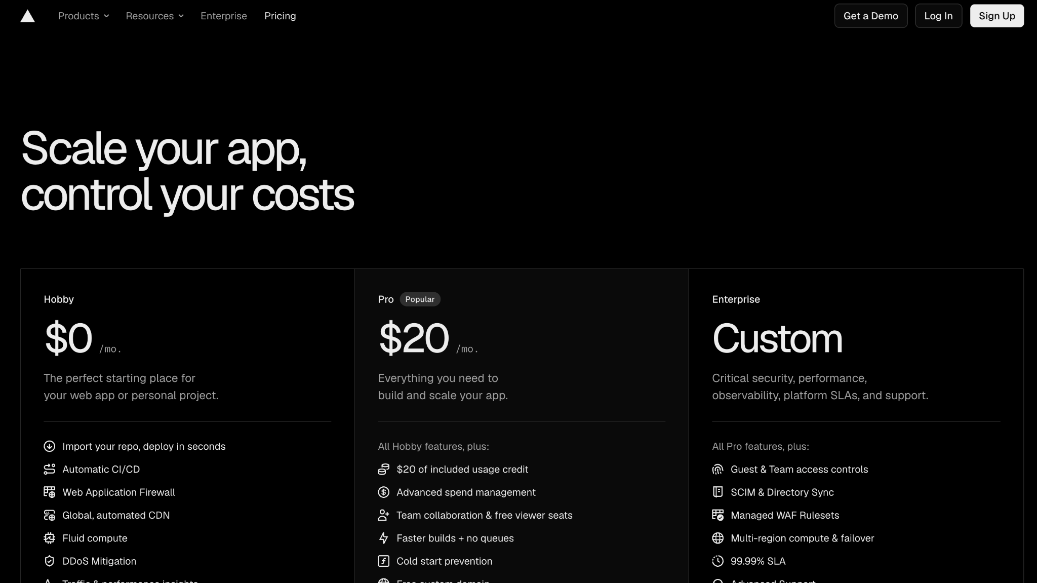
- Patterns Demonstrated: Goldilocks Frame, Friction Reducer.
- Steal this: Frame your usage component as an "included" baseline with "pay-as-you-go" for overages. This makes the pricing feel predictable and fair, even if it's technically a hybrid model.
Freemium and PLG-First: Notion and Linear
For product-led growth (PLG) companies, the pricing page is the sales team. It must convert without a human conversation, which demands exceptional clarity and a frictionless path to value.
Notion
Notion's pricing page is engineered to serve two distinct audiences: individuals exploring the free plan and team leads evaluating paid tiers. It places the free tier prominently on the left but uses visual emphasis and a "Get Started" CTA to guide teams toward the Plus plan. One small but powerful detail: the annual billing toggle doesn't just show a percentage discount. It calculates and displays the specific dollar amount saved per year. This is more concrete and persuasive than an abstract percentage. As many CRO practitioners will tell you, a 'most popular' badge on a middle tier works through social proof only when the visitor has no strong prior intent; for high-intent buyers, the feature list wins. Notion balances both.
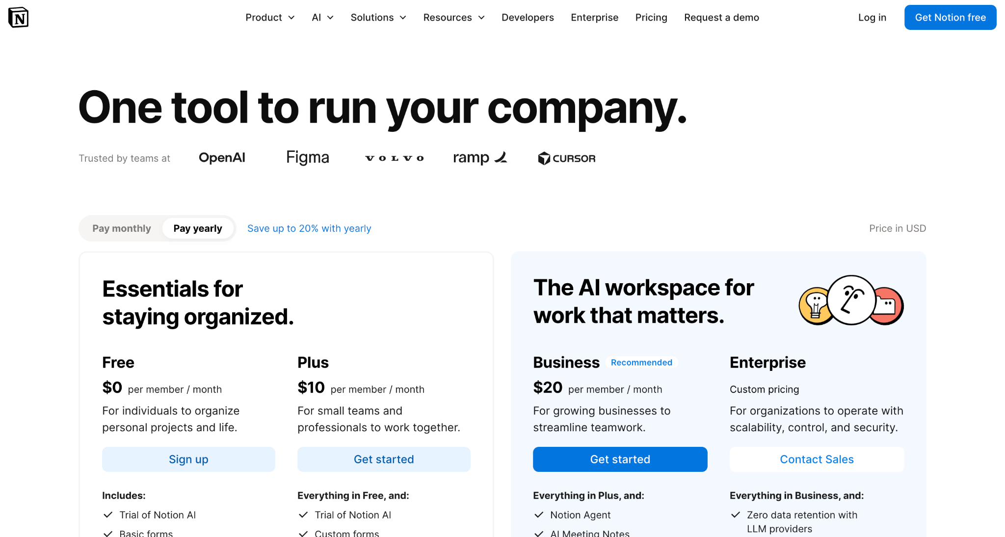
- Patterns Demonstrated: Goldilocks Frame, Friction Reducer.
- Steal this: Show annual savings as a concrete dollar amount, not a percentage. "Save $48/year" is more compelling than "Save 20%" because it requires no mental math.
Linear
Linear's pricing page is an exercise in radical simplicity, a deliberate anti-pattern to the typical 3- or 4-tier layout. With just one main paid tier alongside free and enterprise options, they communicate confidence. This works because their value proposition—a fast, opinionated project manager for software teams—doesn't require complex feature gating. Fewer tiers can actually increase conversions when the product's value doesn't scale along multiple axes. Their enterprise CTA is also hyper-specific, naming the exact features enterprise buyers look for: "SAML/SSO," "Audit logs," and "Advanced security."
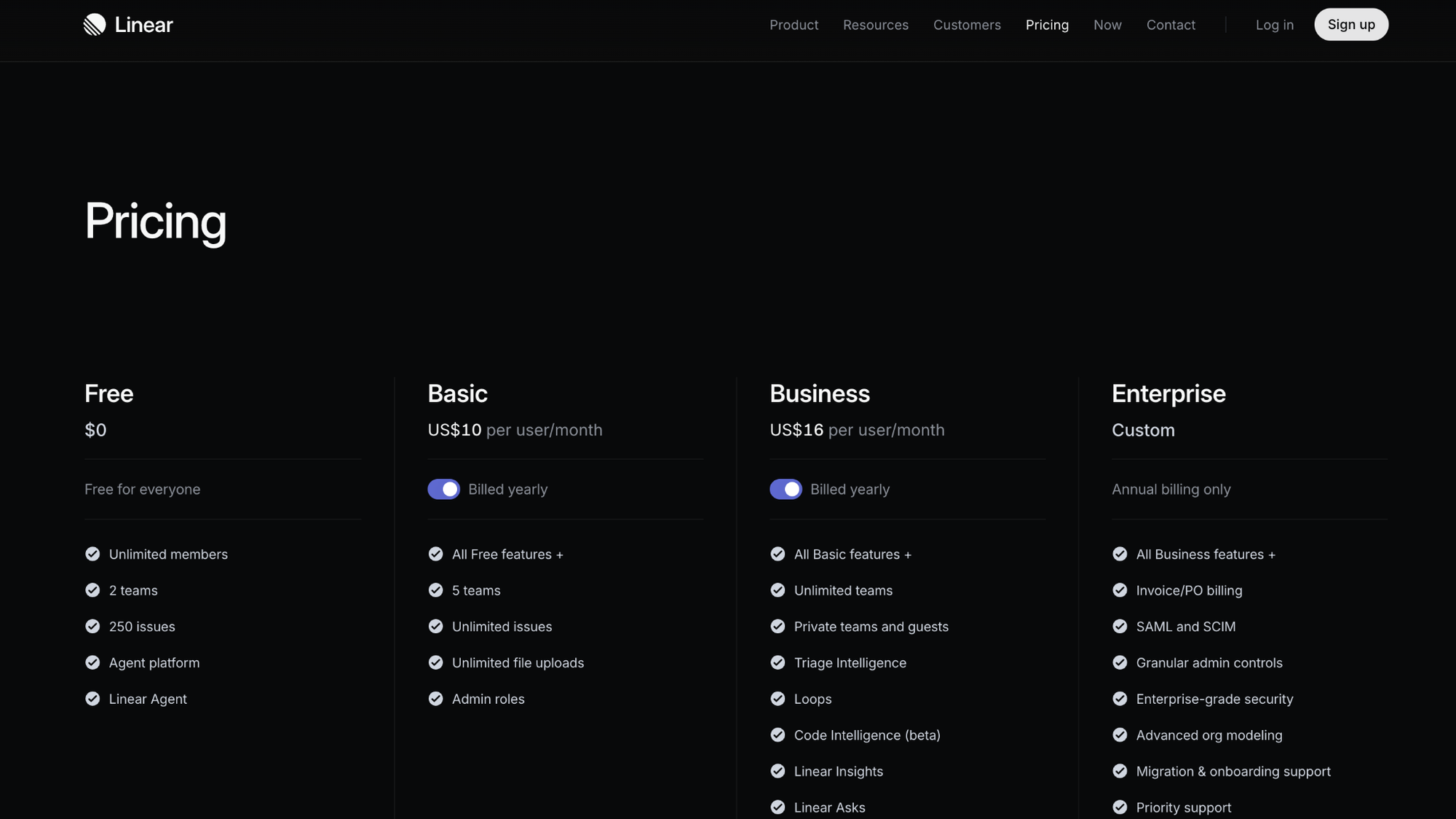
- Patterns Demonstrated: Value Metric Signal, Trust Sequence.
- Steal this: Question if you need three tiers. If your feature set doesn't naturally segment into "good-better-best," a simpler structure might reduce decision paralysis and improve your PCR.
Persona-Aligned Tiers: Webflow and Jasper
The most sophisticated pricing pages don't just list features; they align each tier with a specific buyer persona, making self-selection effortless.
Webflow
Webflow's pricing is complex, with separate plans for sites and workspaces. They manage this by aligning each workspace tier with a clear persona: "Starter" for individuals, "Core" for small teams, and "Growth" for agencies. The tier names and descriptions do the heavy lifting of qualification. The feature table is also a hybrid; it uses checkmarks for binary features but specific limits (e.g., "10 guest seats," "up to 3,000 collection items") for things that scale. This is far more informative than a sea of identical checkmarks, which can actually hurt conversion by increasing cognitive load without adding decision-relevant information.
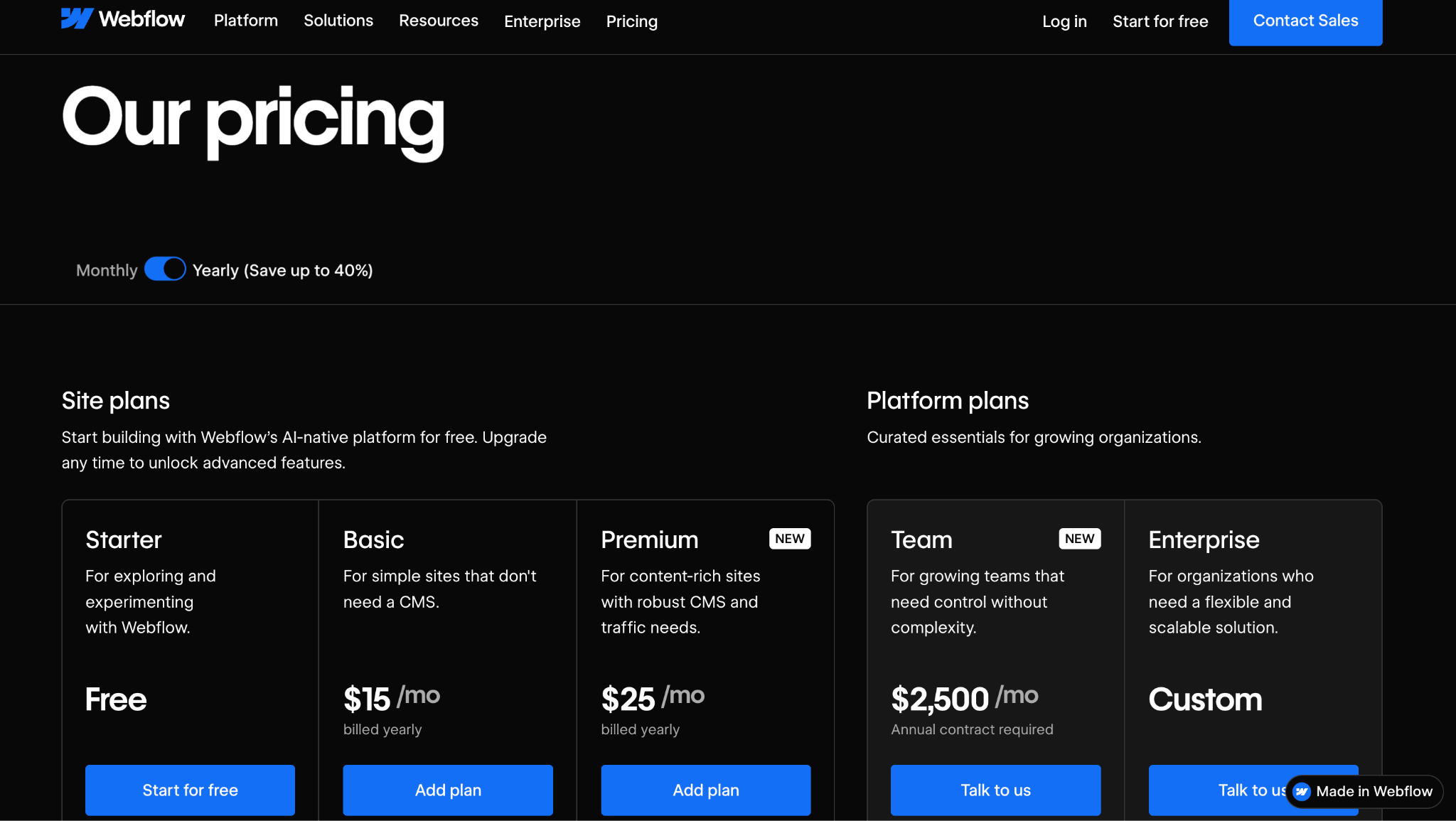
- Patterns Demonstrated: Value Metric Signal, Goldilocks Frame.
- Steal this: Name your tiers after your target user, not abstract levels. "Freelancer," "Agency," and "Enterprise" are more descriptive and helpful than "Basic," "Pro," and "Business."
Jasper (AI-Native)
Jasper's page confronts the core challenge of AI-native pricing: translating an abstract unit ("words" or "credits") into tangible value. While earlier versions struggled with this, their current page frames plans around personas like "Creators" and "Teams," with features tailored to each. The key insight here is the attempt to anchor abstract credits to recognizable outcomes. Where many AI tools simply list a credit number, leaving the buyer to guess its value, the best are adding context. I once worked on a credit-based AI product where replacing a raw credit count with a usage-equivalent label like "approximately 500 document summaries per month" and linking to a usage calculator reduced support tickets about plan selection by nearly half. Jasper is moving in this direction by focusing on the user's goal.
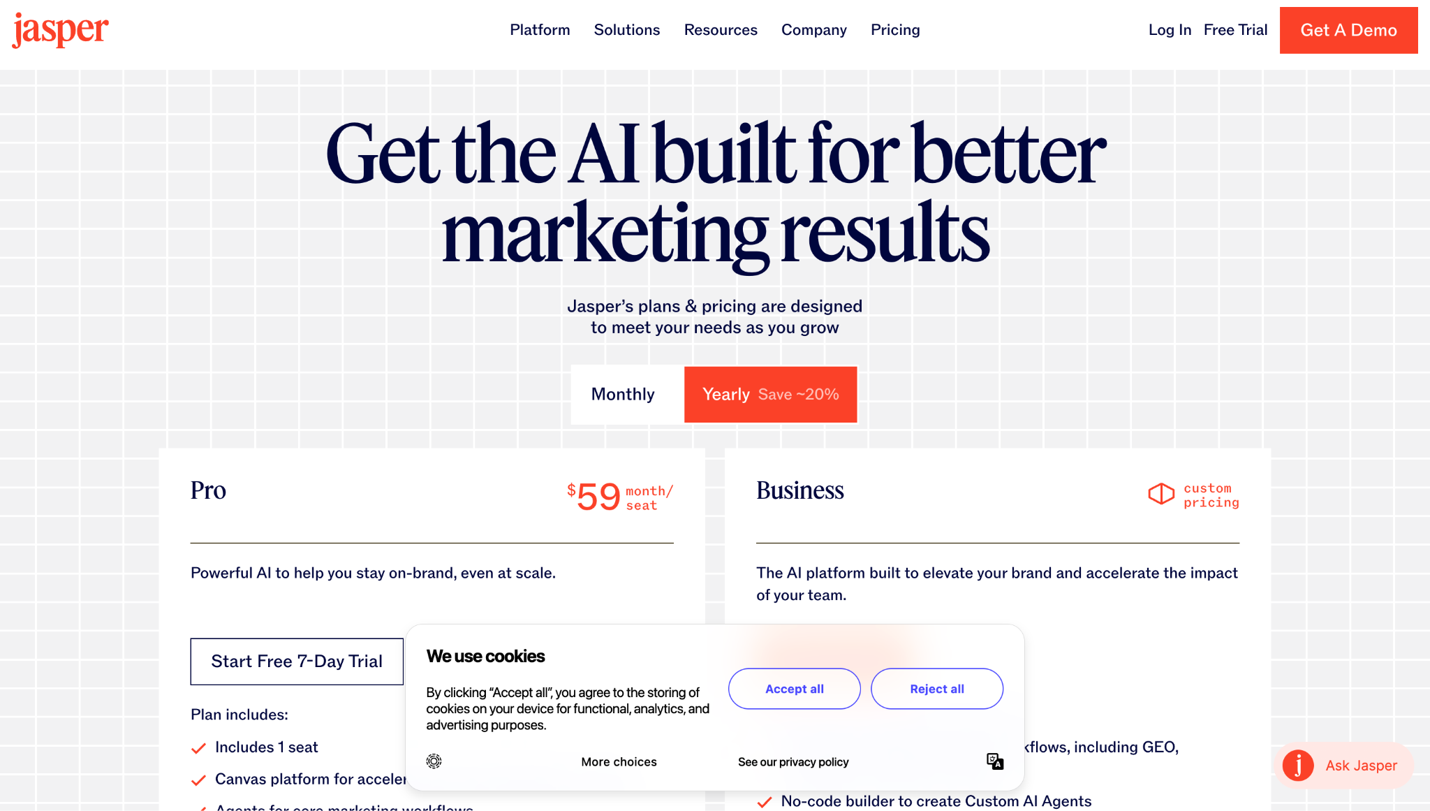
- Patterns Demonstrated: Value Metric Signal (in progress), Friction Reducer.
- Steal this: Add a "translation layer" to your value metric. If you charge by tokens, API calls, or credits, add an "equivalent to X" label (e.g., "≈ 100 reports generated") to make the value tangible.
How PLG-First Pricing Pages Differ From Sales-Led Pages
Most advice on SaaS pricing page examples assumes a self-serve, PLG motion. But for sales-led or hybrid companies, the pricing page has a fundamentally different job.
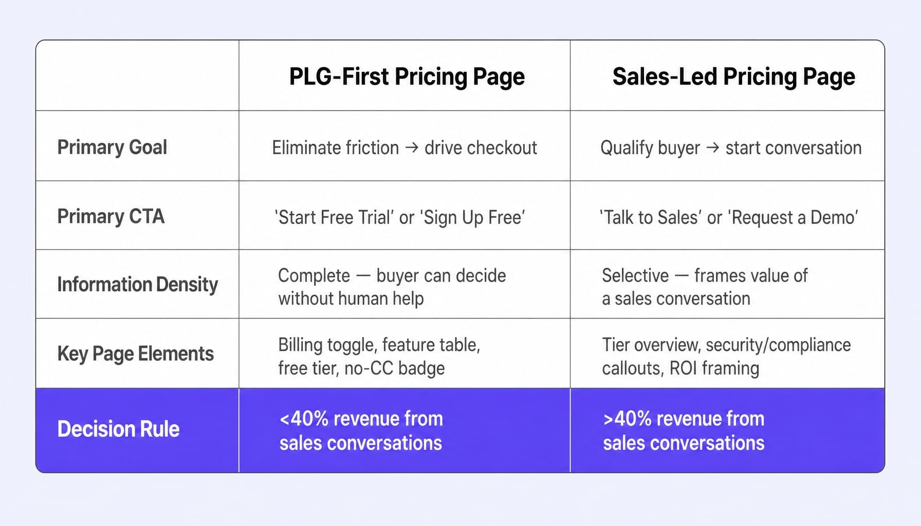
In a PLG motion, the pricing page is the conversion point. Its goal is to eliminate all friction on the path to checkout. It needs a clear billing toggle, a prominent free trial CTA, and enough information for a buyer to make a decision without ever speaking to a human.
In a sales-led motion, the pricing page is a qualification tool. Its goal is not to trigger a purchase but to start a valuable conversation. It needs to help a buyer self-identify their tier and understand why a conversation with sales is the logical next step. This means the CTA should be "Talk to Sales" or "Request a Demo," and the surrounding copy should frame the value of that conversation (e.g., "for custom security reviews and implementation planning").
Hybrid models, like HubSpot's, often struggle by mixing self-serve and sales-led tiers on the same page, creating confusion. A company like Intercom handles this more cleanly by clearly separating the self-serve entry point from the enterprise path. Understanding the free trial conversion rate benchmarks for your trial model can help you decide which motion your pricing page should optimize for.
Decision rule: If more than 40% of your revenue comes from sales conversations, your pricing page's primary goal should be lead qualification, not self-serve checkout. Engineer it to increase a buyer's confidence that a call will be worth their time.
The Emerging Pattern: AI-Native and Credit-Based Pricing Pages
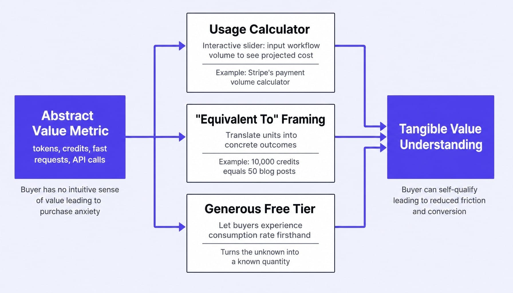
AI-native SaaS products face a pricing display challenge that seat-based SaaS never did. When your value metric is tokens, API calls, or "fast requests," the buyer has no intuitive sense of what they're buying.
A team lead evaluating a new AI coding assistant doesn't know if 500 "fast requests" per month is generous or restrictive. This creates purchase anxiety and conversion friction.
Three patterns are emerging to solve this translation problem:
- Usage Calculators: Interactive sliders let the buyer input their expected workflow volume (e.g., "number of documents to analyze") and see a projected cost. Stripe pioneered this for payments, and it's becoming essential for AI APIs.
- 'Equivalent To' Framing: The page translates abstract units into concrete outcomes. For example, "10,000 credits ≈ 50 blog posts" or "1M tokens ≈ 2,000 pages of text." This gives the buyer a mental model for consumption.
- Generous Free Tiers: A free plan that includes a meaningful number of credits allows buyers to experience the consumption rate firsthand before committing, turning the unknown into a known quantity.
Most AI-native companies are still getting this wrong, simply displaying a number of credits and hoping for the best. The principle is simple: if your value metric isn't self-explanatory, your pricing page needs a translation layer.
Your Pricing Page Is Never Finished — Here's How to Keep Optimizing It
The teardowns show that even top SaaS companies iterate constantly. Public data reveals that companies like Notion and Slack have changed their pricing page structure multiple times a year. Pricing page optimization isn't a one-time project; it's a continuous process of adapting to your product, audience, and market.
But the "redesign-and-hope" cycle is slow and expensive. You spend a quarter briefing an agency or tying up internal resources, ship a new page, and wait to see what happens.
Spike AI reframes this. Instead of treating your pricing page as a static deliverable, we treat it as a dynamic system under continuous optimization. Spike AI identifies the highest-impact conversion improvements across your entire website—including tier structure, CTA clarity, and trust signal placement on your pricing page—and helps you ship them. It replaces the slow, heroic quarterly sprint with a compounding weekly cadence of improvement.
See what Spike AI would change on your pricing page this week
Your Pricing Page Is a Decision Engine
The single most important takeaway is this: pricing page success is a function of decision architecture, not visual design.
The five structural patterns—the Goldilocks Frame, Value Metric Signal, Trust Sequence, Friction Reducer, and Expansion Signal—are the engineering behind every high-converting page. The teardowns prove that the companies winning are those making deliberate choices about how buyers process options, not just those with the prettiest gradients.
Your pricing page is the highest-leverage asset on your website. It deserves the same continuous optimization you give your homepage. Don't redesign it once a year. Improve it every week.
Frequently Asked Questions
Does showing an annual vs monthly billing toggle actually increase conversions?
Yes, but its effectiveness depends entirely on the execution. The toggle should default to annual pricing to anchor the buyer on the lower effective monthly rate. Critically, the savings should be displayed as a concrete dollar amount or month count ("Save $240/year" or "Get 2 months free"), not a percentage. This avoids forcing the user to do mental math, which introduces friction right at the decision point.
How do you A/B test a SaaS pricing page without risking revenue?
The safest and most effective method is to test presentation elements, not the prices themselves. You can test tier naming conventions, the order of features in a comparison table, CTA copy ("Get Started" vs. "Start Free Trial"), and the placement of trust signals. Tools like VWO or PostHog are ideal for this. Just ensure you have enough traffic—at least 1,000 unique visitors per variation—to get a statistically significant result on plan selection rates.
What pricing page mistakes cause the highest drop-off rates?
The three most common conversion killers are: (1) Too many tiers (more than four) creating decision paralysis. (2) Overly complex feature comparison tables that force users to parse a spreadsheet of checkmarks instead of grouping features by outcome. (3) Hiding the price for mid-market tiers behind a "Contact Sales" wall. This signals the price is unexpectedly high and creates distrust, causing high-intent buyers to bounce.
How do you choose the right value metric for SaaS pricing?
A good value metric scales directly with the customer's success. As they get more value from your product, they naturally consume more of the metric. Seats work when each user gets independent value. Usage metrics (events, storage) work when value is tied to volume. The best way to validate this is with a price sensitivity analysis (like a Van Westendorp survey) with 15-20 customers. If your customers can't intuitively estimate their usage of your metric, it's the wrong one.
Should a SaaS pricing page include a free tier or only a free trial?
This depends on your growth motion. A free tier is ideal for PLG products where the free experience itself creates natural expansion pressure (e.g., hitting a usage limit in Slack or Notion). A free trial is more effective for products where the core value is only realized after a setup or data integration period (e.g., a CRM or analytics tool). If your product's "aha!" moment is accessible in minutes, use a free tier. If it requires configuration, a 14-day trial is better.