SaaS Website Best Practices for 2026: From Static Pages to Continuous Optimization
TL;DR
- Your homepage messaging should lead with the visitor's problem, not your product's features. If they can't see their pain in your headline, they'll leave in seconds.
- Design your pricing page to reduce comparison fatigue. Limit tiers to three, visually anchor your recommended plan, and use progressive disclosure for feature lists.
- The fastest-growing SaaS companies serve both self-serve (PLG) and sales-led buyers. Your site architecture must have distinct conversion paths for each, not a one-size-fits-all "Book a Demo" CTA.
- Stop letting stakeholder opinions drive your redesign. Use session replay data—specifically scroll depth, rage clicks, and conversion friction—to identify what's actually broken.
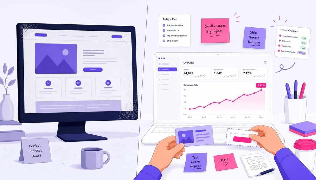
- The most important "best practice" isn't a design choice; it's an operating rhythm. A 1% relative improvement in conversion rate shipped weekly compounds to a 67% gain in one year, vastly outperforming a single redesign every 18 months.
Your marketing team just wrapped a six-month website redesign. New brand, new copy, new layout. Three months later, the analytics dashboard tells a familiar story: your conversion rate is exactly where it was before. The site looks better, but it doesn't convert better.
This isn't a hypothetical. It's the default outcome for most B2B SaaS teams. The redesign optimized for aesthetics and stakeholder opinions, not for the behavioral friction that was actually killing conversions.
The data confirms this is a systemic problem. According to Unbounce, the median SaaS landing page converts at just 3.8%—nearly half the all-industry median.
The gap isn't caused by bad design. It's caused by treating the website as a periodic project instead of a continuously optimized product surface. The highest-impact SaaS website best practices aren't a checklist; they're a system. We'll cover the six that matter most, from the foundational decisions you make once (messaging, architecture) to the operational rhythm you need to run forever (continuous behavioral optimization).
Your Homepage Has 10 Seconds — Spend Them on the Problem, Not Your Product
Most SaaS homepages fail in the first 10 seconds. They lead with what the product does—"The All-in-One Platform for Revenue Operations"—instead of what problem the visitor has. The visitor, who is problem-aware but not yet solution-aware, has no idea if this platform solves their specific pain of inaccurate CRM data causing lost deals. They bounce.
Nielsen Norman Group research shows you have 10-20 seconds to communicate a clear value proposition before a user leaves. For a visitor just beginning their search, that window is even smaller. They aren't looking for your solution; they're looking for a reflection of their problem.
A headline like "Stop Losing Deals Because Your CRM Data Is Wrong" immediately confirms the visitor is in the right place. It speaks to their pain, not your product category. The best-converting SaaS websites follow a clear above-the-fold messaging hierarchy:
- Problem-First Headline: State the visitor's pain directly.
- Solution-Oriented Subheadline: Briefly explain how you solve it.
- Single Primary CTA: Tell them what to do next (e.g., "Start Free Trial" or "See It in Action").
- Product Visual: Show the product, ideally in an interactive demo embed.
- Trust Signal Strip: A simple bar of customer logos or a single, powerful proof point.
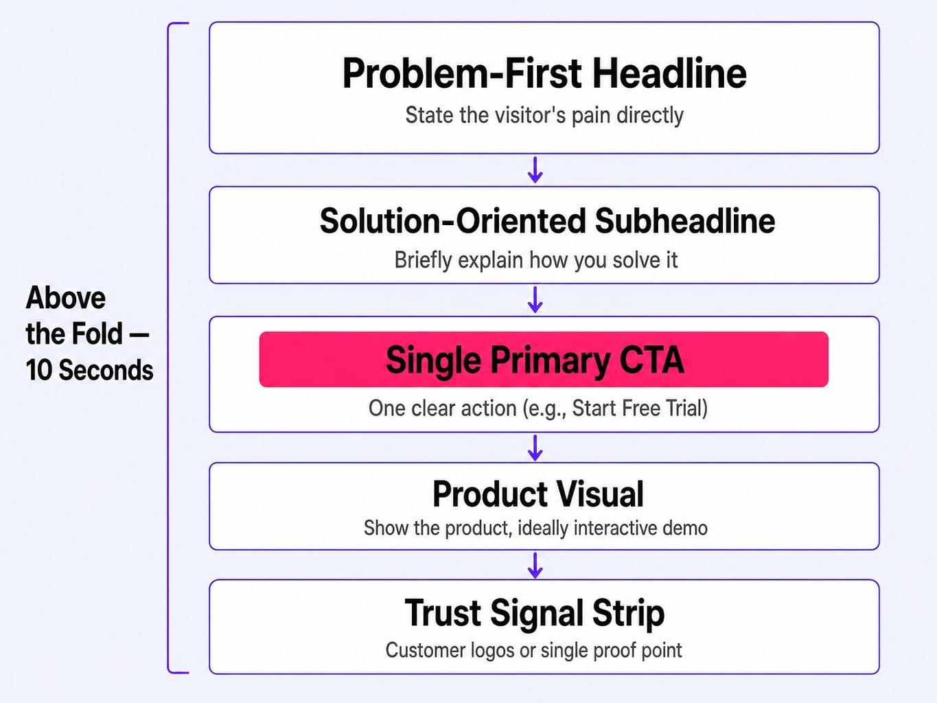
This structure also improves your fold density—the ratio of meaningful content to decorative space. Most sites waste 40% of their critical above-the-fold real estate on abstract stock imagery. Your homepage headline must pass the 'so what' test. If a visitor can't identify their problem in your headline within three seconds, the rest of the page doesn't matter.
Read more: SaaS Landing Page Best Practices: What Actually Converts in 2026 | Spike AI
Your Pricing Page Is a Conversion Gate — Design It Like One
The pricing page is the highest-intent page on any SaaS website. Visitors who land here are actively evaluating a purchase. Yet most teams treat it as an afterthought—a table of features slapped together after the homepage redesign is approved. This is a critical mistake.
According to OpenView, 55% of private SaaS unicorns now publish their pricing publicly. The trend is overwhelmingly toward transparency, because modern buyers want to self-educate before engaging sales. Designing a high-converting pricing page isn't about whether to show prices; it's about how the page's structure and clarity guide the visitor toward a confident decision.
Structure the Page to Reduce Comparison Fatigue
Most pricing pages fail because they present too many tiers with too many feature rows. This creates comparison fatigue, a state of cognitive overload that leads directly to abandonment. The goal is to make the decision easier, not more comprehensive.
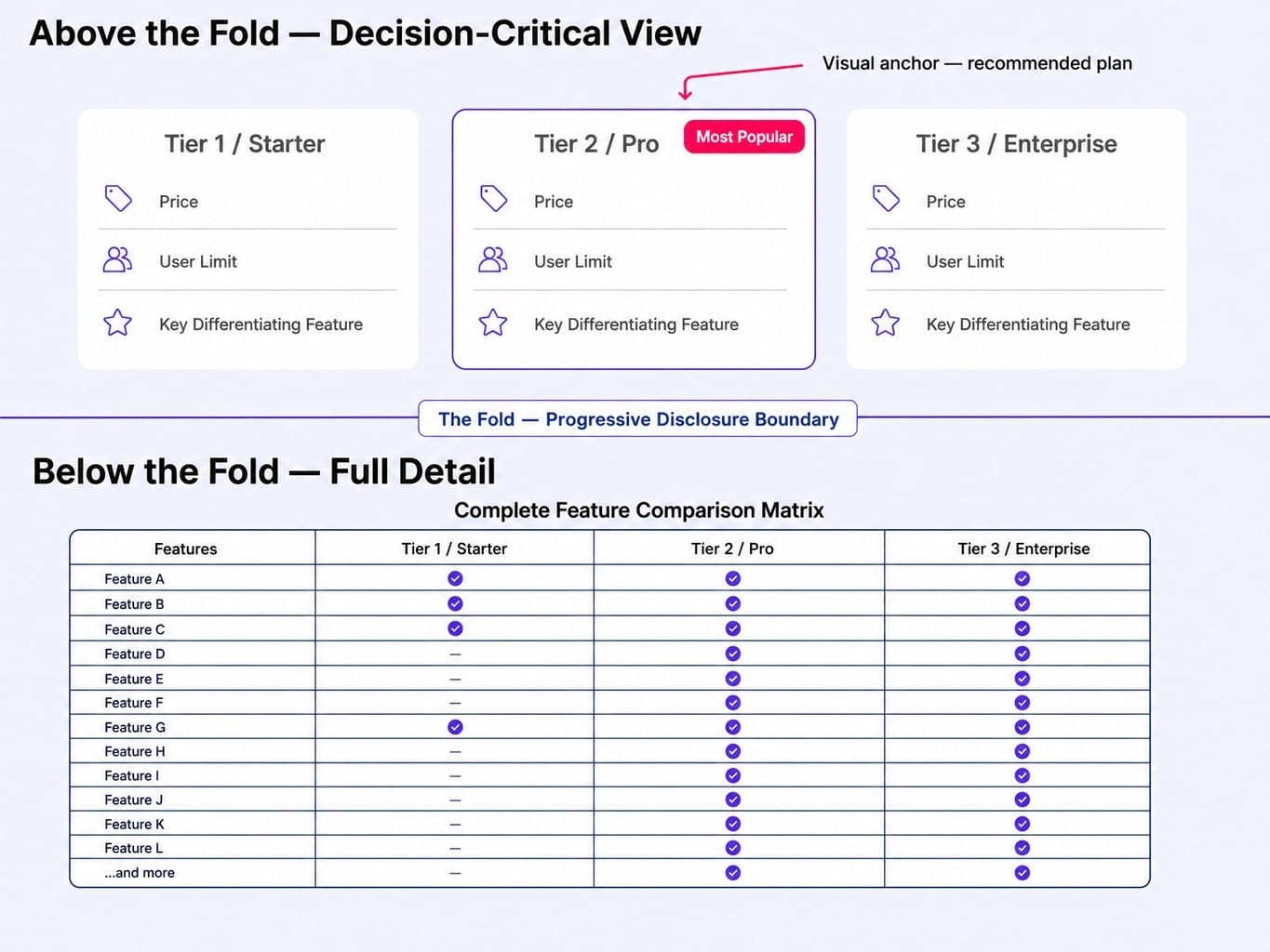
The structural best practice is to limit your offering to three tiers maximum. Visually anchor the recommended tier with a border, a different color, or a "Most Popular" badge to create a clear focal point.
Then, apply the progressive disclosure pattern. Above the fold, show only the decision-critical differences: price, user limits, and the one or two key features that define each tier. For visitors who need granular detail, place a full feature comparison table below the fold. This serves the expert buyer without overwhelming the new visitor. Your pricing page is an information architecture problem, not just a graphic design one.
Transparency Builds Trust — Hidden Pricing Builds Suspicion
Hiding pricing behind a "Contact Sales" wall is increasingly a conversion killer, not a qualification strategy. For mid-market SaaS, the data is clear: transparency wins. Research from ChartMogul shows that 50% of trialists convert within seven days. This means your highest-probability conversion window is when intent is hottest. Forcing a sales conversation adds days of friction precisely when the buyer is most motivated to act.
Of course, there's a legitimate exception: enterprise-only products with genuinely custom pricing and complex implementations. But for any SaaS with standardized tiers, hiding the price signals a lack of confidence and forces a comparison based on sales pitches rather than product value.
The "we need to qualify leads" objection usually masks a fear of price comparison. If your product delivers value, the price should be a point of confidence, not a secret. Pricing visibility is a trust signal.
Read more: SaaS Pricing Strategy That Compounds: Models, Value Metrics, and Governance for 2026 | Spike AI
Design for Two Buyers at Once: PLG Self-Serve and Enterprise Sales-Led
Most SaaS websites are designed for one buyer motion—either a self-serve signup or a demo request. But the fastest-growing companies serve both simultaneously, and their website architecture reflects that.
Consider a 50-person SaaS company whose product is used by individual contributors (who want to try it for free) and enterprise teams (who need a security review and custom pricing). Their current website has a single "Book a Demo" CTA. This architecture forces every self-serve buyer who would have signed up in two minutes into a 48-hour wait for a sales call they never wanted. It's a conversion funnel built to leak revenue.
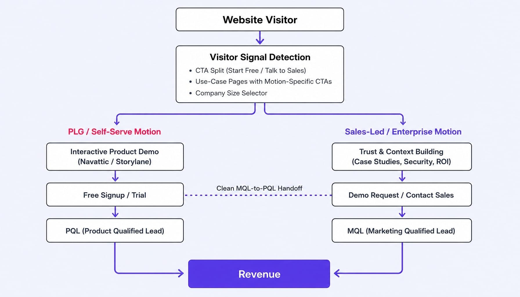
A dual-motion architecture creates distinct paths. The website's job is to route visitors to the right conversion flow based on their signals. This can be achieved through:
- A simple "Start Free" / "Talk to Sales" CTA split in the hero.
- Use-case pages with motion-specific CTAs.
- A company size selector that dynamically changes the primary CTA.
The goal is a clean MQL-to-PQL handoff. For product-led growth (PLG) visitors, the website's job is to get them into the product as fast as possible. For enterprise visitors, its job is to build enough trust and context to justify a conversation. Tools like Navattic or Storylane allow you to embed interactive product demos that serve the PLG motion by letting users experience value immediately, without requiring a full signup. Pairing a short launch video in the hero with an interactive demo lifts trial signups by 30 to 50 percent versus either alone. Don't force one buyer type into the other's conversion path.
Let Behavioral Data Decide What to Fix — Not Your Last Stakeholder Meeting
Imagine a redesign kickoff meeting. The CEO wants the homepage to "feel more premium." The VP of Sales wants the demo form above the fold. The product team wants an interactive tour. The marketing team has no behavioral data to arbitrate between these opinions. The result? A redesign driven by the loudest voice in the room, not by evidence of what's actually causing visitors to leave.
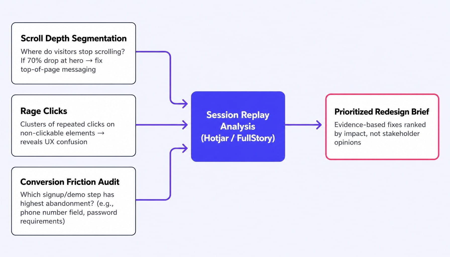
The single most valuable pre-redesign investment is instrumenting your current site with a session replay tool like Hotjar or FullStory. Instead of guessing, you can analyze three specific behavioral signals:
- Scroll Depth Segmentation: Where do visitors stop scrolling on key pages? If 70% of visitors never scroll past your hero section, the problem is your top-of-page messaging, not the rest of the page design.
- Rage Clicks: Where are visitors repeatedly clicking on elements that aren't clickable? These clusters reveal profound UX confusion and unmet user expectations.
- Conversion Friction Audit: At which specific step in the signup or demo-request flow do most visitors abandon? Is it the password requirements? The request for a phone number? This tells you exactly where your funnel is broken.
These signals translate directly into a prioritized redesign brief. If rage clicks cluster on a static feature grid, the fix is an interactive component, not a new color palette. You've been letting opinions drive your website decisions when you should have been letting behavior drive them.
Protect Your SEO Equity During a Redesign — Or Lose 6 Months of Traffic
Most SaaS website redesigns inadvertently destroy months of accumulated SEO equity. The team treats it as a design project, not a migration project, and the consequences can be catastrophic.
Here's a common failure pattern: a company redesigns its site, changes the URL structure from /features/analytics to /product/analytics-dashboard, fails to set up proper 301 redirects, and watches its organic traffic drop 40% over the next eight weeks.
Google treats a changed URL as a brand-new page unless it's told otherwise. Redirect chains—where an old URL redirects to an intermediate URL which then redirects to the new one—further dilute link equity. To prevent this, your redesign process must include a technical SEO migration plan.
Here is a concise, actionable pre-launch checklist:
- Crawl your existing site using Semrush or Google Search Console and export a list of all indexed URLs. This is your master list.
- Map every old URL to its new equivalent in a spreadsheet. This is your redirect map.
- Implement 1:1 301 redirects. No redirect chains. No lazy, catch-all redirects to the homepage. Every old page must point directly to its new counterpart.
- Preserve semantic heading hierarchy. Ensure the H1/H2 structure on migrated pages remains logically consistent.
- Submit your updated sitemap to Google Search Console immediately after launch.
- Monitor crawl errors in Search Console daily for the first two weeks post-launch to catch and fix any broken redirects.
This isn't optional. It's the cost of entry for a successful SaaS website redesign.
The Real Best Practice: Stop Treating Your Website Like a Project
The problem with "SaaS website best practices" as a concept is that it implies a checklist you complete once. But the teams that consistently outperform don't just launch a better website; they run a better system. They don't redesign every two years and hope for the best—they ship small, high-impact changes every week and let those changes compound.
The math is undeniable. A team that improves its conversion rate by just 1% per week (a relative, not absolute, improvement) will achieve a 67% cumulative gain over a single year. A team that redesigns once every 18 months gets one big shot and then stagnates until the next cycle. BiggerPockets, for instance, improved its signup conversion rate by 72% over nine months not from one big redesign, but from continuous, iterative A/B testing.
This exposes the real constraint for most marketing teams: the execution gap. You know what needs to change—the behavioral data tells you. But the latency between identifying a fix and shipping it—through design reviews, developer tickets, staging environments, and QA—eats weeks. By the time one fix ships, three more have piled up in the backlog. The cadence stalls.
The most important best practice isn't a single design decision. It's building an operational rhythm of continuous optimization.
What If the Execution Gap Didn't Exist?
The article has built a specific tension: the best SaaS website practice is continuous optimization, but most teams can't execute it. The latency between "we know what to fix" and "it's fixed" is measured in weeks, not hours. Your team knows the hero section messaging is underperforming—the session replays prove it. But the fix requires a copywriter, a designer, a developer, and a sprint slot. By the time it ships, the opportunity cost of the fixes sitting in the backlog is immense.
Spike AI is the system that closes that gap. It's not a website builder or a CRO tool; it's an execution engine.
Every week, Spike AI identifies the highest-impact change across your website—whether it's messaging, CTA placement, page structure, or SEO—and then deploys it. No dev tickets. No agency briefs. No quarterly redesign cycles. The weekly cadence is the point. Each fix compounds on the last, turning your website from a static project into a continuously improving conversion surface. That 1% weekly improvement that produces 67% annual gains requires a system that can actually ship weekly. That is what Spike AI provides.
See how Spike AI turns your website backlog into weekly shipped improvements
A SaaS website is never "done." The most critical belief shift is realizing that best practices are not a checklist you complete during a redesign—they are an operating rhythm you maintain continuously.
The static decisions matter: your messaging hierarchy, pricing transparency, and dual-motion architecture set the foundation. But their effectiveness decays without a system for continuous behavioral measurement and iterative improvement. The teams converting at 6% and higher aren't necessarily smarter about design; they simply ship more changes, faster, grounded in behavioral evidence rather than stakeholder opinions.
The next time someone on your team says, "we need a redesign," ask instead: "what's the single highest-impact change we can ship this week?" That question, repeated 52 times a year, will outperform any redesign.
Frequently Asked Questions
What accessibility standards should a SaaS website meet in 2026?
WCAG 2.2 Level AA is the practical baseline, covering keyboard navigation, color contrast ratios, and screen reader compatibility. Beyond compliance, accessible design directly improves conversion by benefiting all users. Treat accessibility as a core UX investment, not just a legal checkbox.
What is the best CMS platform for a SaaS website redesign?
For most B2B SaaS teams, it's a choice between Webflow (visual, marketer-friendly) and a headless CMS like Contentful or Sanity paired with a framework like Next.js (more flexible, for teams with dev resources). Choose Webflow for marketing autonomy; choose headless for component-level control and API-driven content.
How often should a SaaS company redesign its website?
A full redesign every 2-3 years is common, but a site that gets continuous small optimizations weekly will outperform one that gets a big redesign and then stagnates. Redesign when your brand, product, or ICP fundamentally shifts—not just because the site "looks dated."
How do interactive product demos on a SaaS website affect conversion rates?
Interactive demos from tools like Navattic or Storylane let visitors experience the product's value before committing to a trial or call, reducing perceived risk. They are most effective on product and pricing pages. Keep them focused on one core workflow and under 60 seconds for maximum impact.
Should a SaaS website use a freemium signup or a demo request CTA?
It depends on your average contract value and product complexity. Products under ~$500/month should default to self-serve signup. Products above ~$2,000/month should lead with demo requests. The mistake is forcing every visitor, regardless of their intent or size, into a single path.
How do I build a SaaS website design system that scales with new features?
Start with modular CMS blocks—reusable components (hero sections, feature grids, testimonials) built in Figma with corresponding code in Storybook or your CMS. Use component tokenization for colors and typography so updates propagate globally. The goal is to assemble new pages from existing blocks, not design from scratch.