The SaaS Website Best Practices Guide: From Static Brochure to Conversion System
TLDR
- Your go-to-market model—product-led or sales-led—should dictate your site's architecture, not a generic template.
- Treat your homepage as a routing mechanism for the B2B buying committee, not a summary of your product. Each scroll section should address a different stakeholder's primary objection.
- Replace static product screenshots with embedded interactive demos to reduce the prospect's time-to-value and qualify leads based on in-product engagement.
- Implement a Lighthouse performance budget to prevent site speed degradation as your marketing stack grows, and structure content with semantic HTML for AI answer engine extractability.
- Stop treating your website as a periodic redesign project. The highest-performing SaaS websites are continuously optimized systems that compound gains weekly.

Most SaaS websites are redesigned every two to three years, launched with fanfare, and then left to decay until the next cycle begins. The problem is not that these sites look bad—it's that they are built as static brochures rather than as continuously optimized conversion systems.
This creates a fundamental disconnect. The gap between what a SaaS website could do (qualify visitors, accelerate pipeline, reduce sales cycle friction) and what it actually does (display features and hope someone clicks 'Book a Demo') is where revenue gets lost.
The SaaS website best practices that matter in 2026 are not about aesthetics or fleeting layout trends. They are about aligning every page to activation metrics, designing for multi-stakeholder buying committees, and building technical infrastructure that compounds performance over time. This guide covers the architectural decisions, page-level execution, and the technical layer most teams ignore, moving your site from a brochure to a system.
Why Most SaaS Websites Fail: The Brochure Problem
The default SaaS website architecture—homepage, features, pricing, blog, contact—was designed for a world where buyers read marketing copy and then called sales. That world is shrinking. Today's B2B buyers self-educate across multiple touchpoints before ever engaging, and your website must function as the primary qualification and activation layer.
Consider this scenario: a three-person marketing team at a $10M ARR SaaS company redesigns their site on Webflow. It launches, they see a brief traffic bump, and then watch conversion rates settle back to the industry average of 1.8% within 90 days. The problem was never the design; it was that the site was not architected around how modern buyers actually move through a decision. Despite massive investment in design and CRO platforms, that ~2% average conversion rate persists because the underlying problem is systemic, not cosmetic.
The best practices that follow aren't a checklist of visual elements. They represent an architectural philosophy: aligning your site structure to buyer behavior and activation metrics.
PLG vs. Sales-Led: Your Go-to-Market Model Should Shape Your Site Architecture
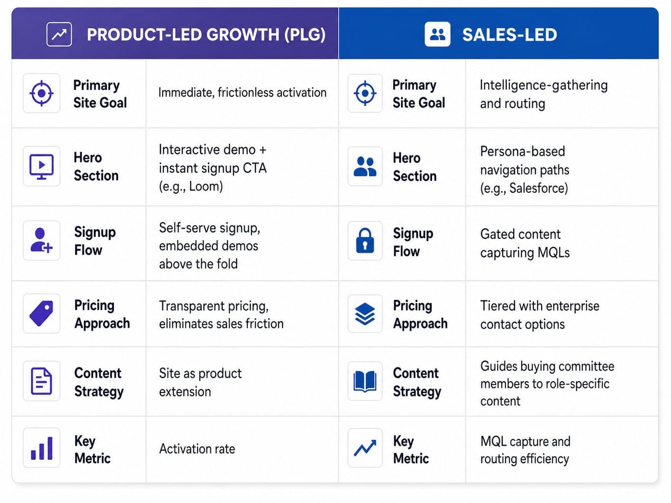
The single biggest architectural mistake SaaS companies make is adopting a generic website template regardless of their go-to-market motion. A product-led growth (PLG) company needs a site built for immediate, frictionless value. This means self-serve signup flows, interactive product demos from tools like Navattic or Storylane embedded above the fold, and pricing transparency that eliminates sales friction. The goal is activation, and the site must be an extension of the product itself. Think of Loom's homepage, where the hero section is essentially a product demo with an instant signup CTA.
A sales-led company, however, requires a different system. The site must serve as an intelligence-gathering and routing mechanism. This means persona-based navigation paths, a gated content strategy that captures MQLs, and a structure that guides different buying committee members—the technical evaluator, the economic buyer, the end user—to different content. Salesforce's homepage is a classic example, immediately routing visitors by role and industry. The best practices are contextual; what works for PLG will actively hurt a sales-led motion, and vice versa.
Read more: Stop Syncing Strategy and Execution: Platforms That Unify Marketing Goals With Task Management
Treat Your Docs Site and Marketing Site as One Experience
In 2026, the artificial wall between your "marketing site" and your "documentation" is a conversion liability. B2B buyers, especially the technical evaluators on a buying committee, move fluidly between marketing pages and docs during their evaluation. If the docs site looks and feels like a different product, using different navigation and requiring a separate login, the buyer's confidence in your product's coherence plummets.
Imagine a DevOps lead evaluating your tool. They click from a polished features page to your API documentation and are met with a completely different design system and a confusing navigation structure. That friction translates directly to lost trust. The solution is a unified experience, often enabled by a shared design token system and navigation shell across both properties. Headless CMS architectures from providers like Contentful or Sanity, paired with modern frontend frameworks like Next.js on Vercel, make this technically feasible without forcing your marketing team to manage the docs codebase. Your docs site is a critical conversion asset, not just a support cost center.
Homepage and Hero Section: Messaging Hierarchy That Converts Buying Committees
Most SaaS homepages fail not because the headline is weak, but because the messaging hierarchy is wrong. They try to say everything to everyone above the fold and end up communicating nothing. Your homepage is not a summary of your product; it is a routing mechanism that must accomplish three things in under five seconds: confirm the visitor is in the right place, communicate the primary outcome the product delivers, and provide a clear next action.
Picture a VP of Marketing landing on a homepage. They see a headline about "AI-powered analytics," a subheadline about "empowering teams," a product screenshot, three feature icons, a customer logo bar, and two CTAs ('Start Free Trial' and 'Book a Demo'). Every element is individually reasonable, but together they create cognitive overload. The VP bounces. High-converting SaaS homepages like those from Notion or Linear understand that conversion is a sequencing problem. They sequence their messaging: outcome headline → single supporting visual → one primary CTA → scroll to social proof → scroll to feature-benefit mapping.
Above the Fold: One Outcome, One Action, One Visual
Above-the-fold density is the most common SaaS homepage mistake. The rule should be ruthlessly simple: one outcome-oriented headline, one supporting subheadline, one core visual, and one primary call-to-action.
The headline must communicate the buyer's gain, not your product's function. This is time-to-value messaging. A bad headline is feature-focused: "AI-Powered Revenue Intelligence Platform." A better one is outcome-focused: "See which deals will close this quarter—before your reps do."
The visual should be a clean product screenshot or a short, auto-playing demo—not abstract stock illustration. It needs to ground the headline's promise in reality.
Finally, the CTA hierarchy must eliminate decision paralysis. If you have both a free trial and a demo booking, one must be visually dominant. The primary CTA button should align with your main GTM motion (e.g., 'Start free trial' for PLG, 'Book a demo' for sales-led). A secondary, text-link CTA is acceptable, but two equally weighted buttons create friction at the most critical moment.
Below the Fold: Feature-Benefit Mapping for the Buying Committee
The below-the-fold content on your homepage should be designed for the buying committee, not a single visitor. In B2B SaaS, the person who first lands on your site is rarely the sole decision-maker. The homepage scroll sequence must strategically address different stakeholders' concerns.
Think of it as a buyer journey page mapping exercise, executed vertically.
- Immediately below the fold: Social proof and customer logos. This establishes credibility for the economic buyer and de-risks the evaluation.
- Next section: A 3-step value proposition that maps features to business outcomes. This speaks to the champion who needs to sell the solution internally.
- Following section: Integration logos or a technical architecture diagram. This addresses the technical evaluator who needs to know if your product will fit their stack.
- Final section before the footer: A case study teaser with a compelling ROI metric or a direct link to a comparison page. This provides ammunition for the budget holder.
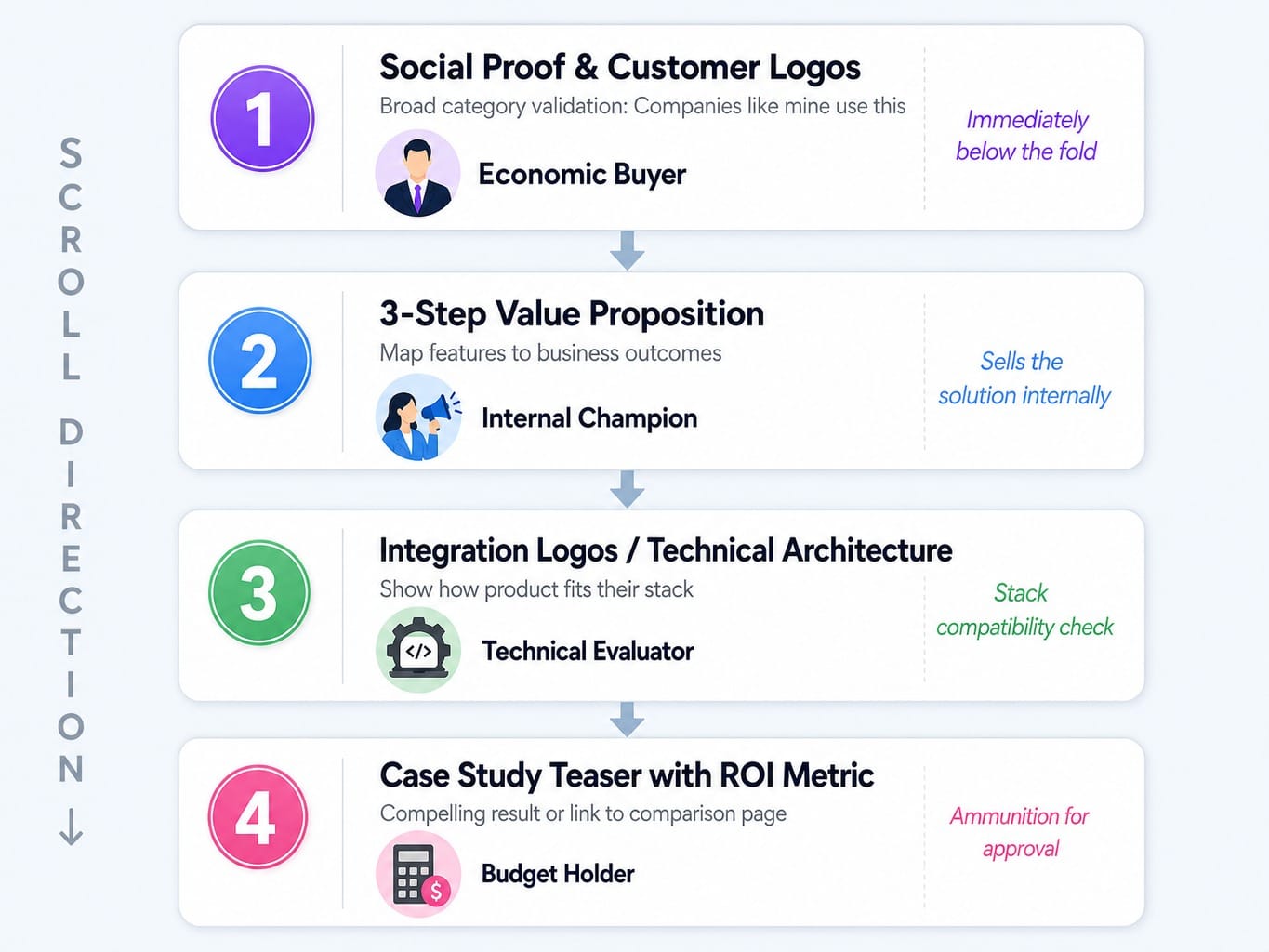
Some teams even use tools like Clearbit Reveal to personalize this sequence based on visitor firmographic data, dynamically prioritizing which stakeholder concerns appear first. The goal isn't just "more content"; it's about sequencing arguments for different decision-makers as they scroll.
Pricing Page Optimization: Transparency as a Conversion Lever
The pricing page is the highest-intent page on any SaaS website. Visitors who reach it are no longer asking "what is this?" but "is this for me?" Your page's job is to remove the remaining friction, not create new objections. Yet most SaaS pricing pages introduce friction through vague "Contact Sales" CTAs, feature comparison tables that obscure rather than clarify, and tier names that mean nothing to the buyer.
Imagine a growth marketer evaluating two competing tools. Tool A shows three tiers with clear pricing, a comparison table that highlights the most popular plan, and a 14-day free trial CTA. Tool B shows two tiers and a third "Enterprise" tier that says "Contact Us." The marketer has budget authority up to $500/month. Tool B's enterprise plan might be well within budget, but the "Contact Us" wall signals a long sales process, and the marketer defaults to Tool A.
Pricing transparency isn't about showing every number; it's about removing unnecessary friction.
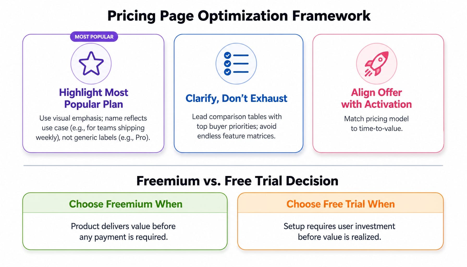
- Highlight the most popular plan. Use visual cues and name it something meaningful that reflects the use case ("For teams shipping weekly") rather than a generic label ("Pro").
- Use comparison tables to clarify, not exhaust. Lead with the capabilities buyers care most about. Don't create an endless feature matrix that forces users to squint and scroll.
- Align your offer with activation. The freemium vs. free trial decision should be based on your product's time-to-value. Freemium works when the product delivers value before any payment is required. A free trial is better when setup requires some user investment.
Tools like Mutiny can even help personalize pricing page content based on visitor segment, but the foundational principle is universal: make the decision easy.
Interactive Demos and Self-Serve Activation: Replacing the Screenshot Carousel
Static product screenshots and feature icon grids are the SaaS website equivalent of a restaurant menu with no photos. They describe the experience without letting the buyer taste it. In 2026, the highest-converting SaaS websites embed interactive product demos directly into marketing pages, allowing visitors to experience the core workflow before signing up or talking to sales.
This isn't about replacing the sales demo; it's about qualifying visitors by letting them self-select. Consider a RevOps manager evaluating workflow automation tools. On Site A, they see a hero screenshot and a "Book a Demo" button. They add it to a list and move on. On Site B, they engage with an embedded interactive demo, complete a 90-second guided workflow, and immediately understand how the tool fits their process. Site B gets the demo booking because it delivered value first.
The key is progressive disclosure UX: show the single most valuable workflow, not a full product tour. Tools like Navattic and Storylane are purpose-built for creating these embeddable demos without engineering resources. This approach also serves as an activation metric alignment tool. You can measure which demo steps visitors complete, using that data to inform the MQL-to-PQL handoff on-site and arm your sales team with context before they even make contact. Interactive demos are not a nice-to-have; they are a structural advantage in reducing a prospect's time-to-value.
Technical Performance and AI Readiness: The Infrastructure Layer Most Teams Ignore
Discussions of saas website best practices almost always stop at the visual and content layer. But the technical infrastructure underneath determines whether those optimizations compound or decay. Two infrastructure decisions matter most in 2026: performance budgets that protect Core Web Vitals, and a semantic HTML structure that makes your content extractable by AI answer engines. These are the differences between a website that performs well on launch day and one that performs well continuously. Google's own guidance confirms that Core Web Vitals are a ranking signal and that its AI Overviews source from well-structured pages, directly connecting performance and AEO readiness to discoverability.
Performance Budgets: Protecting Core Web Vitals as Your Site Scales
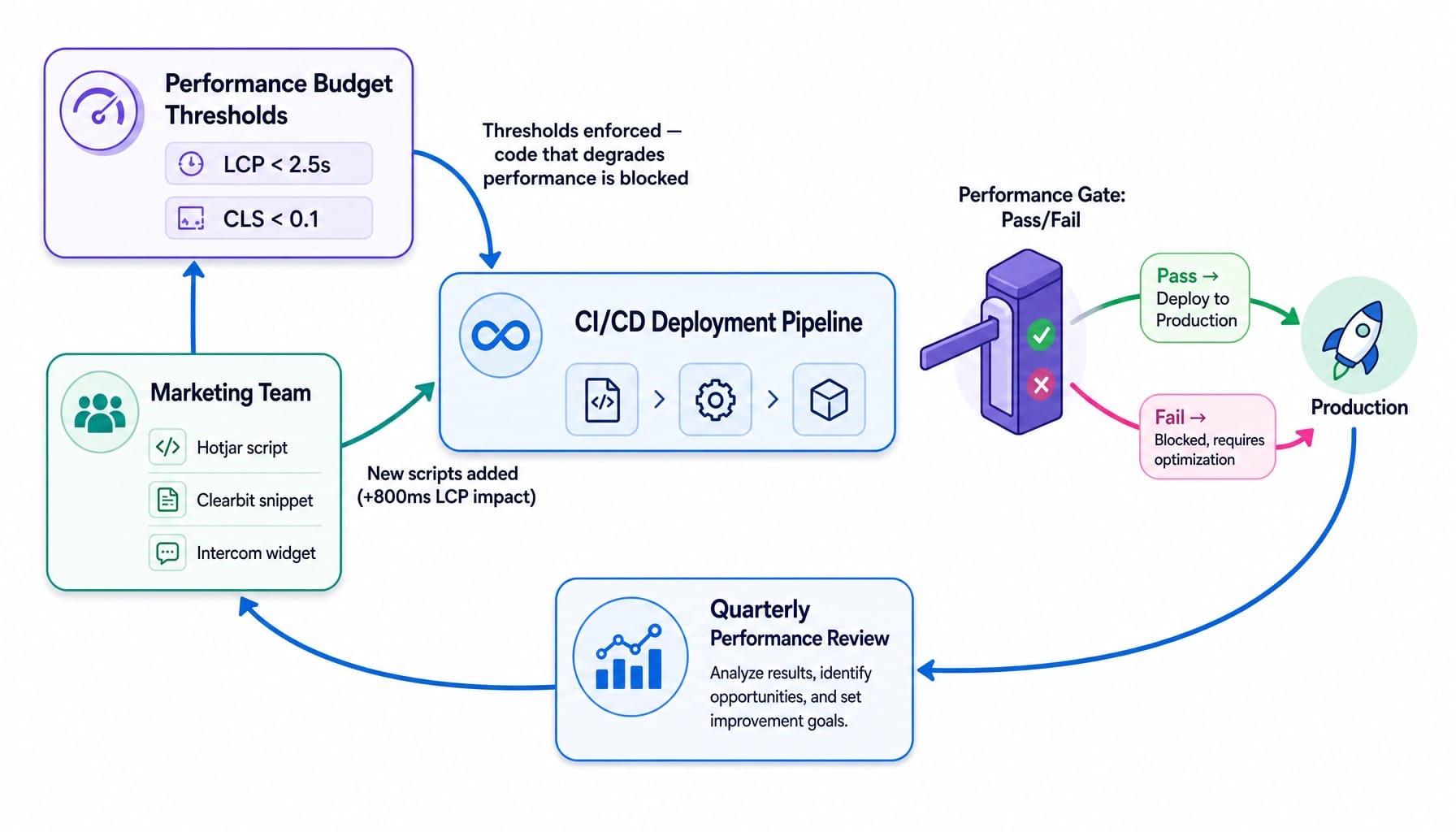
Most SaaS websites pass Core Web Vitals on launch day and fail them within six months. Marketing adds tracking scripts, chat widgets, video embeds, and third-party integrations. Each addition is small, but collectively they can add seconds to your load time.
The solution is a Lighthouse performance budget: a set of thresholds (e.g., LCP under 2.5s, CLS under 0.1) that are enforced in your deployment pipeline. No code that would degrade performance below the threshold can be pushed live. This forces a conversation. A marketing team might add a Hotjar script, a Clearbit snippet, and an Intercom widget, collectively adding 800ms to LCP. A performance budget makes that cost visible. Work with engineering to establish this budget and review it quarterly. Modern frameworks like Next.js and platforms like Vercel make this easier through features like built-in image optimization and edge rendering. Performance is not a one-time fix; it's an ongoing constraint to be managed.
Semantic HTML and Structured Content for AI Answer Engine Visibility
Your website in 2026 needs to be designed for three audiences: human visitors, traditional search crawlers, and AI answer engines like Google's AI Overviews. The practical implication is that every key page must use semantic HTML for AEO extraction. This means proper heading hierarchy (one H1, logical H2s and H3s), descriptive section elements, and meaningful alt text.
This isn't about creating special llms.txt files; Google's guidance explicitly states those are unnecessary. It's about writing content in self-contained, extractable sections with direct answers at the top of each block. Audit your top pages for passage extractability: can each H2 section stand alone as a coherent answer if pulled out of context? If your section on "Pricing" begins with a long narrative before stating the price, an AI can't easily extract the answer. AEO readiness is an extension of good content structure, not a separate discipline.
Trust Architecture: Building Credibility as a System, Not a Checklist
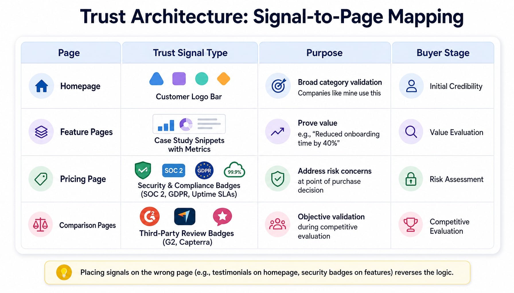
Most SaaS websites treat trust signals as decoration: a customer logo bar on the homepage, a testimonial on the pricing page, a SOC 2 badge in the footer. This scattershot approach wastes your most powerful conversion lever. Trust should be architected as a system, with specific signals placed at specific decision points.
Here is a simple framework:
- Homepage: The customer logo bar serves as broad category validation ("Companies like mine use this"). It's for initial credibility.
- Feature Pages: These need case study snippets that connect a feature to a measurable business outcome ("Reduced onboarding time by 40%"). It's about proving value.
- Pricing Page: This is where security and compliance badges (SOC 2, GDPR, uptime SLAs) belong. The buyer is now evaluating risk, not just features.
- Comparison Pages: Here, third-party review site badges (G2, Capterra) are most powerful. The buyer is in competitive evaluation mode and needs objective validation.
Placing testimonials on the homepage and security badges on the features page reverses the logic. Use tools like PostHog or Hotjar to create scroll depth heatmaps and see if visitors are even seeing the trust signals you've placed. Measure page-level conversion attribution to understand which signals actually correlate with downstream conversions. This is about engineering credibility at each decision point.
Why Continuous Optimization Requires a System, Not a Sprint
This guide has built a cumulative tension. A truly high-performing SaaS website requires continuous attention to architectural decisions, page-level messaging, pricing transparency, interactive demos, technical performance, and trust architecture. Each of these demands not just initial implementation but a constant variant testing cadence, scroll depth analysis, and performance budget enforcement.
The honest reality is that a lean marketing team of 1-5 people cannot maintain all of this simultaneously. They will optimize the homepage, neglect the pricing page, fix Core Web Vitals, then watch them degrade as new scripts are added. This is the execution gap.
This is where a marketing execution engine like Spike AI closes that gap. It's a system designed to continuously identify the highest-impact optimization across your entire site—whether it's a hero section messaging change, a pricing page CTA adjustment, or a performance regression—and ship it weekly. Spike AI isn't a tool that replaces your judgment; it's the execution layer that turns your strategic clarity into a consistent shipping cadence. The result is a website that compounds improvements weekly, without the endless cycle of engineering tickets and agency retainers.
See how Spike AI turns your website optimization backlog into weekly shipped improvements
Read more: Landing Page Conversion Rate Optimization: A Revenue-Weighted Playbook
Conclusion
The most important belief shift for any SaaS team is this: website best practices are not a redesign checklist you execute once every 2-3 years. They are an operating system for continuous conversion optimization. The best SaaS websites in 2026 are architected around buyer activation, not just aesthetics. They are structured for AI extractability, not just traditional SEO. And they are maintained through a continuous optimization cadence, not periodic, disruptive redesign sprints. The teams that win will not be the ones with the best-looking website on launch day—they will be the ones whose website is measurably better this week than it was last week.
Frequently Asked Questions
Should a SaaS startup build a custom website or use a no-code platform like Webflow?
For teams under $5M ARR with no dedicated frontend engineer, a platform like Webflow provides faster iteration and lower overhead. Move to a custom build (e.g., Next.js + headless CMS) when you need programmatic pages, deep personalization, or performance control that no-code platforms can't provide, typically around the $10M ARR stage.
How often should a SaaS company redesign its website versus optimizing incrementally?
Full redesigns should only happen when the site architecture no longer supports your go-to-market motion, like shifting from sales-led to PLG. For everything else, continuous incremental optimization outperforms periodic redesigns by compounding gains weekly rather than resetting every 2-3 years and destroying months of learned optimization data.
Should a SaaS website use a headless CMS or a traditional CMS?
A headless CMS (Contentful, Sanity) is worth the complexity when you need to publish content across multiple frontends (marketing site, docs, in-app), require component-driven page building for non-engineers, or must decouple content updates from engineering deployments. For sites under 50 pages managed by one team, a traditional CMS or Webflow is simpler.
What accessibility standards should a SaaS website meet in 2026?
Target WCAG 2.2 Level AA compliance at minimum. For SaaS sites, focus on making interactive demos and signup flows keyboard-navigable, ensuring sufficient color contrast on CTAs and pricing tables, and adding descriptive alt text to product screenshots. Accessibility is also a procurement requirement for many enterprise buyers, making it a conversion factor.
How do I measure whether a SaaS website redesign or optimization was successful?
Define success metrics before launching changes. The three that matter most are page-level conversion rate (not site-wide), activation rate (percentage of visitors completing a key first action), and pipeline velocity (time from first visit to demo booking). Vanity metrics like bounce rate are misleading without conversion context.