Whatagraph Alternatives 2026: Which Reporting Tool Actually Fits Your Stack

TL;DR
- Most teams leave Whatagraph due to unpredictable pricing, incomplete connector coverage, slow data syncs, and limited data blending capabilities.
- Before evaluating any tool, decide if you need a monolithic (all-in-one) platform for ease of use or a composable stack (pipeline + visualization) for control and scalability.
- Evaluate alternatives based on your primary bottleneck: connector breadth (Funnel.io), data transformation (Supermetrics), client presentation (DashThis), or cost (Looker Studio).
- Watch for hidden costs: per-source pricing models can inflate your bill 6x, and connector deprecation can break your reporting with no warning.
- No reporting tool solves the execution gap. The real problem isn't which dashboard to use, but the lack of bandwidth to act on what the dashboard shows.
If you've read three articles on Whatagraph alternatives, you've been pitched three different "#1-rated" products, each by the vendor who wrote the post. You've probably noticed the pattern. Every list is a thinly veiled ad, recommending the author's own tool while giving a superficial nod to others.
This isn't that article.
We're not going to sell you a reporting tool. Instead, this is a decision framework built by people who have migrated reporting stacks and felt the pain of a bad choice. We'll give you a way to evaluate your own needs before you look at any vendor's feature page. Then, we'll assess seven genuine Whatagraph competitors against that framework—including their real-world limitations.
Finally, we'll cover the hidden costs and operational risks that no vendor comparison ever mentions. Because choosing the right tool isn't about finding the longest feature list; it's about avoiding the next migration in 18 months.
Why Teams Actually Leave Whatagraph (Not Why Vendors Say They Do)
Vendors claim you're leaving Whatagraph over a missing feature that their tool just happens to have. The reality is usually more systemic. When a B2B SaaS team switches reporting tools every eighteen months, the compounding cost is not the subscription delta but the execution velocity lost during each migration: rebuilt dashboards, retrained stakeholders, and weeks where nobody trusts the numbers enough to act on them, which is precisely the gap that platforms like Spike AI close by removing the human-dependent layer between insight and on-site optimization.
The frustrations that trigger this costly cycle are almost always one of these five:
- Unpredictable Credit-Based Pricing: The per-source pricing model looks manageable at first. But for an agency, onboarding five new clients in a quarter can easily push you into a new credit tier, jumping your bill by 40% overnight. It makes per-client unit economics a moving target.
- The "55+ Connectors" Gap: The connector library seems adequate until you need a niche but critical source like CallRail, Klaviyo segments, or a custom internal API. You quickly discover the only workaround is a manual CSV upload, which defeats the entire purpose of an automated reporting platform.
- Daily Data Freshness Isn't Fresh Enough: A 24-hour sync interval is fine for monthly board reports. It's a liability during a campaign launch when your client or team needs to see performance data on an hourly basis. The dashboard is always a day behind the decisions you need to make.
- Superficial Data Blending: Whatagraph's data blending and calculated fields work for simple rollups like adding spend across platforms. They falter when you need true dimension mapping across sources—like joining Facebook Ad Set names to Google Analytics landing page paths to see which creative drives the most engaged traffic. The tool can't build the source-of-truth view you actually need.
- The Report-to-Action Gap: This is the deepest issue. Whatagraph is good at showing you what happened. It shows your cost-per-lead increased by 25%. It gives you no mechanism to understand why or what to do about it. The report becomes a deliverable, a piece of homework, not a solution.
If these sound familiar, the solution isn't just another tool with a similar architecture. It's a better evaluation process.
How to Evaluate a Whatagraph Alternative (Before You Look at Any Tool)
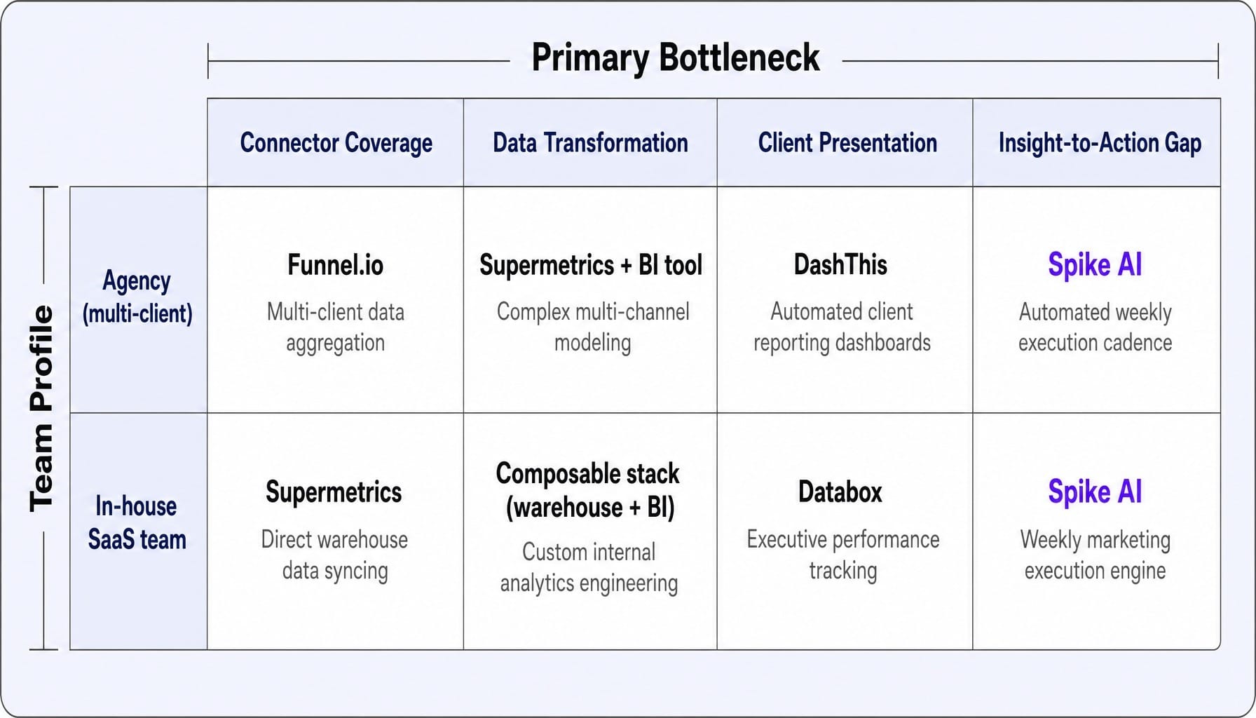
Most teams choose a new reporting tool by scanning feature lists and pricing pages. This is a recipe for another migration. The right approach is to diagnose your primary bottleneck first. Are you struggling with:
- Connector Coverage: You can't pull data from all your sources.
- Data Transformation: You can't blend or calculate metrics the way you need to.
- Client-Facing Presentation: Your reports look generic and aren't telling a clear story.
- The Insight-to-Action Gap: You have the data, but no bandwidth to implement changes.
Your answer determines which category of tool you should even be looking at. For example, an agency with 30 clients across four ad platforms has a connector breadth problem. A SaaS company with eight enterprise clients and a data warehouse has a data transformation problem. Same search query, completely different "best" alternative.
Before you review the tools below, make two architectural decisions first.
Connector Coverage vs. Data Freshness: You Probably Can't Optimize for Both
Here's the architectural tradeoff most vendors won't tell you about: platforms with the widest connector libraries (500+ sources) often rely on batch ETL pipelines that sync data every 6, 12, or even 24 hours. Conversely, tools with faster, near-real-time refresh rates tend to support a smaller, more curated list of native connectors.
I once spent three weeks migrating a seven-channel reporting stack to a competitor that promised native BigQuery exports, only to discover the connector for LinkedIn Ads pulled campaign-level data but not creative-level breakdowns. This single gap in field-level coverage meant we had to rebuild our entire attribution layer manually in Looker Studio, costing the growth team a full sprint.
The lesson: a tool with 500+ connectors that syncs every 12 hours is useless during a Black Friday campaign. A tool with 60 connectors that offers 1-hour syncs for the three you actually use is far more valuable. "Most connectors" is not the same as "the right data, on time."
Monolithic Platform vs. Composable Reporting Stack
Your second decision is whether you want an all-in-one platform or a modular, "composable" stack.
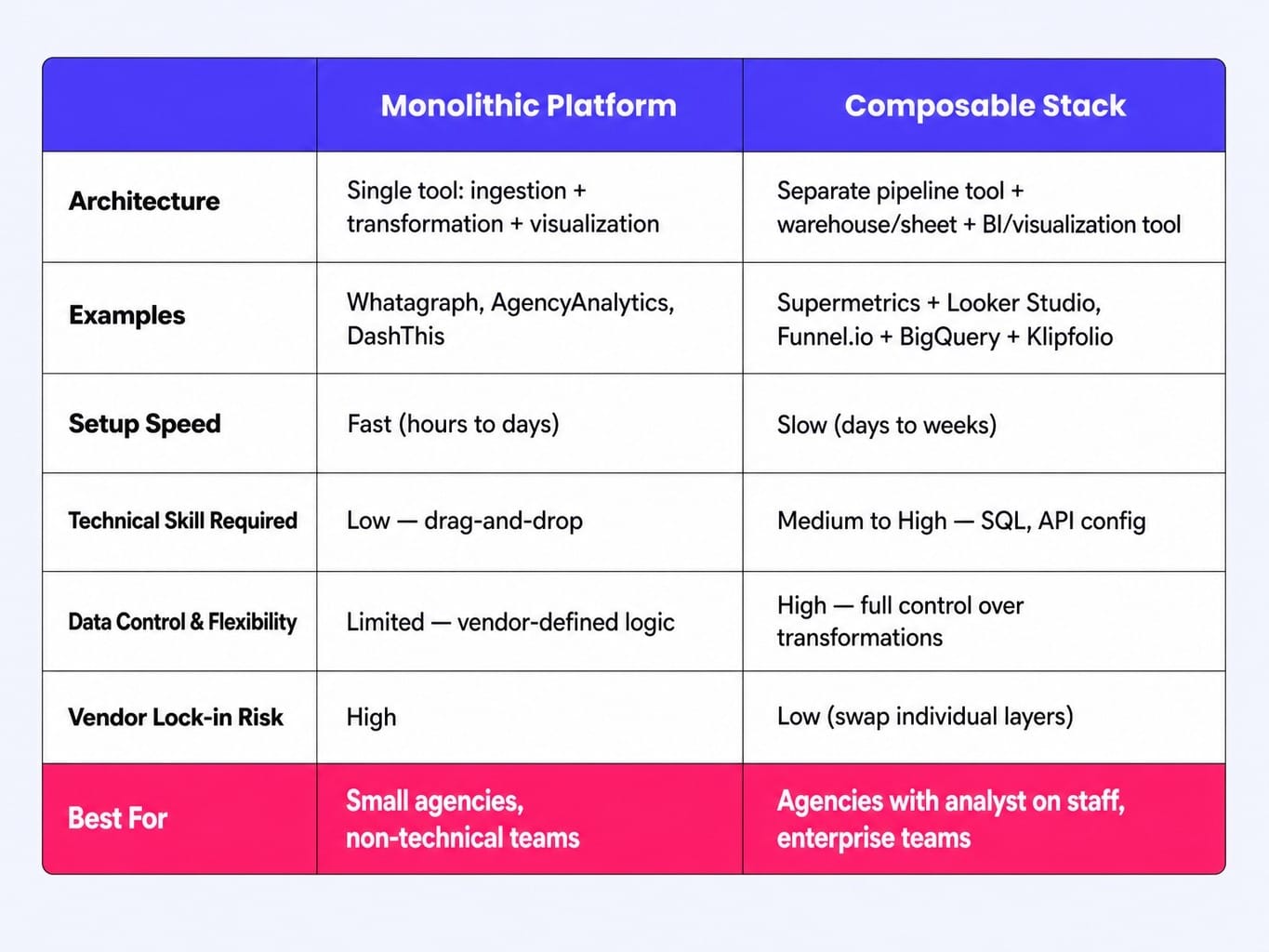
- Monolithic Platforms (e.g., Whatagraph, AgencyAnalytics, DashThis): These tools handle data ingestion, transformation, and visualization in a single, user-friendly interface. They are faster to set up and ideal for non-technical teams. The tradeoff is vendor lock-in and less control over the underlying data logic.
- Composable Stacks (e.g., Supermetrics + Looker Studio): This approach uses a dedicated data pipeline tool (like Supermetrics or Funnel.io) to pull data into a warehouse or spreadsheet, and a separate visualization layer (like Looker Studio or Klipfolio) to build reports. It offers far more control and flexibility but requires more technical skill to manage.
A three-person agency with no data engineer should almost always choose a monolithic platform. A 20-person agency with an analyst on staff will get more leverage from a composable stack. Know which path you're on before you start comparing features.
7 Whatagraph Alternatives Worth Evaluating in 2026
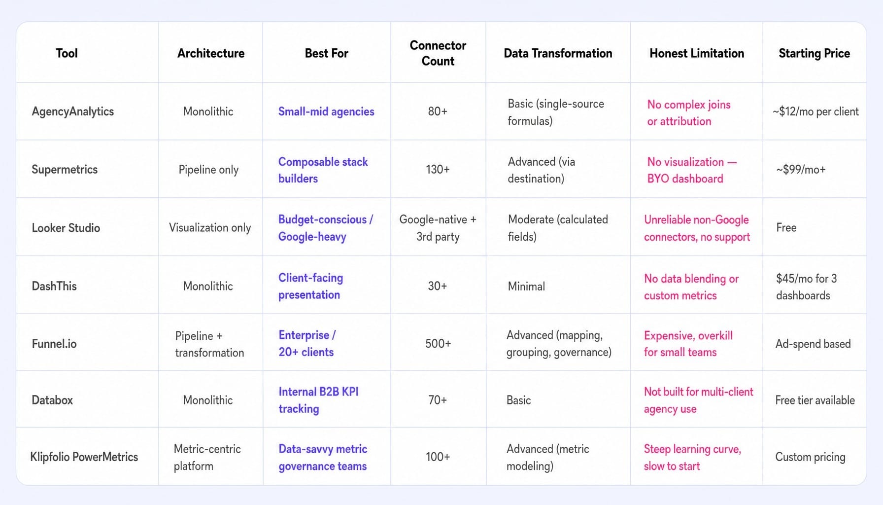
With that framework in mind, here are seven Whatagraph competitors, each representing a different architectural choice. We've assessed them based on the four common bottlenecks, leading with a clear "Best for" verdict so you can find your fit.
1. AgencyAnalytics
- Best for: Small-to-midsize agencies needing an easy-to-use, all-in-one client reporting and management platform.
- Strengths: AgencyAnalytics is purpose-built for the agency workflow. It combines reporting with SEO tools (rank tracking, site audits) and project management features. With 80+ native integrations, it covers the core marketing channels well. Its white-label capabilities are strong, allowing for custom branding on reports and client-facing portals. The pricing is per-client, making it predictable and scalable.
- Honest Limitation: The data blending is basic. It's great for summing metrics across sources, but if you need to perform complex joins or multi-touch attribution modeling, you'll hit a wall. It's a reporting and presentation tool, not a data transformation engine.
- Pricing: Starts around $12/month per client campaign.
2. Supermetrics
- Best for: Teams that want to pull marketing data into a data warehouse (BigQuery, Snowflake), spreadsheet (Google Sheets, Excel), or BI tool (Looker Studio, Power BI).
- Strengths: Supermetrics is a data pipeline, not a dashboarding tool. Its core strength is its massive library of 130+ connectors with deep field-level coverage. It solves the data ingestion problem better than almost anyone. For teams building a composable stack, Supermetrics is the essential first layer that feeds everything else.
- Honest Limitation: It has no native visualization or dashboarding capabilities. A non-technical team will find it frustrating, as it requires you to bring your own visualization tool and know how to use it. It's one part of a stack, not the whole solution.
- Pricing: Varies by destination and number of data sources, typically starting around $99/month for Google Sheets and significantly more for warehouse destinations.
3. Looker Studio (formerly Google Data Studio)
- Best for: Startups, freelancers, and teams on a tight budget who are comfortable with manual setup and a DIY approach.
- Strengths: It's free. For teams that primarily use Google-owned platforms (Google Ads, Analytics, Search Console), the native connectors are reliable and easy to set up. Its visualization capabilities are highly flexible, offering more customization than most template-based tools. When paired with third-party connectors (like those from Supermetrics or Windsor.ai), it can become a powerful reporting hub.
- Honest Limitation: You get what you pay for. The reliability of non-Google connectors varies wildly by provider. Building anything beyond a simple dashboard requires writing SQL-like formulas for calculated fields, and there's no dedicated customer support to help when a connector breaks.
4. DashThis
- Best for: Agencies and marketers who prioritize beautiful, easy-to-build, client-facing reports over complex data analysis.
- Strengths: DashThis excels at presentation. Its drag-and-drop report builder and library of pre-built templates allow you to create visually polished dashboards in minutes. It consistently receives high marks for ease of use. If your primary job is to communicate top-line results to clients who value clarity and aesthetics, DashThis is a strong contender. Client-facing reporting and internal decision-making reporting have opposite design requirements, and DashThis is firmly optimized for the former.
- Honest Limitation: It has almost no data transformation capabilities. The data you see is what the source API provides. There's no powerful data blending or custom metric engine. It's designed for summarizing performance, not for deep-dive analysis.
- Pricing: Starts at $45/month for 3 dashboards.
5. Funnel.io
- Best for: Larger agencies and enterprise marketing teams that need a robust, warehouse-native data transformation layer.
- Strengths: Funnel is an enterprise-grade data pipeline and transformation tool with over 500 connectors. It automatically cleans, maps, and groups data from disparate sources before sending it to a warehouse or BI tool. Its strength is handling schema drift and creating a stable, analysis-ready data set at scale. If you're managing dozens of ad accounts with complex naming conventions, Funnel solves the data governance problem.
- Honest Limitation: It's expensive and complex. For most agencies with fewer than 20 clients, Funnel is overkill. The pricing model is based on ad spend, which can become prohibitive for performance marketing agencies managing large budgets.
6. Databox
- Best for: Internal B2B marketing teams focused on tracking and sharing KPIs across the company.
- Strengths: Databox is built for internal KPI tracking. Its "Scorecards" and "Dashboards" are designed to give teams a quick, at-a-glance view of performance against goals. It has strong mobile apps and integrations with tools like Slack for sharing insights. The platform's focus on goal tracking makes it effective for aligning marketing with sales and product teams.
- Honest Limitation: It's not built for a multi-client agency workflow. The workspace architecture and user permissions are geared toward a single company, not managing dozens of separate client accounts with isolated data.
7. Klipfolio PowerMetrics
- Best for: Data-savvy teams that want to build a centralized library of governed, calculated metrics to use across all reports.
- Strengths: Klipfolio's unique approach is its metric-centric architecture. Instead of building charts from raw data sources, you first define and model your key metrics (e.g., "Blended CAC," "Marketing-Sourced Pipeline"). These metrics then become reusable components. This enforces consistency and creates a single source of truth for your KPIs. It's a powerful concept for mature teams tired of source-of-truth discrepancies.
- Honest Limitation: It has a steeper learning curve than simple drag-and-drop builders. The metric-first modeling approach requires more upfront strategic thinking and setup, which can be a hurdle for teams that just want to build a dashboard quickly.
The Hidden Costs Most Whatagraph Comparison Articles Won't Mention
Choosing a new tool involves risks beyond the subscription fee. Most vendors ignore these because they're trying to sell you a replacement. Here's what to watch for.
1. Per-Source Pricing Traps
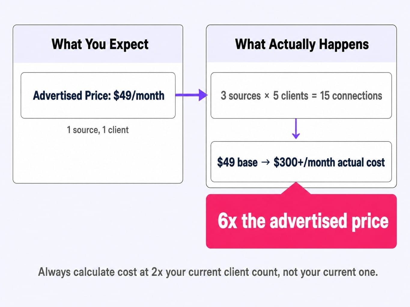
Tools that advertise a low monthly fee often use a per-source, per-connector, or per-row pricing model. A plan that looks cheap at $49/month can easily become $800/month once you connect 15 sources across 20 clients. For example, an agency might sign up for a per-source tool, connect three sources for just five clients (15 connections), and discover their actual cost is 6x the advertised starting price. Rule of thumb: Calculate your potential cost at 2x your current client count, not your current one.
2. Connector Deprecation Risk
When an API changes—like Meta's frequent Graph API updates or Google's evolving OAuth requirements—your connector breaks. The vendor is responsible for fixing it. Tools with small engineering teams or a reliance on community-maintained plugins may leave you with a broken report for days or weeks. Before you buy, ask: how many of your connectors are maintained by a dedicated internal team?
3. Credential and API Rate Limit Overhead
This is the invisible work that breaks your Monday morning report. Enterprise clients increasingly require credential rotation every 90 days for security, forcing you to re-authenticate every data source. Furthermore, many tools can hit API rate limits from platforms like Google Ads during high-demand periods (like month-end), causing data to fail to refresh. These issues don't show up on a feature page, but they create significant operational drag.
When the Real Problem Isn't Your Reporting Tool — It's the Gap Between Report and Action
Every tool in this article—including the ones we recommend—shares one fundamental limitation. They show you that your landing page conversion rate dropped 30% last month. They do not fix the landing page. They are diagnostic tools, and the output of a diagnostic is more work for your already-stretched team.
If you're tired of generating reports about problems you lack the bandwidth to solve, your bottleneck isn't reporting. It's execution.
This is why we built Spike AI. It's not another Whatagraph alternative; it's what comes after reporting. Spike AI is a marketing execution platform that closes the gap between insight and action. Instead of just showing you what's broken, our system identifies the highest-impact fix across your website, SEO, and ads—and then ships it. Every week.
The marketing teams we work with have stopped debating which dashboard looks best. They're too busy approving the next set of shipped improvements that actually move revenue.
See how Spike AI turns reporting insights into weekly shipped improvements — book a discovery call.
Your Next Move
The right Whatagraph alternative depends entirely on your core bottleneck. Is it connector coverage, data transformation, client presentation, or the gap between data and action? Most comparison articles won't help you answer that because they're selling their own solution.
Before you sign up for any tool on this list, do three things. Calculate your total cost at double your current scale. Investigate the vendor's history of fixing deprecated connectors. And most importantly, ask yourself if a better dashboard is the solution you actually need, or if it's just a prettier way of looking at a backlog you can't get to.
Read more: SaaS Marketing Metrics That Actually Inform Decisions (Not Just Dashboards) | Spike AI
Frequently Asked Questions
Which Whatagraph alternatives have the fastest data sync refresh rates?
Most standard reporting tools sync data every 6 to 24 hours by default. For faster updates, AgencyAnalytics and Databox offer hourly syncs on their higher-tier plans. Pipeline-focused tools like Funnel.io and Supermetrics offer more frequent syncs, especially when sending data to a warehouse, but this depends on the destination's capabilities. Be skeptical of "real-time" marketing claims; for ad platforms like Google and Meta, API rate limits mean "real-time" is almost always hourly at best.
How do Whatagraph competitors handle calculated metrics and custom formulas?
There are three tiers of capability. Basic tools like DashThis let you create simple formulas (e.g., CPA, ROAS) from metrics within a single source. Mid-tier tools like AgencyAnalytics and Klipfolio offer formula builders for cross-source calculated metrics. The most advanced option is using pipeline tools like Funnel.io or Supermetrics to push data to a warehouse like BigQuery, where you can write SQL for complex dimension mapping and data blending joins. Your choice depends on your team's comfort with writing formulas or code.
Are there any Whatagraph alternatives with AI-powered narrative reporting?
Yes, AI-generated narratives are an emerging differentiator in 2026. Whatagraph, Databox, and AgencyAnalytics have all introduced AI features that generate text summaries of report data. However, the quality varies. Most currently produce generic text that restates the numbers in a sentence (e.g., "Your CTR increased by 12%"). The key is to evaluate whether the AI provides actionable interpretation—the why behind the change—or if it's just decorative text.
What reporting tools do large agencies with 50+ clients use instead of Whatagraph?
Agencies at this scale typically outgrow monolithic reporting tools and adopt a composable stack. A common setup is Funnel.io or Supermetrics for data ingestion, a data warehouse like BigQuery or Snowflake for storage and transformation, and a BI tool like Looker Studio or Klipfolio for visualization. At 50+ clients, the critical need becomes workspace-level permissions and robust data isolation, not just more dashboards. Purpose-built enterprise platforms like TapClicks and NinjaCat also serve this market, but with higher costs and longer implementation cycles.
How difficult is it to migrate from Whatagraph to a competitor?
Difficulty depends on your level of customization. If you use default templates and standard connectors, you can likely replicate your setup in a new tool within a couple of days. However, if you've built dozens of custom calculated fields, complex data blends, or unique white-labeled report designs, expect 1-2 weeks of manual rebuilding. None of that custom logic exports cleanly. The biggest hidden cost is often the institutional knowledge lost about why a specific metric was calculated a certain way, as this logic is rarely documented outside the tool's interface.